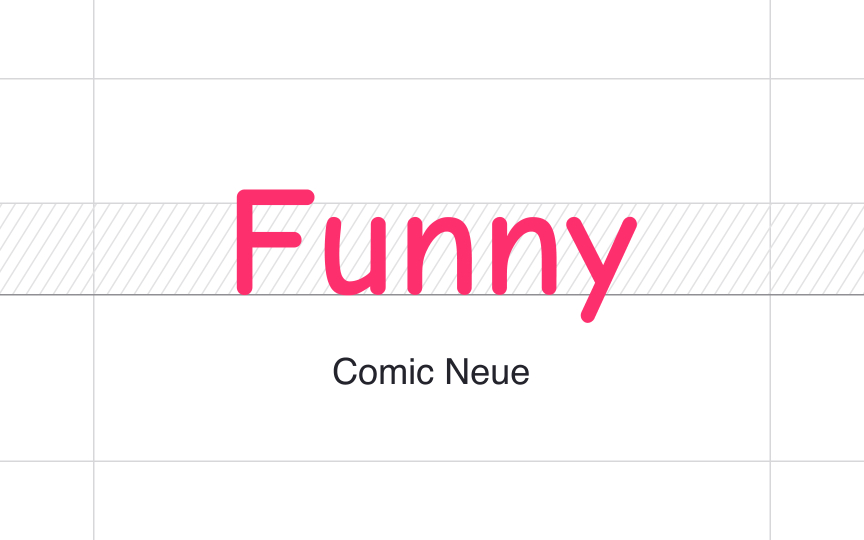
Make sure moods match
Playful, serious, elegant, casual — your typeface choices should match the purpose of your design and brand personality. You can't use a child-like handwriting typeface like Comic Sans for insurance or banking service. It not only looks awkward but also confuses users, creating the wrong impression of your brand. Instead of confidence and trust, this typeface will make your brand appear reckless and unprofessional.
Like colors, typefaces also bring up certain associations and evoke emotions. Just like bright yellow or pink hues, decorative typefaces with a strong contrast between thin and thick strokes have no place on an insurance app or website.
Pro Tip: If you're uncertain about the typeface's mood, type its name in Google and read its characteristics, or check out other design projects and products created using this type.

