Keep it simple
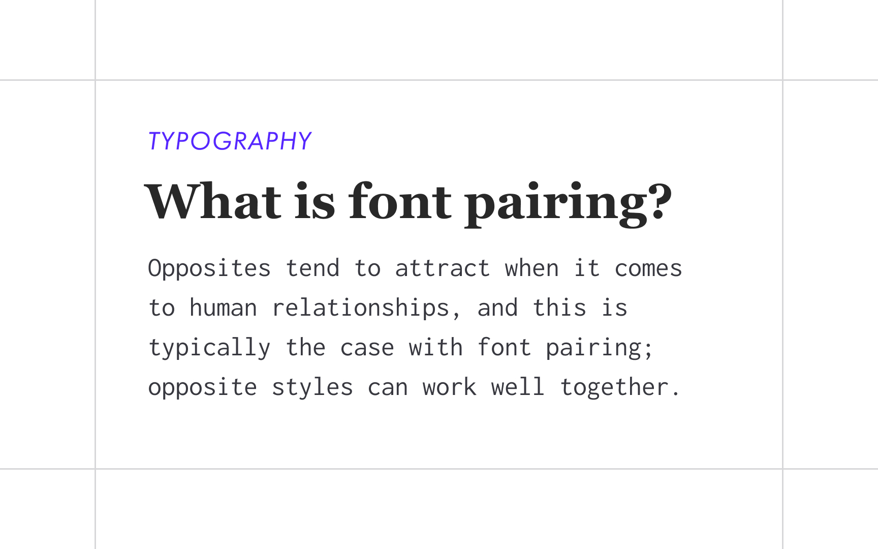
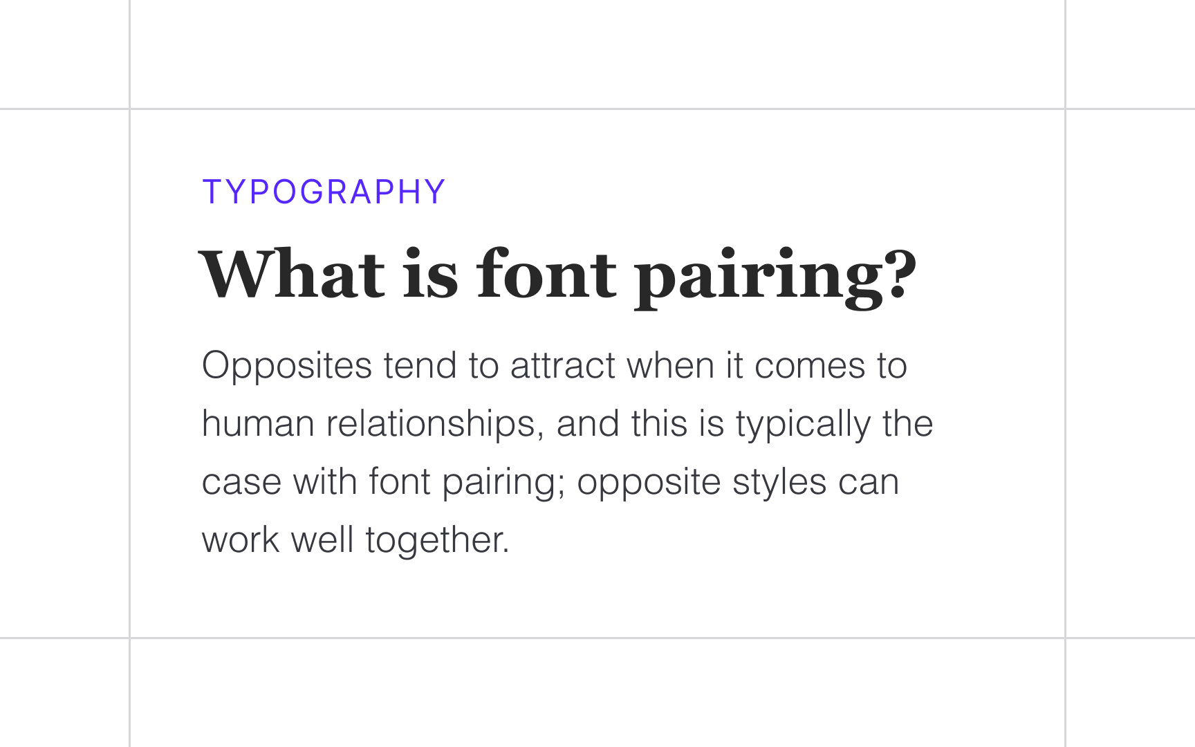
If you mix too many colors in a painting, it might turn into a muddy mess. Likewise, if you mix too many typefaces, you could risk confusing your users. So how many typefaces are enough? Keep it simple — sometimes, one typeface with several font variations can be enough for the whole project.
If you want to introduce a bit more contrast, it's okay to use 2-3 typefaces. Ensure they balance and complement each other. For example, neutral, reserved sans serifs go well with elegant scripts and classic serifs.
Top contributors