Combining distinct and neutral typefaces
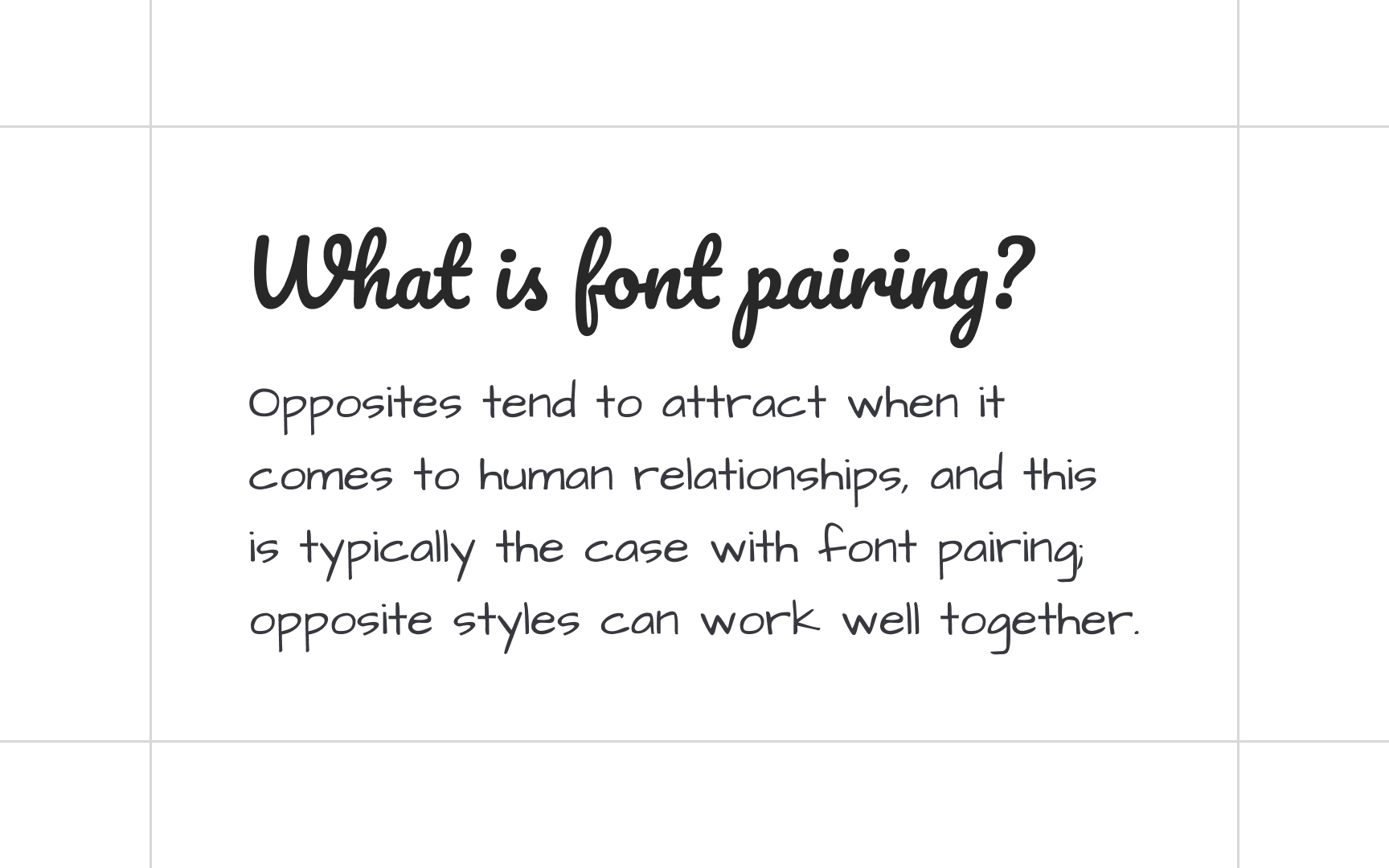
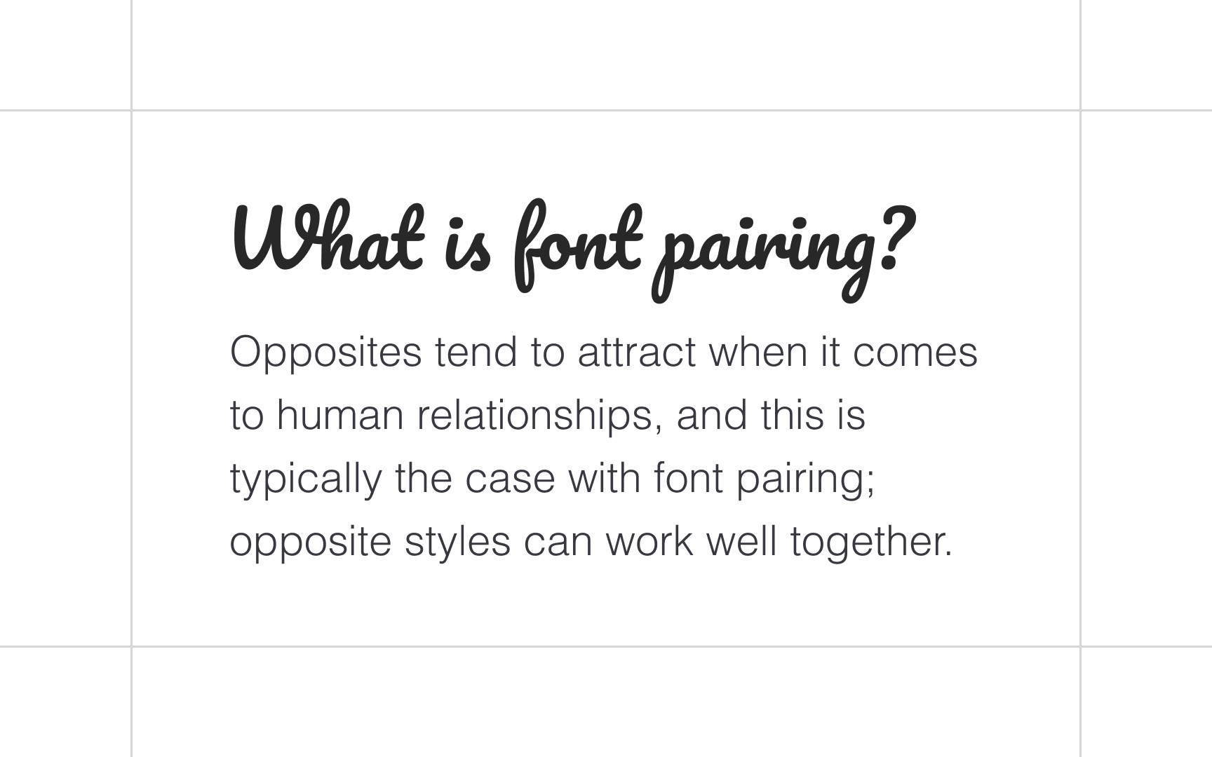
Like two extroverts hardly can get along together, two distinct, attention-grabbing typefaces will only compete for attention with each other and produce chaos. Creativity using script, display, or slab serif typefaces is more common for short phrases like headlines and subheads. For body text, it's better to stay neutral and legible with typefaces like Helvetica, Roboto, Open Sans, or Futura.
Architects Daughter and Pacifico are both handwriting typefaces and convey the same friendly, informal attitude. Their combination lacks contrast, resulting in a poor visual hierarchy. Conversely, Pacifico and Helvetica complement each other and reinforce the importance of each text part (headlines, body text, etc.).
Top contributors