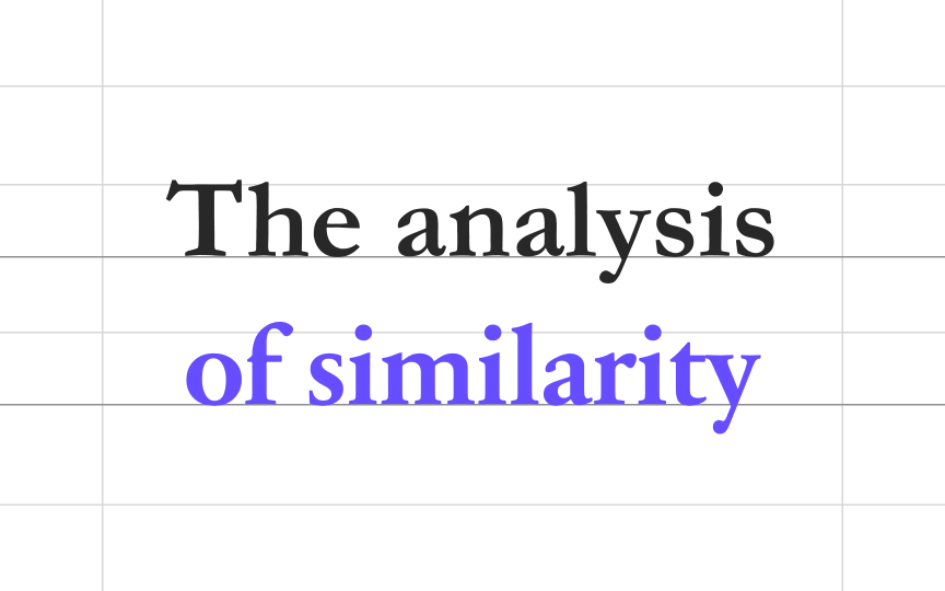
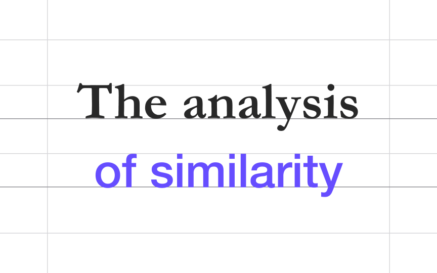
Avoid too much similarity
Combining 2-3 typefaces won't have the intended effect if your typefaces have too much in common. Using two neutral sans-serif fonts like Helvetica and Univers can make your users feel like something is off without knowing exactly what.
Try combining typefaces having different but complementary personalities. For example, the distinctive, friendly sans serif Helvetica and the traditional, elegant Garamond typefaces form a complex yet appealing pair.


