Kerning
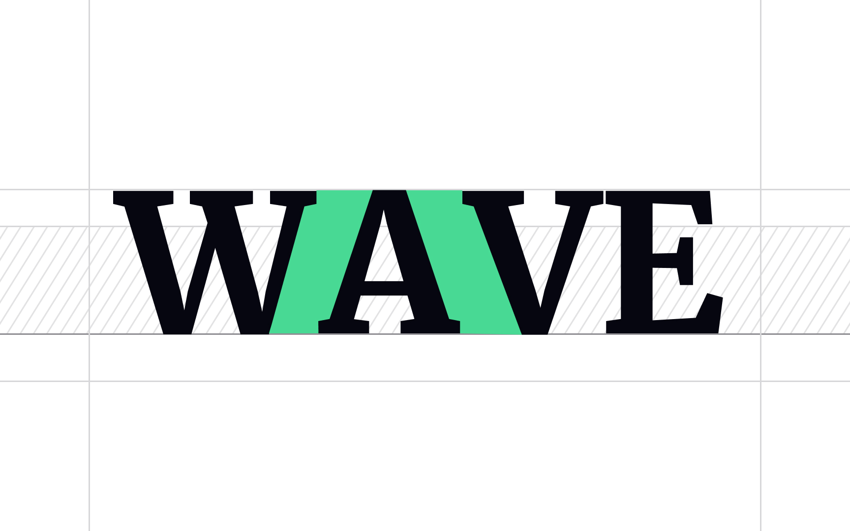
Kerning is the adjustment of spacing between individual characters, usually to achieve a visually appealing result. Certain letter combinations (usually involving outward angles or large open spaces like W, Y, V, or T) have large gaps and look awkward.[1]
Some typefaces have kerning that looks fine at small sizes but becomes unbalanced and difficult to read when enlarged for headlines. That happens because many free (and even low-cost) typefaces have little or no built-in kerning and demand manual adjustments.
Pro Tip: You can experiment with kerning to create unique logo variations.
