User flow visualization
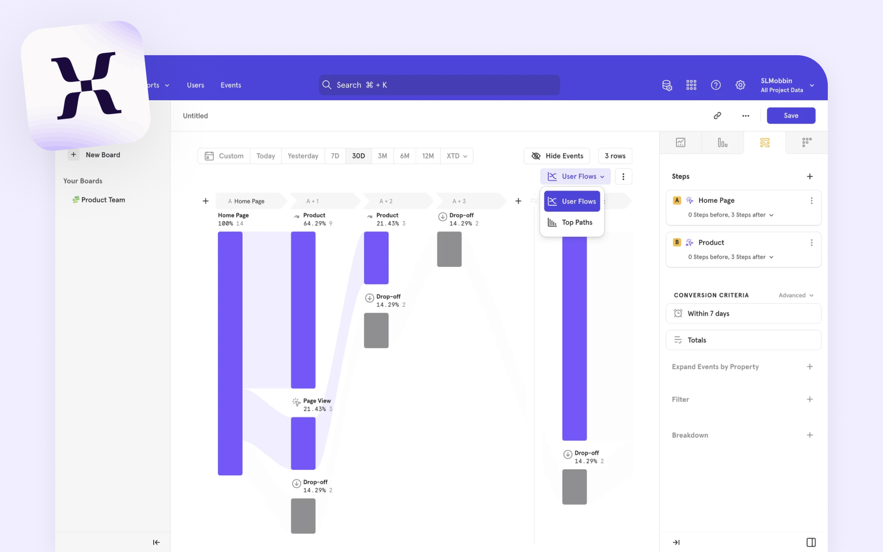
Flow visualization turns complex user journey data into clear, visual paths. Tools like Google Analytics and Woopra transform thousands of user sessions into sankey diagrams (visual maps where wider paths show more users taking that route) or tree maps showing how users navigate. For example, you might see that 70% of users go from your landing page to pricing, while 30% check the features page first.
Modern visualization tools offer interactive features for deeper analysis. Using Mixpanel, you can click on any path to see detailed metrics like time spent, drop-off rates, and user segments. This helps identify patterns — like discovering that users who visit your help center within their first week are 2x more likely to become paying customers.
Product teams can use these visualizations to spot opportunities and problems. A SaaS product might notice that users who customize their dashboard settings show higher engagement. An e-commerce site might find that users who start from category pages convert better than those who use search. These insights help teams focus on improving the most impactful user paths.
