Put destructive items at the bottom
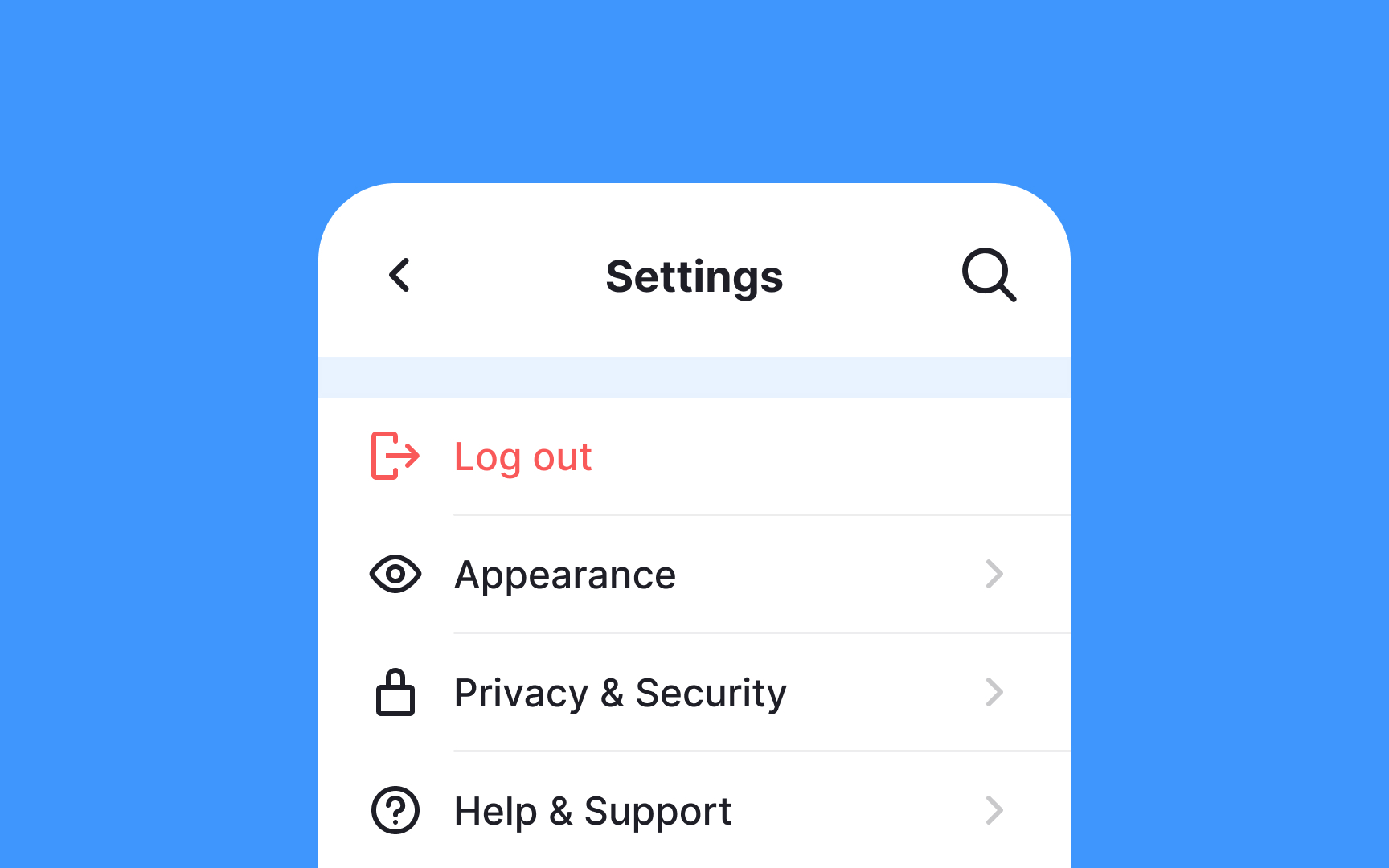
Hiding options for deleting an account or even logging out from users is a dark design pattern. However, due to their destructive nature, they shouldn't be too prominent. Keeping them at the top of the Settings page can result in users accidentally clicking them. It can cause anxiety and require users to do extra work like logging back in. If they forget their credentials, such accidental clicks can result in a lot of added stress and cognitive load.
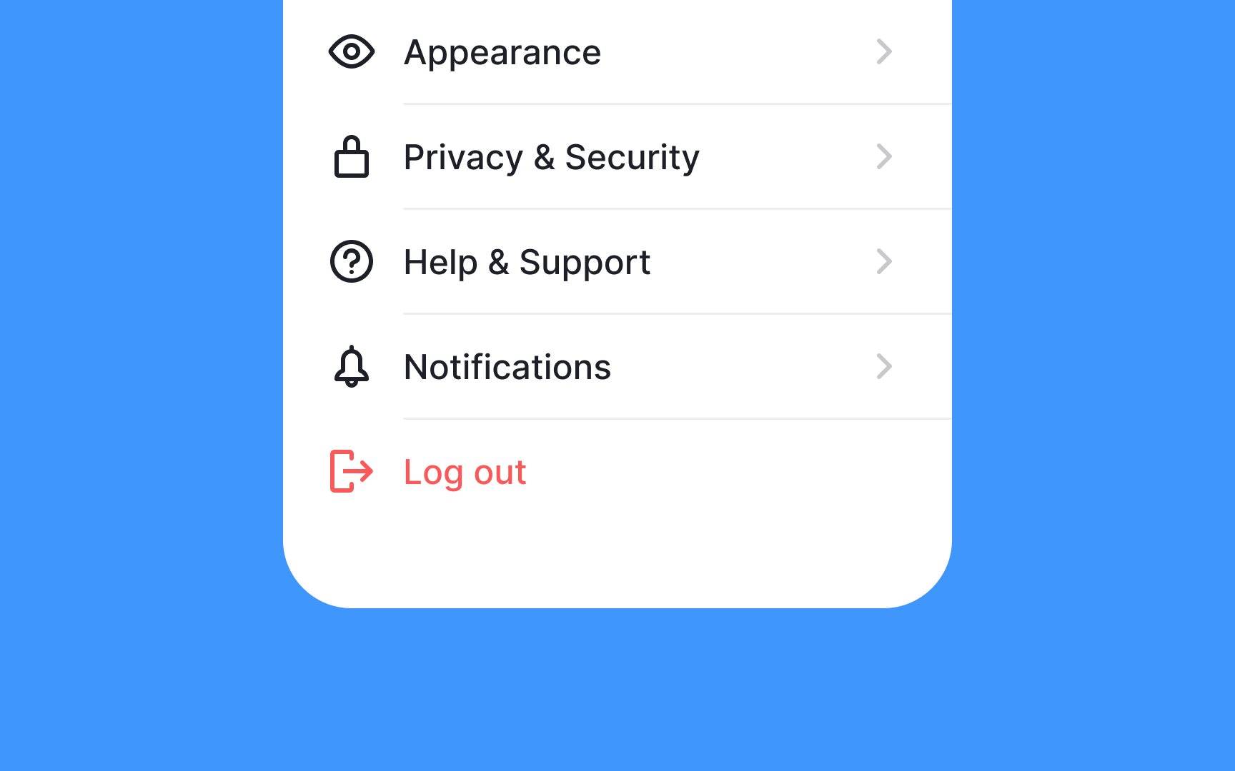
Putting destructive actions at the bottom of the Settings page and setting them apart with the use of color or icons reduces the likelihood of accidental clicks. Moreover, it has become a common design pattern, and many users expect these actions to appear last on the Settings page screen.
