Mobile Settings Design
Dive into the basics of designing an intuitive and helpful mobile Settings page
When default settings are set properly, most users rarely visit the Settings page. However, users should have no trouble finding the proper settings and applying changes when an emergency occurs.
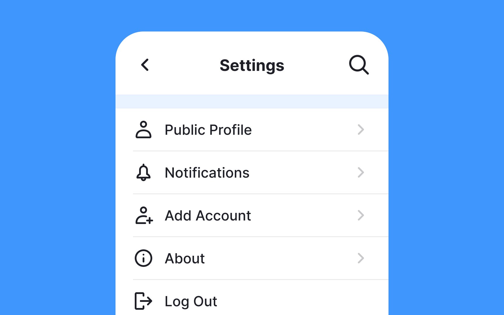
The Settings page allows users to customize an app and manage push notifications, app appearance, privacy, time zones, login credentials, etc. Apps, too, can get a lot of valuable data about users through app permission requests and information stored on the device.
Naturally, designers shouldn't underestimate this task. You may only guess your users' preferences and their flow of adjusting settings, but assumptions are never enough. Designing an intuitive and helpful Settings page requires collaboration with user research findings or, at the very least, following design guidelines and heuristics.
Mobile devices manage app
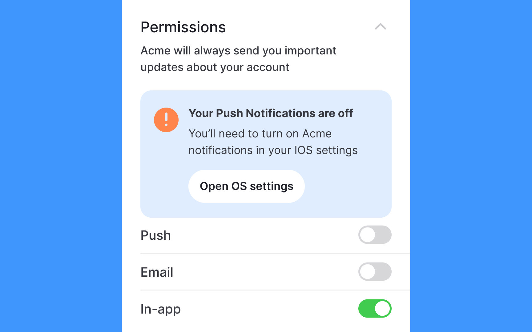
Here's how to make permission settings more user-friendly:
- Let users customize permissions within your app. If we take notifications, users can manage what they get notified about and how often.
- Make it easy to find system-level settings when users need them.
- Show clear steps to Settings when users need to change permissions like location access.
For example, if someone says no to location access when first using your app, explain why it's helpful and show them exactly how to enable it in Settings later.
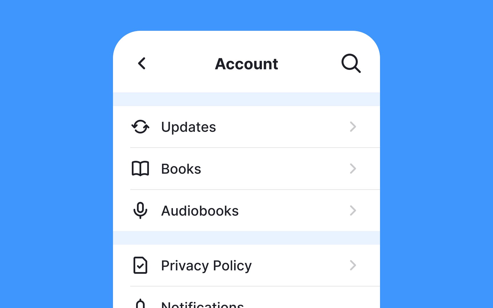
Long lists of
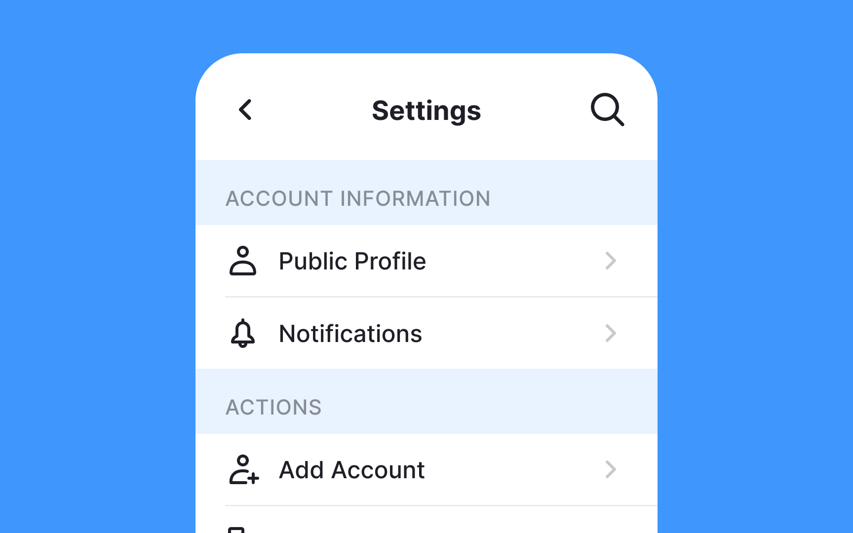
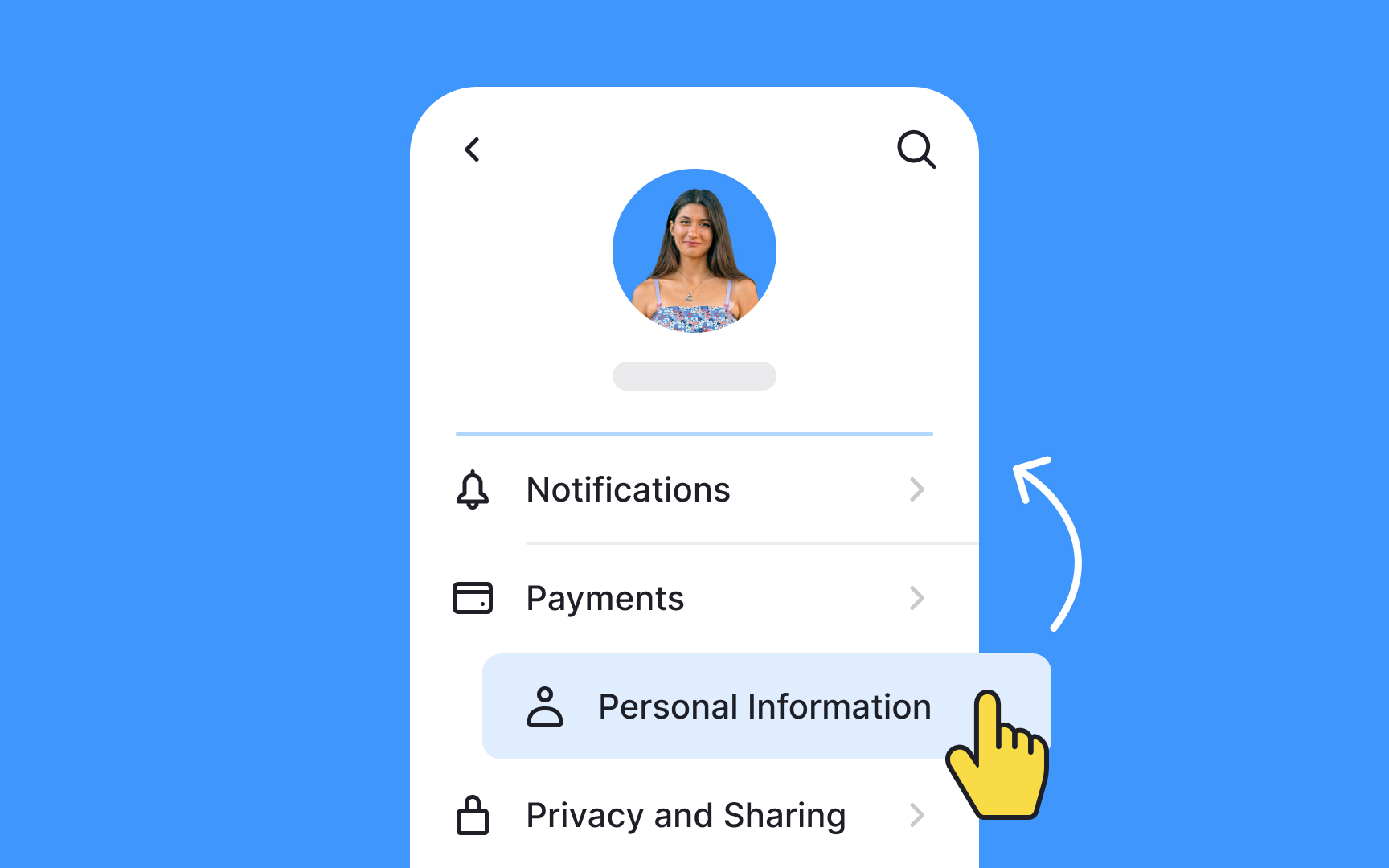
The design principle of proximity recommends Placing related settings close together and keeping unrelated ones apart. When you group settings into clear categories, users can find options more easily.
Write category headings in plain language that users understand. Skip the technical terms that only developers know and use words that match how your users talk about your product.
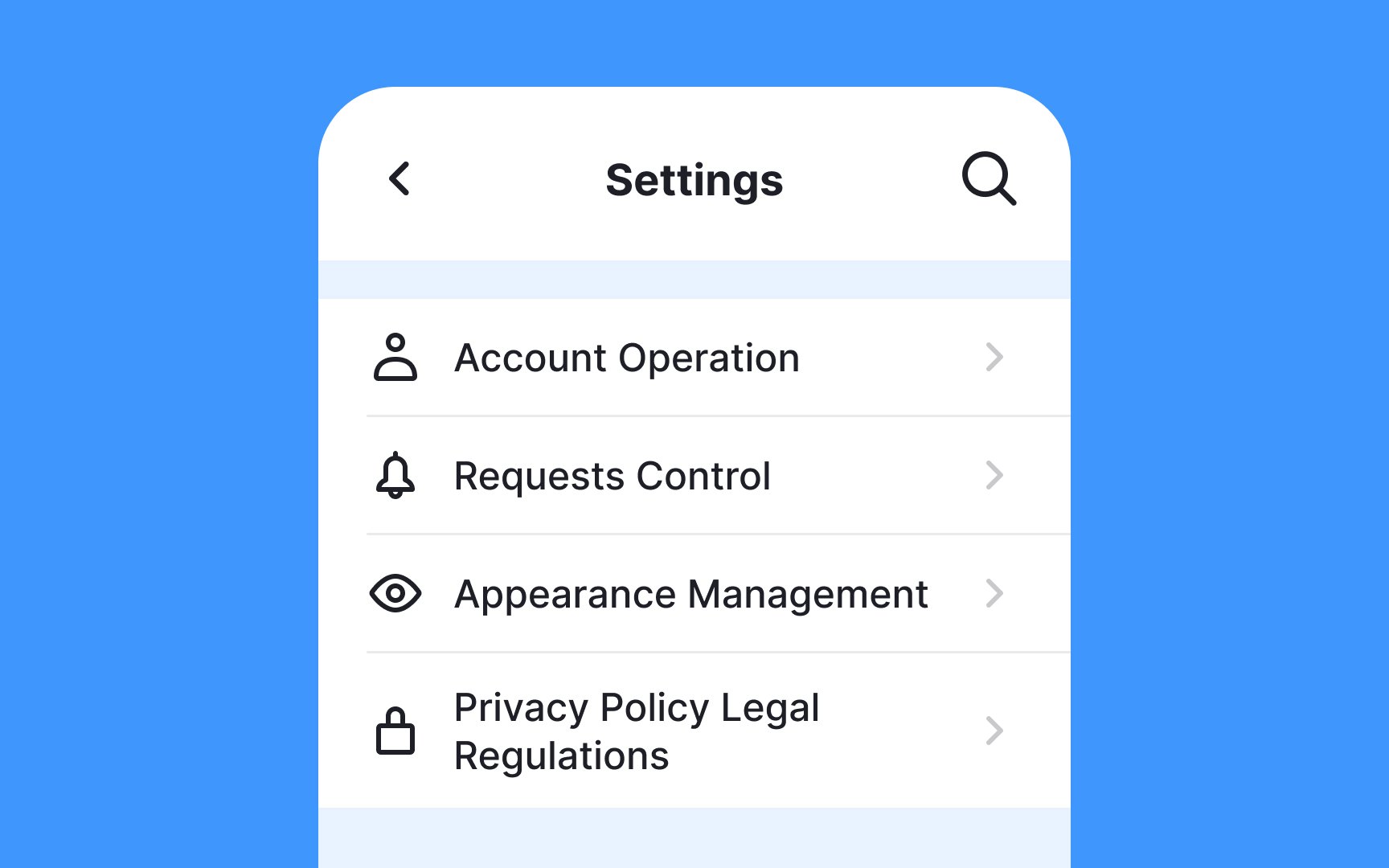
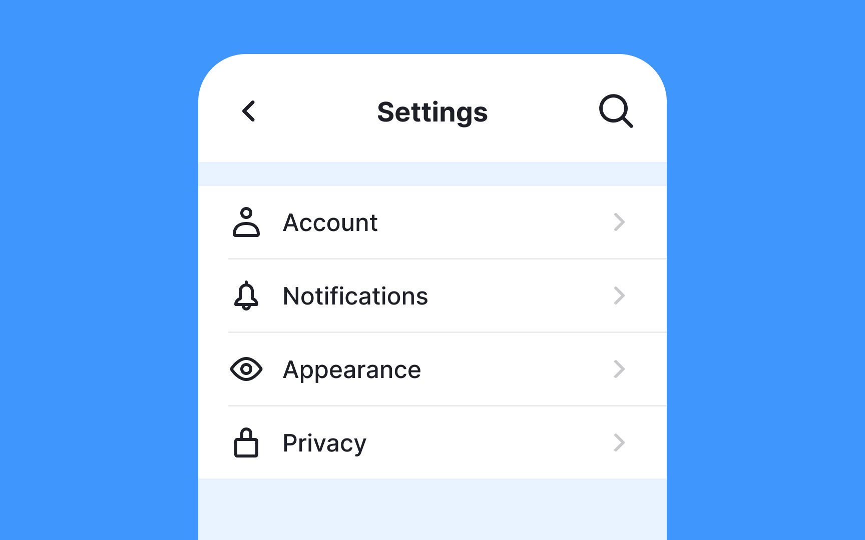
Designers establish hierarchy through scale, color, typography, and other techniques to highlight important elements and guide users' attention. Hierarchy makes
Avoid presenting
Most users rarely visit
You can research user vocabulary through:
- Online surveys
- Forum discussions
- Support tickets
- App store reviews
- Social media comments
For advanced options, provide brief explanations below labels. Keep descriptions concise and link to detailed support
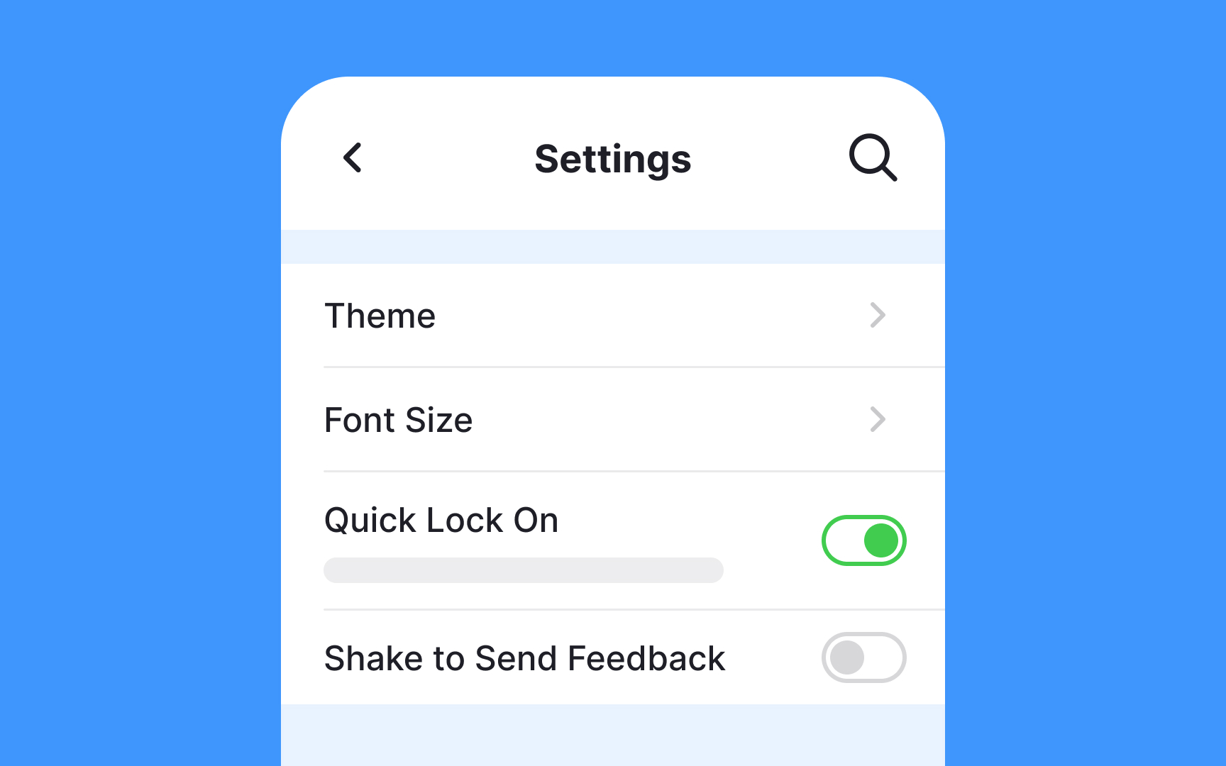
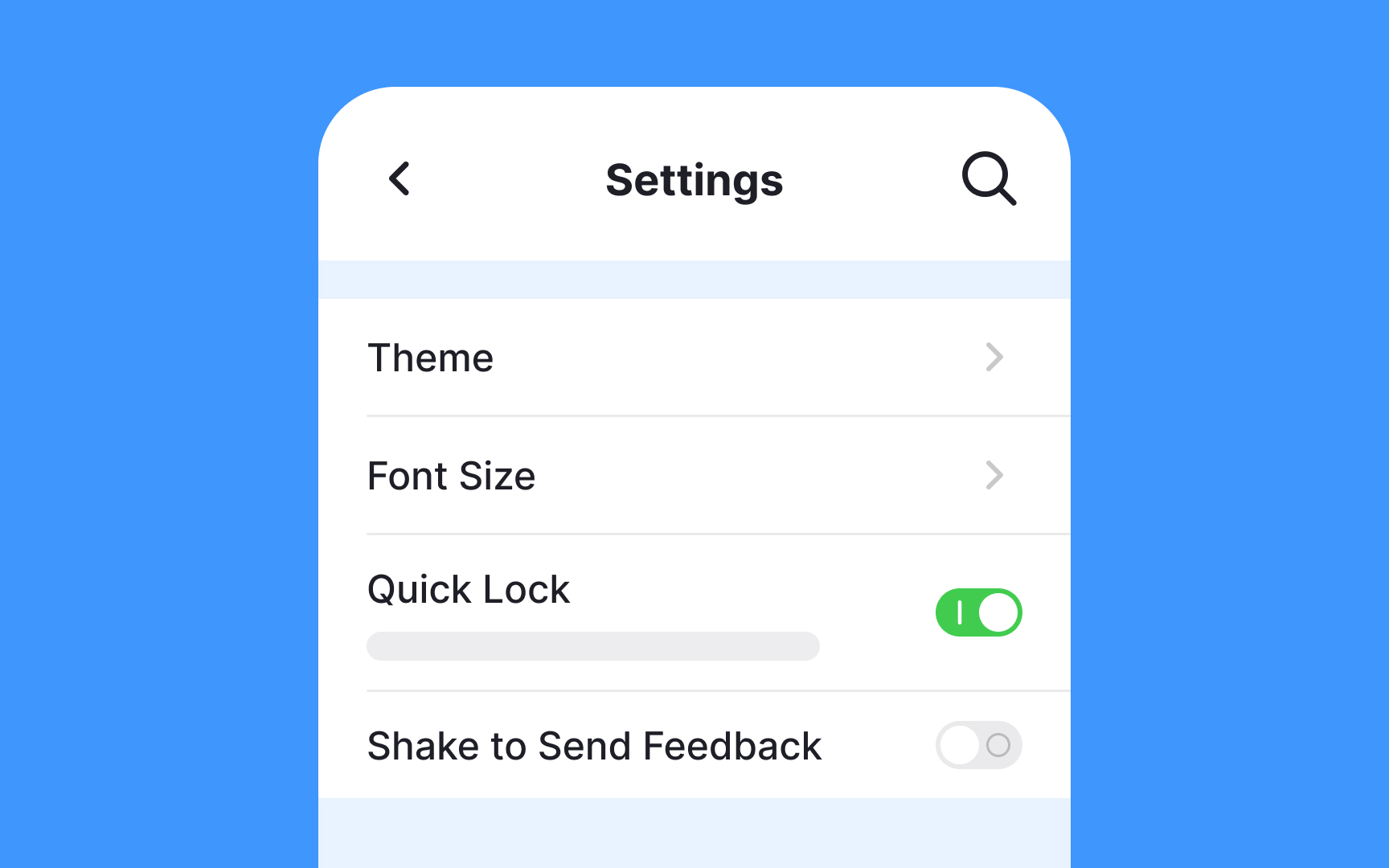
Toggle switches work well in
Make toggle states clear by:
- Using both visual changes and
labels - Showing clear on/off states
- Avoiding ambiguous descriptions
Write clear toggle labels that describe the feature's action rather than its state. For example, use "Shake to Send Feedback" instead of "Shake to Send Feedback Off" - the toggle's visual state will indicate whether it's enabled or disabled.
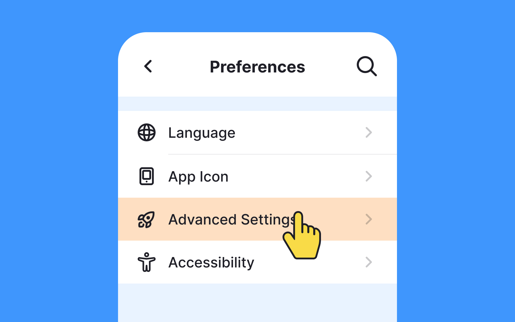
Primary settings:
- Visible to everyone
- Cover common needs
- Easy to understand
Advanced settings:
- Hidden under "Advanced Settings"
- Include complex options
- Target experienced users
This approach respects both novice and advanced users, reduces cognitive load, saves screen space, and improves scannability.[1]
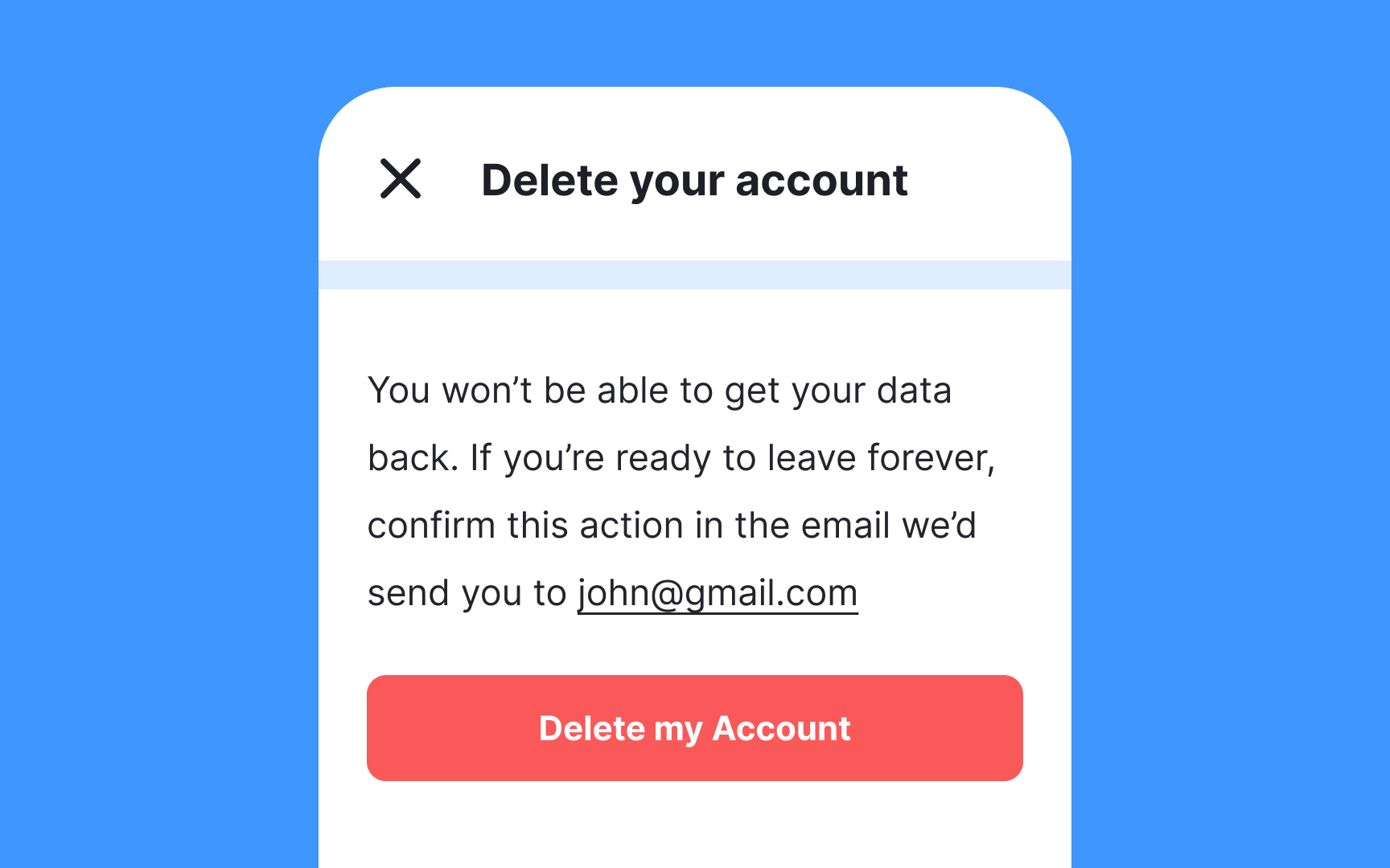
Passwords, email addresses, and payment methods fall into the category of sensitive information and an app shouldn't change such data without notifying users and getting their
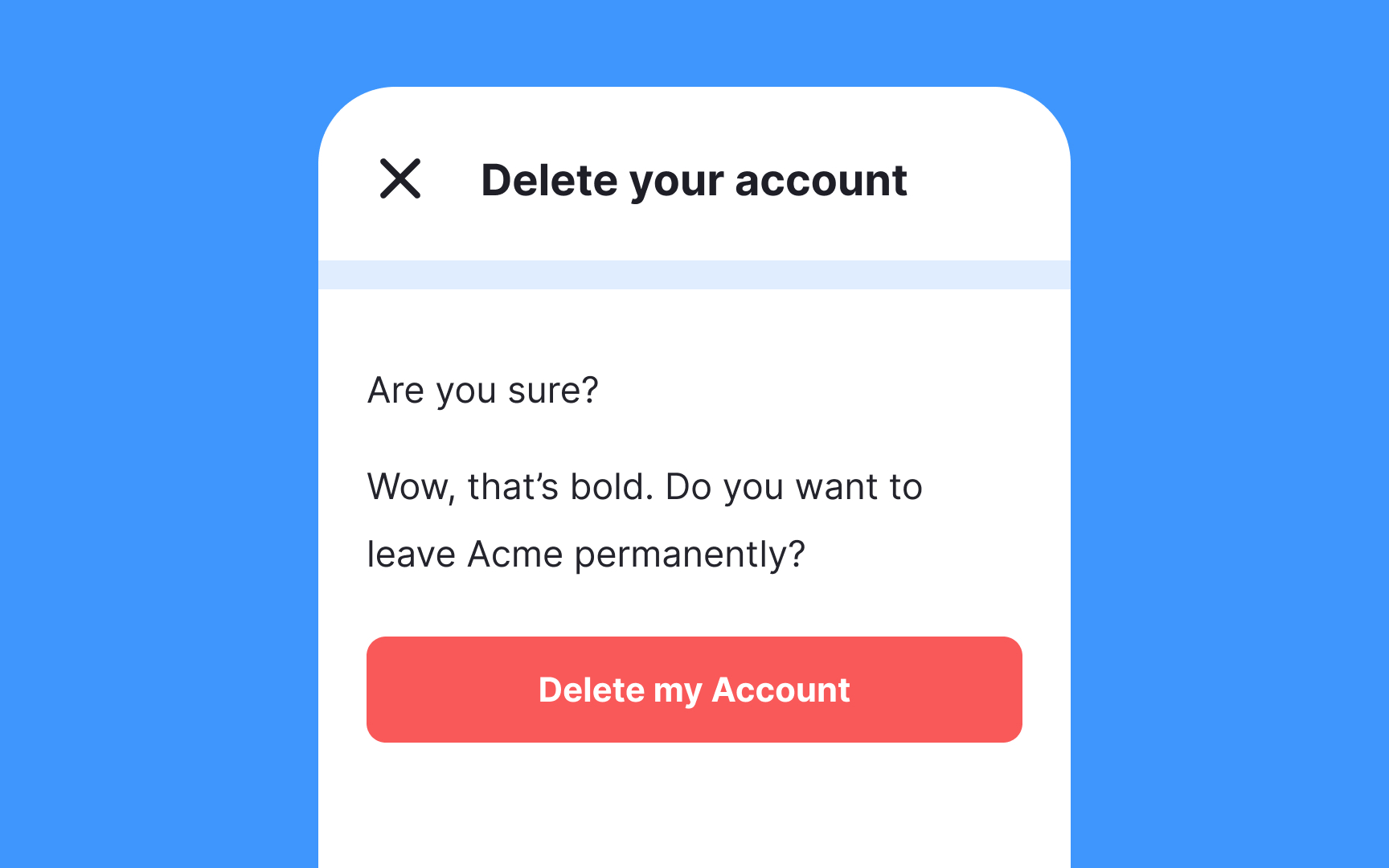
Furthermore, destructive actions like deleting or deactivating an account also require users' consent via in-app messages and/or email. It allows users who might have accidentally selected an action to undo it and prevent serious issues like data loss. Confirmations may appear annoying to some users but they inform them about what's happening in the app and take care of their data safety.
Keep in mind that users don't read instructions and alerts word by word, so make sure confirmation dialogs are concise, direct, and informative. Ideally, users should be able to understand the issue by taking one glance at the heading. Try to sound friendly but avoid inappropriate jokes and goofy or ambiguous headings like "Oops" or "Are you sure?"
Ideally, the default
You may guess and build assumptions about what settings will be right for your users, but it's difficult to be accurate. Eventually, products released without user research turn into junk and cost businesses a lot of time and resources.
Instead, you may find a group of users, conduct a few user interviews, and find out how people expect things to work. For example, if it's a messenger app, consider asking the target audience questions like:
- Do you expect a messenger app to download all shared media with cellular data when Wi-Fi isn't available?
- Do you expect other app users to see your profile photo and the time of your last visit?
- Do you want to share your live location with all your contacts?
If the list of
Since typing usually increases the interaction cost, include a search auto-suggest that offers users real-time search suggestions within an on-screen dropdown menu.
On the flip side, users often don’t know exactly what settings they need or what they’re called. So, before adding the search functionality, try to minimize and simplify the Settings
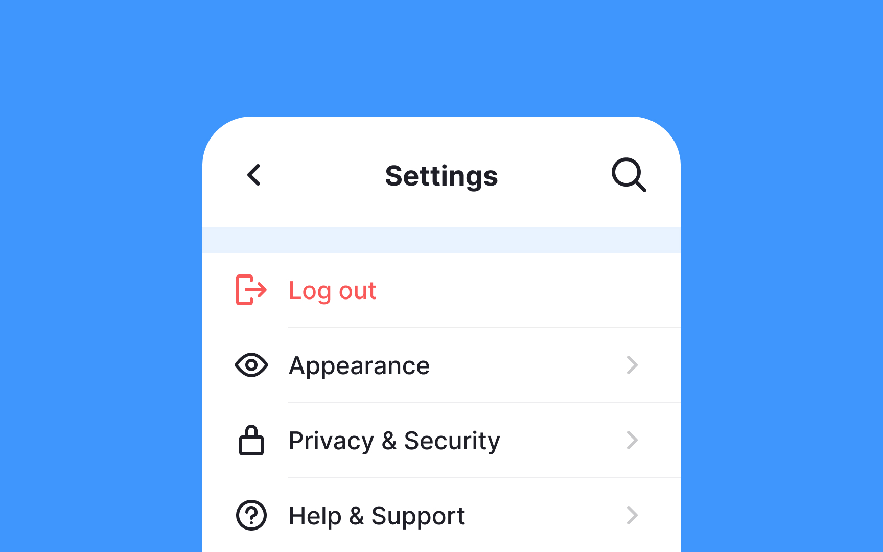
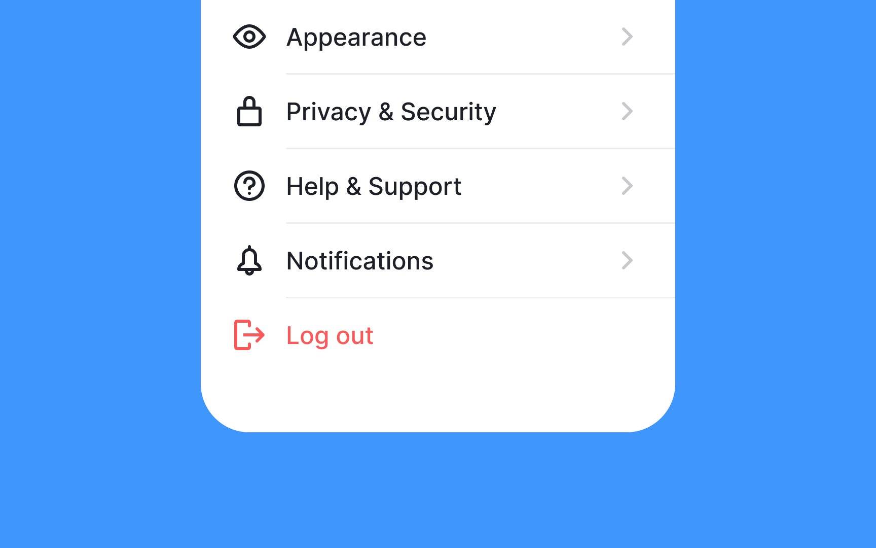
Hiding options for deleting an account or even logging out from users is a dark design pattern. However, due to their destructive nature, they shouldn't be too prominent. Keeping them at the top of the
Putting destructive actions at the bottom of the Settings page and setting them apart with the use of
The most important and most-used
Card sorting can be a useful UX research method when you need to define the order and naming of items.[2] In such studies, participants are asked to order settings or organize them into logical groups that make sense to them. This allows you to see what patterns emerge and what settings seem most relevant to users. You can also ask people if settings' names appeal to them and encourage them to suggest their own variants.
References
- Card Sorting: Uncover Users' Mental Models for Better Information Architecture | Nielsen Norman Group
Top contributors


Topics
From Course

Share


Similar lessons

Designing for Mobile Interfaces

Responsive vs. Adaptive Design
