Translate data for non-technical audiences
Data is useless if you can’t communicate it to people. Effective data translation converts complex statistics into clear narratives that highlight business implications. Your goal is to answer "So what?" for every chart and number you present.
Here are some tips for presenting data to non-technical audiences:
- Start with the goal and the result: Begin presentations with your key finding or recommendation with respect to the goal you are trying to achieve, then support it with data and not the reverse. For example, we are trying to achieve [goal]. We know that our customers [insight]. Therefore we tested [experiment]. We found that [conclusion].
- Use business language: Replace technical terms with business outcomes. Instead of "session duration increased," say "customers spent more time engaging with our content."
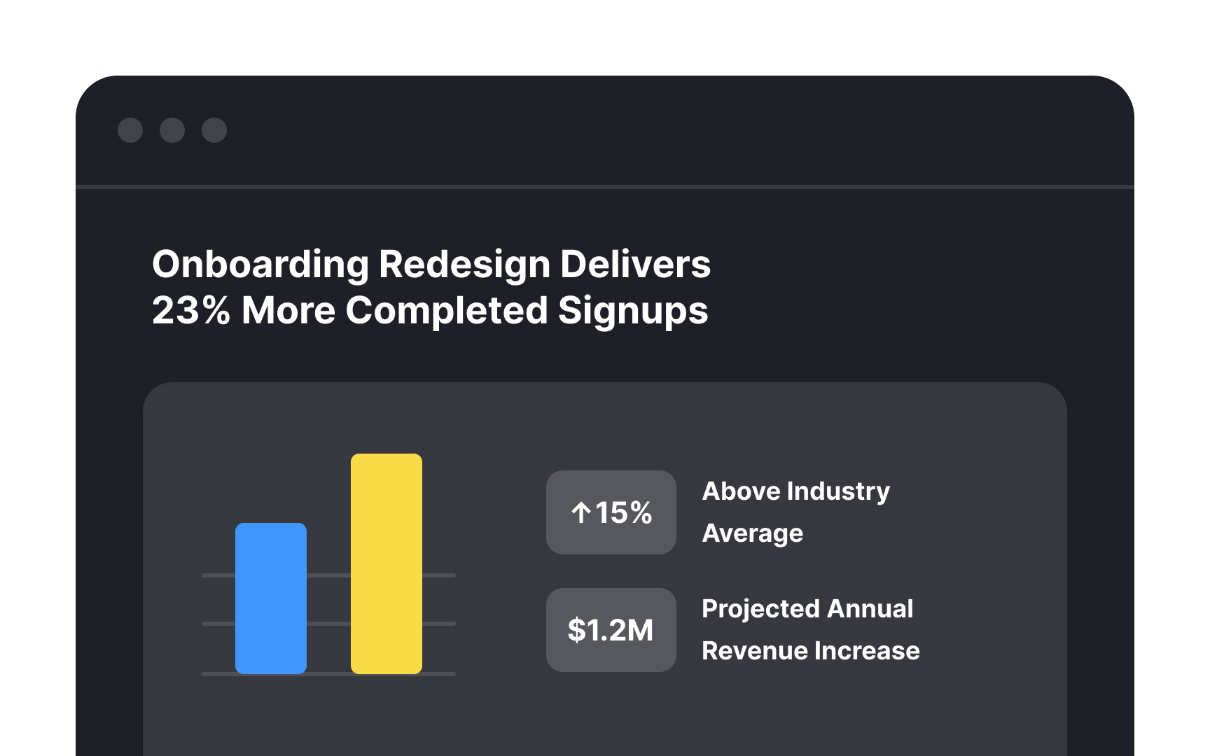
- Contextualize with benchmarks: Raw numbers mean little without context. Show how metrics compare to previous periods, industry averages, or targets.
- Visualize selectively: Choose visualizations that emphasize your main point rather than showing everything possible. One clear chart often communicates better than ten complex ones.
Remember that different audiences need different translations. Executives typically care about revenue implications and strategic alignment, while product managers focus on user experience and feature performance.
