Adding a gradient background
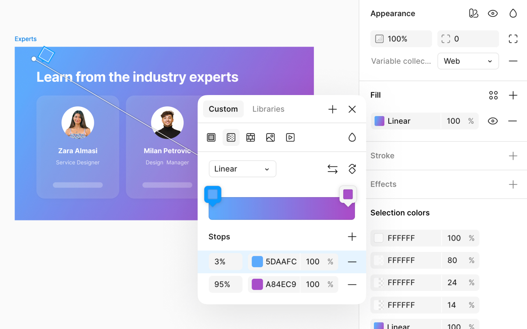
Applying gradients to the background of an interface can create a visually engaging space. However, it's crucial that gradients do not compromise the readability or navigability of your interface. Using analogous colors (the colors next to each other on the color wheel) provides smoother transitions and ensures there are no harsh contrasts. This choice is particularly supportive for users with visual impairments, maintaining clarity and preventing strain.
Recommendations for building a gradient background include:
- Prioritizing legibility: Ensure text and UI elements remain readable against the gradient.
- Testing across devices: Gradients can display differently on various screens, so it's important to check their appearance across devices.
- Using gradients purposefully: Gradients should enhance your designs, not distract from the functionality.
Pro Tip: Opt for a 45° angle for the gradient. It's a nice middle ground that adds energy while keeping things balanced.
