Banking dashboard wireframing
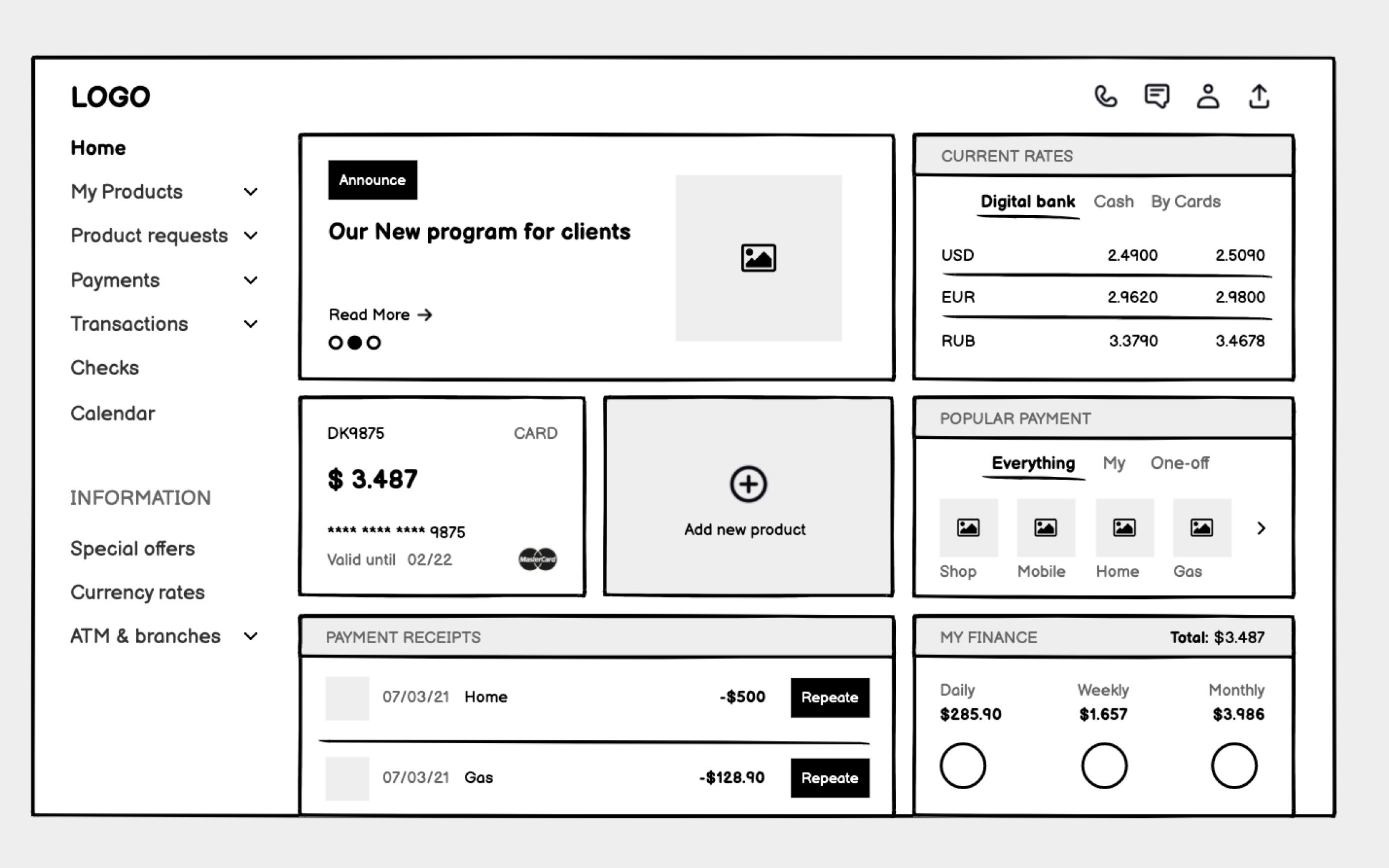
Unlike consumer apps that can hide complexity, banking users need immediate access to balances, transactions, alerts, and tools. Your wireframes must organize dense information without overwhelming users who might be anxious about money.
Start with an information hierarchy based on user priorities. Account balances and urgent alerts demand top placement. Recent transactions need clear formatting that aids scanning. Less frequent actions like transfers or settings can occupy secondary positions. Use consistent data formatting throughout — currency symbols, date formats, and number groupings that match user expectations.
Sample data transforms abstract wireframes into concrete experiences. Include realistic account balances, actual transaction descriptions, and believable merchant names. This reveals whether your layout handles edge cases like negative balances, long merchant names, or multiple currency displays.
Top contributors