Calm colors
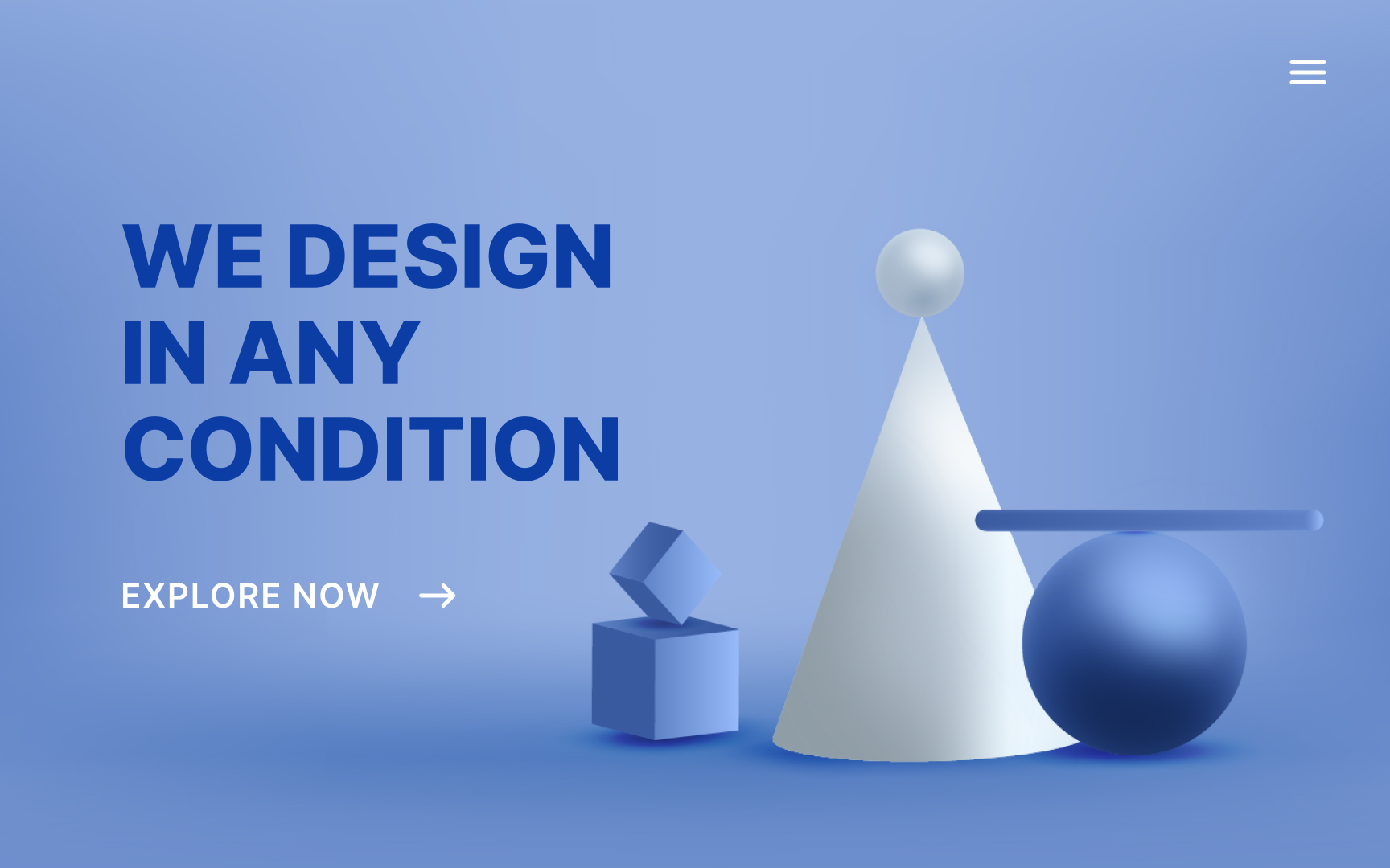
Blue has long been the most popular color in the world — as early as the 1940s it was a clear winner as the most preferred hue.[1] Blue is used widely in marketing, partly for this reason and partly for the emotional impression it makes.
Blue has a strong association with being calm, orderly, secure, and reliable. It’s a passive color, often associated with loyalty and humility.
References
Top contributors