Color contrast and accessibility review
Many apps pass basic contrast checks but fail in real-world conditions. Text might be readable on a clean background but become illegible when placed over images or complex patterns. Interactive elements could lose their distinctiveness when viewed on different screen settings or in bright sunlight.
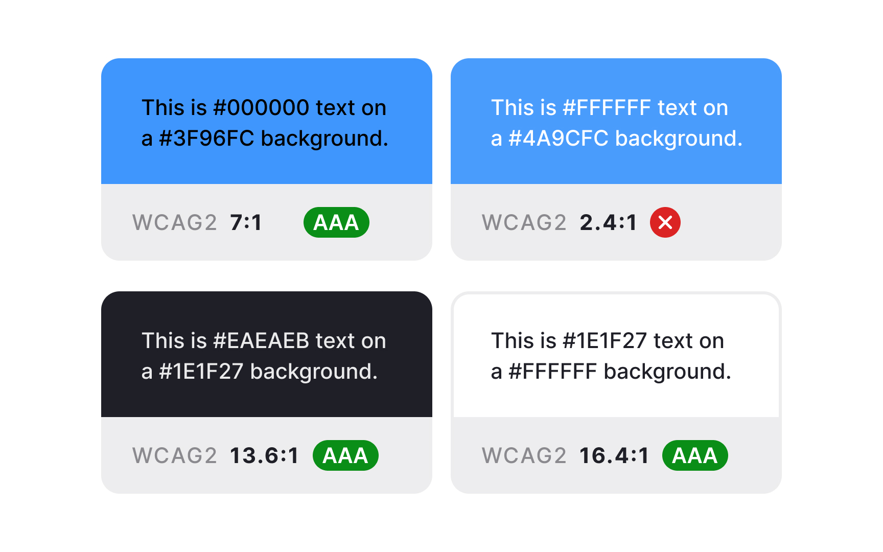
Begin your color contrast review with automated contrast checks, but don't stop there.
Test your interface under various conditions:
- Switch to different display modes
- View screens under bright light
- Check how contrast behaves across different device settings
- Verify readability for all interactive states
Pay special attention to small text, error messages, and critical interface elements. Those are the areas where poor contrast can significantly impact usability.[1]
Pro Tip: Install a color blindness simulator in your browser. It helps quickly spot potential visibility issues during the design process.
References
Top contributors