Use multiple cues for accessible inputs
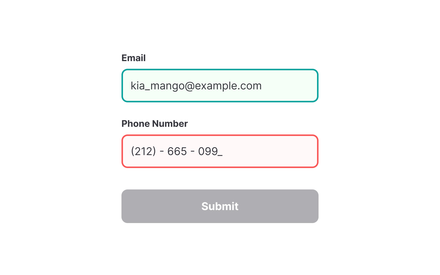
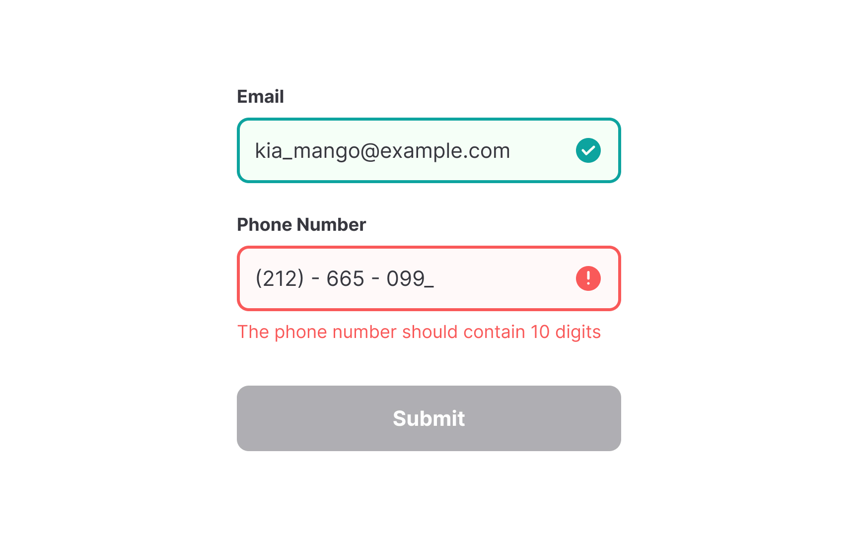
When designing interfaces, relying solely on color can create accessibility barriers. Color-blind users may struggle to differentiate elements, making key information unclear. For example, red and green error or success states appear nearly identical to some users, rendering them ineffective. To ensure clarity, complement colors with additional visual cues like icons, labels, and patterns to communicate meaning effectively.
