Make text legible
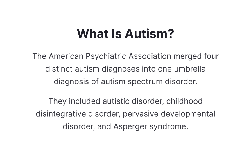
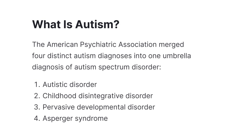
Breaking content into small, focused chunks reduces cognitive load and improves understanding. Left-aligned text provides a consistent starting point for each line, making it easier to track content and maintain reading flow.
Typography choices directly affect readability for autistic users. Sans-serif fonts like Arial, Verdana, or Open Sans offer clear letter shapes without decorative elements that could cause visual distraction.
Structure content using clear visual hierarchy and meaningful headings. Each paragraph should focus on a single idea and contain no more than 20 words per sentence. Use adequate white space between paragraphs to create visual breathing room. This spacing helps users process information at their own pace and reduces the risk of cognitive overload.


