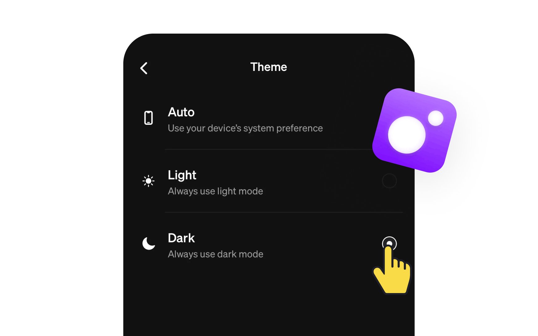
Include dark mode
Dark mode significantly impacts visual comfort and anxiety management in digital interfaces. Bright screens can trigger physical discomfort and heighten anxiety, particularly during extended use or in low-light environments. A well-implemented dark theme reduces eye strain, screen glare, and the potential for light sensitivity triggers that can exacerbate anxiety symptoms.
Dark mode implementation requires careful consideration of contrast ratios and color relationships. The interface should maintain WCAG compliance with a minimum contrast ratio of 4.5:1 for normal text and 3:1 for large text. Color choices should avoid pure black backgrounds, instead using softer dark grays (like #121212) with off-white (like #DEDEDE) to reduce eye strain and prevent halation effects. Interface elements need thoughtful adaptation to ensure readability and maintain visual hierarchy in darker contexts.
The option to toggle between light and dark modes should be easily accessible and remember user preferences across sessions.
Top contributors