Don't forget color contrast for selection
Just as highlighting in physical documents makes important information stand out, digital text selection serves essential functions for copying, sharing, and searching.
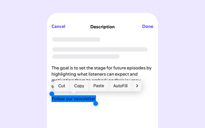
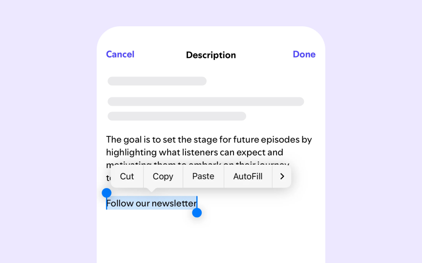
Selection states must maintain proper contrast to ensure users can identify which text they've selected. WCAG guidelines require the same contrast ratios for selected text as for regular text: 4.5:1 for standard text sizes and 3:1 for larger text. Without sufficient contrast in selection states, users with visual impairments may struggle to verify which content they've selected.
The best selection designs achieve exceptionally high contrast ratios, ideally above 7:1, to make selected text unmistakably different from surrounding content. When designing selection states, consider inverting text and background colors or using distinctive highlight colors that maintain strong contrast with both the text and the surrounding content.


