CSS Position
Discover the versatility of CSS positioning and gain the ability to precisely control the placement and behavior of elements within your web pages
Knowing how CSS positioning works is crucial for creating great layout designs. Usually, block-level elements like <div> and <p> take the whole width of the page and force a line break — which means that they follow one another vertically.
Inline elements like <img> or <span> take as much space as necessary, meaning that several smaller inline elements can be on the same line.
CSS positioning modifies this normal document flow, allowing us to move elements relative to their standard position, other elements, and the entire browser window. In this lesson, learn about different positioning methods and their most common use cases.
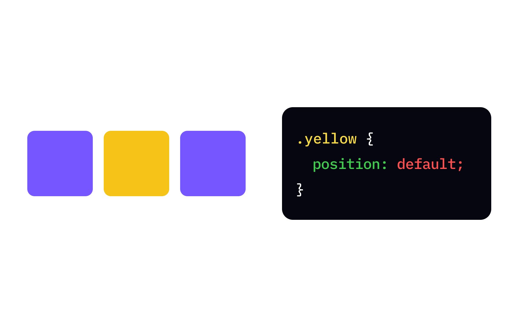
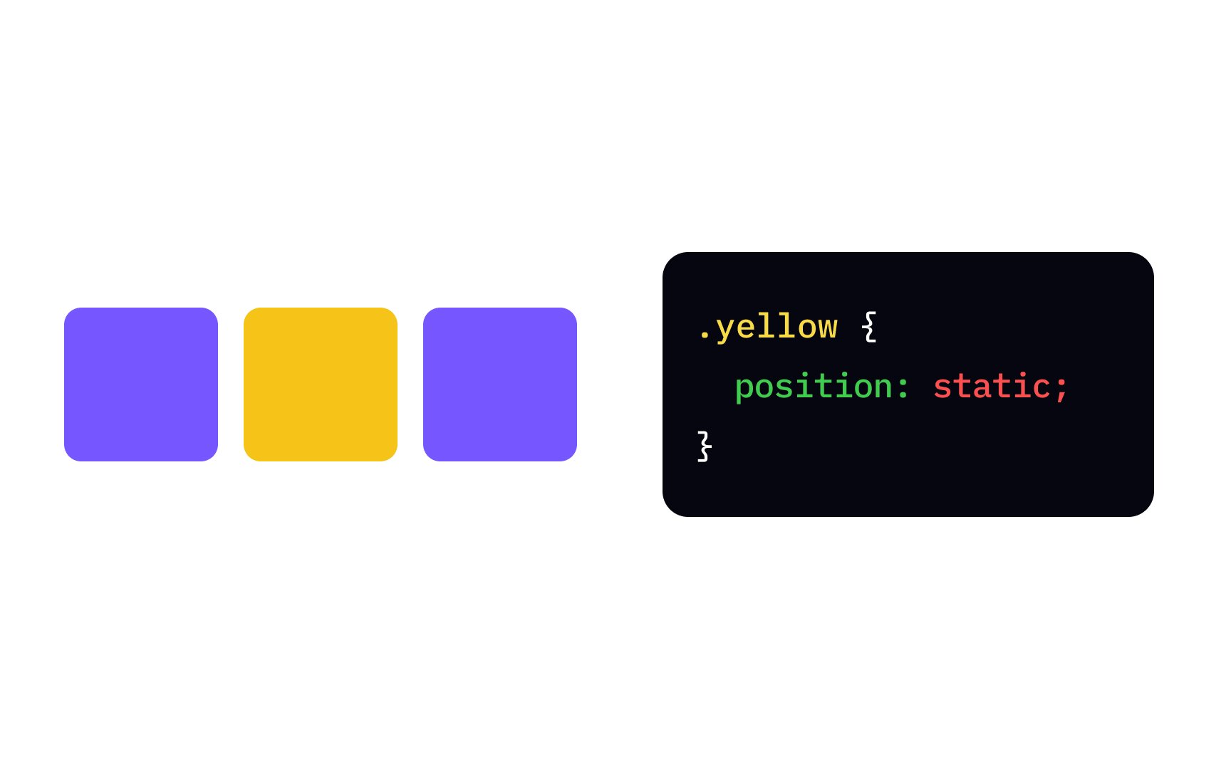
Static is the default value of the element's position property — it means that the browser will position the element according to the normal flow of the top, bottom, left, right, and z-index properties. Elements with position value other than static are considered positioned elements.
In the example, the yellow inline element with position: static; stays in line with other inline elements.
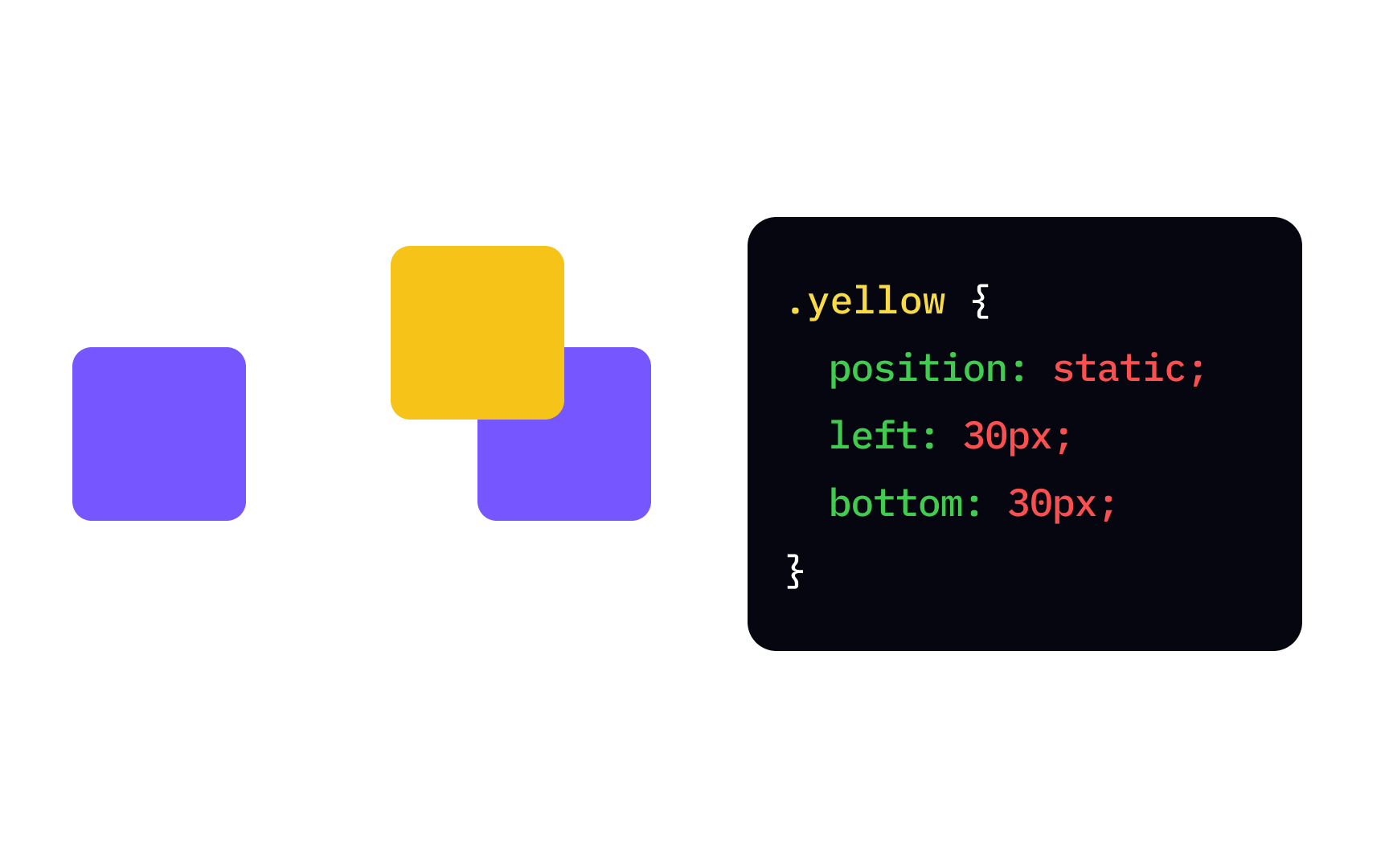

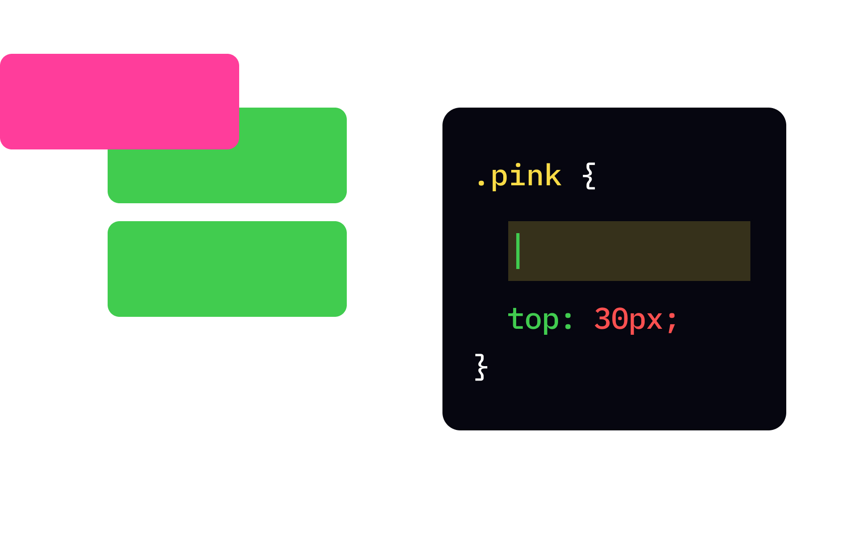
Changing the position relative allows us to set where the element is on the top, bottom, left, and right properties allow us to set the indentation, also called the offset, usually in units of length like px. You can use two properties like left and top to move the element diagonally.
In the example, setting the left and bottom offsets moves the image in the opposite direction — towards the top-right corner. The space where the element should have been if non-positioned stays unoccupied.

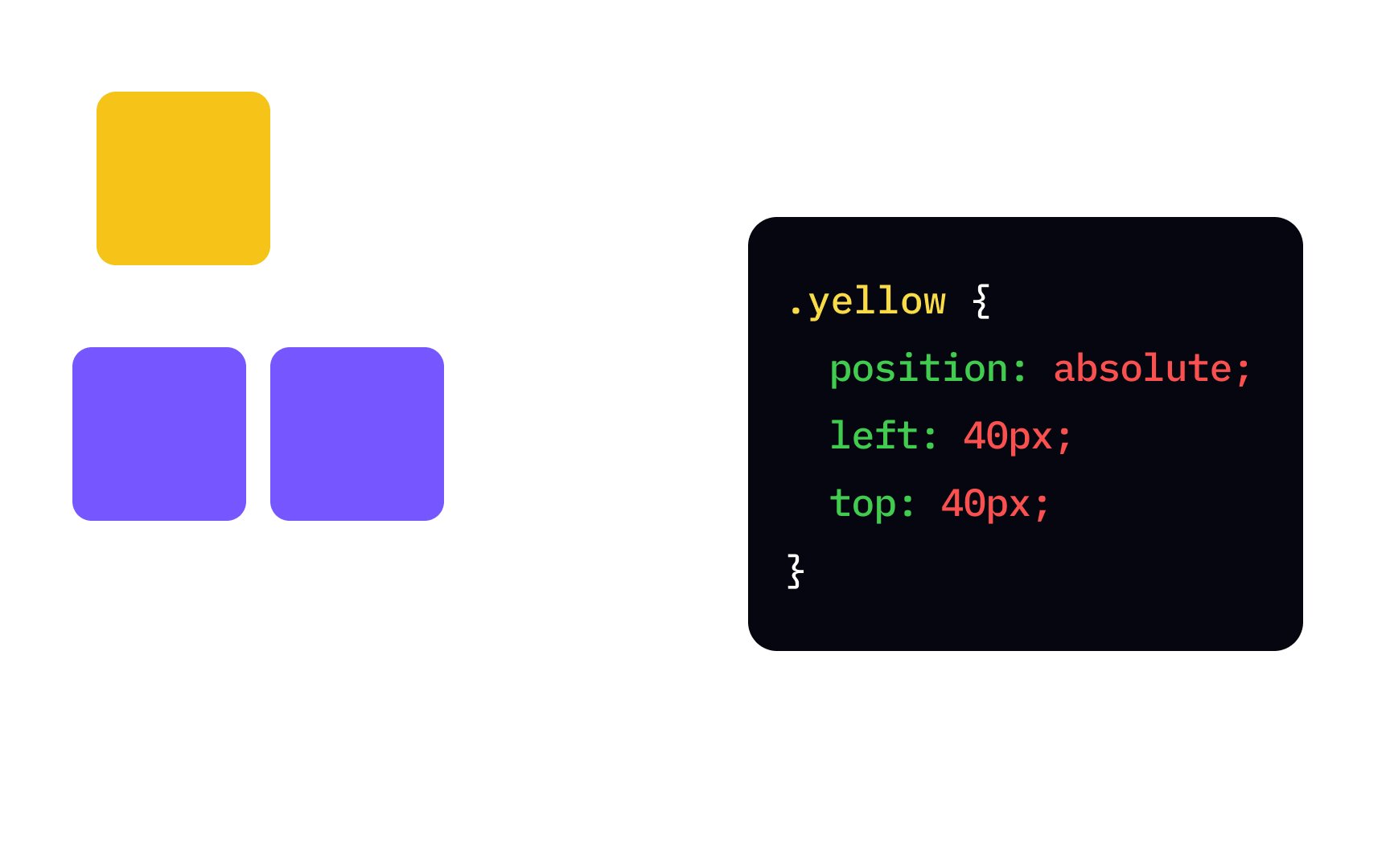
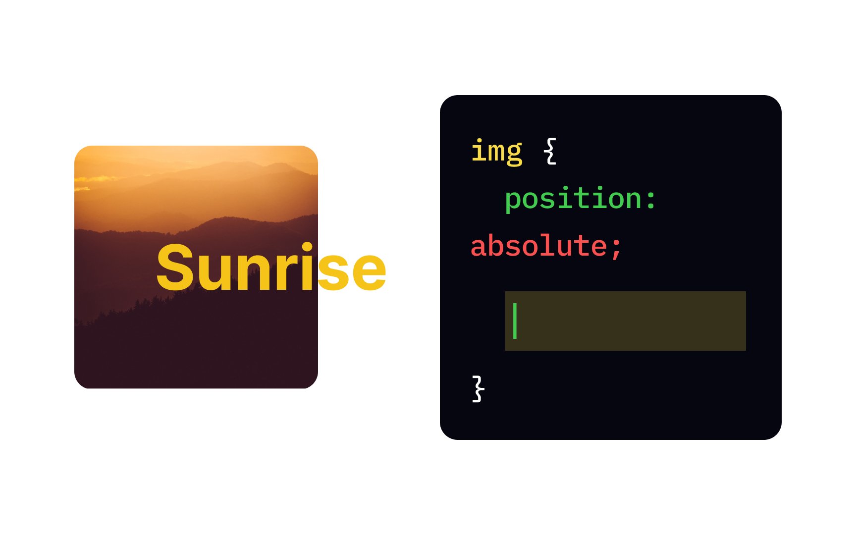
Setting the element's position to absolute takes it out of the flow of the top, bottom, left, and right properties. If all parent elements are non-positioned, the browser calculates the offset from the edge of the page. Absolutely positioned elements are placed on top of non-positioned elements and may overlap with other positioned elements.
In the example, the yellow element is 40px below the top edge and 40px to the right from the left edge of the page.
An element with a fixed value for the position position: fixed; is calculated from the browser window, also called the viewport. In practice, this means that a fixed element doesn't move when you scroll the
In the example, the yellow element with position: fixed; is stuck on top of the page, and will stay there when you scroll.
The sticky value of the position relative and fixed positions. An element behaves as though its position is relative until it crosses a specified threshold — and then it stays in the same place of the viewport, as though its position is fixed.
For example, the yellow element with a sticky position has top: 0;. This means that this element will stay in line with other inline elements until users scroll down. When the element reaches the top of the
Pro Tip: Not all browsers support position: sticky;. You can check the browser compatibility of this value in the LambdaTest testing tool.[1]
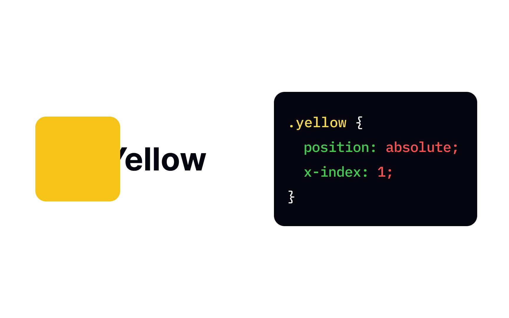
You can use the z-index position property to create layers like in Photoshop. Normally, HTML elements are considered 2D, having only width and height. The z-index property introduces the new dimension — depth, and its value specifies the stack level of the box. Browsers display elements with higher values on top of elements with lower values.
In the example, the yellow element's z-index value is 1, and the header's z-index value is unspecified, which defaults to 0. As 1 is higher than 0, the yellow element overlays the header.
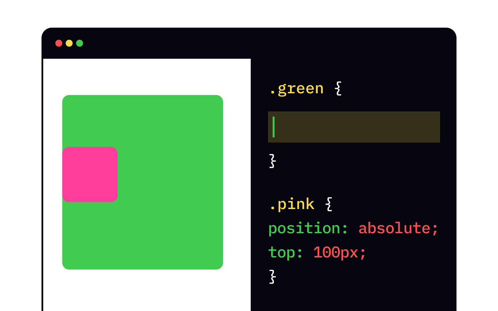
Adding a declaration position: relative; to an element makes it a positioned element. The most common position: absolute;.
In this example, the pink element is the child of the green element, and it's positioned 100px below the top edge of its parent. If we remove the declaration position: relative; from the rule for .green, its positioning sets to default — position: static;, and the pink element will move up to be 100px away from the page's top edge, not the green element's edge.
When you set the element's position to fixed, it always stays in the same place in the browser window and doesn't move. By default, such an element sticks to the top-left corner of the top, bottom, left, and right properties. Common position: fixed; include
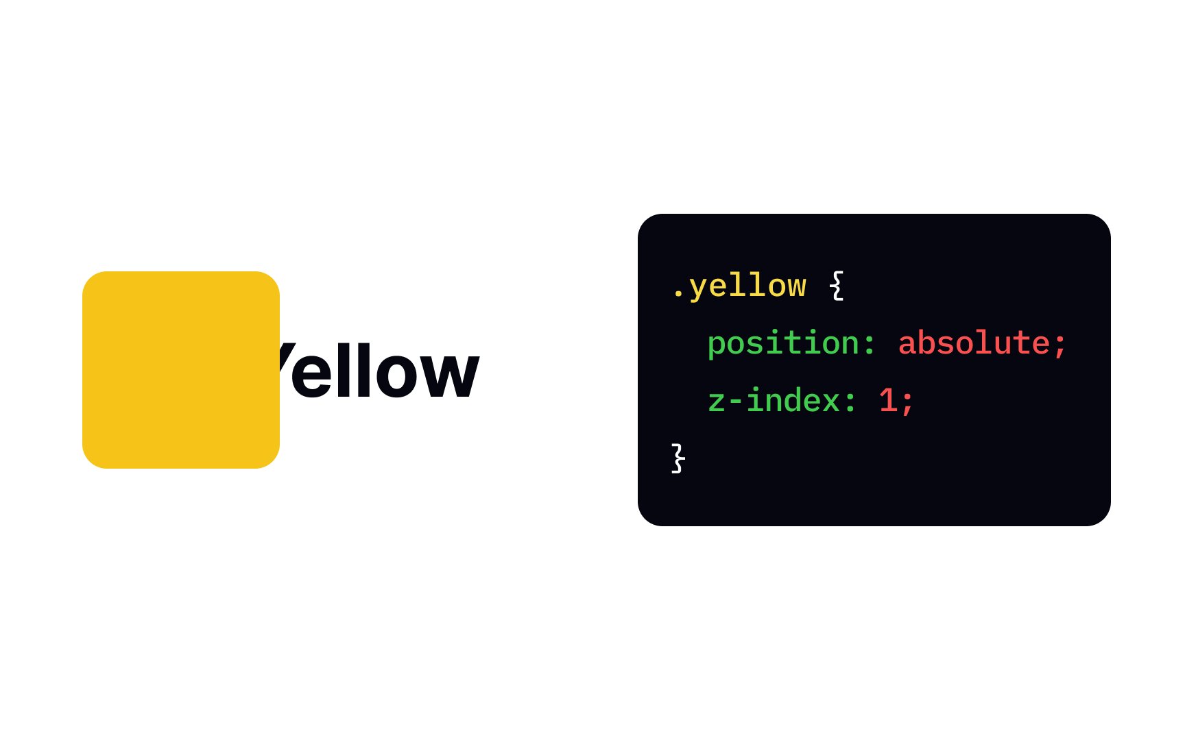
The z-index
When assigning z-index values, give yourself some wiggle room. Using values that closely follow one another like 1, 2, and 3 means that if you want to add another element to the
References
Top contributors

Topics
From Course

Share


Similar lessons

CSS Basics

Introduction to CSS for Designers
