CSS conic-gradient function
The conic-gradient function is relatively new and only appeared in CSS specifications in 2017. Its name comes from the way colors rotate around a center point, forming a cone-shaped gradient. The most familiar examples include a color wheel or pie charts.
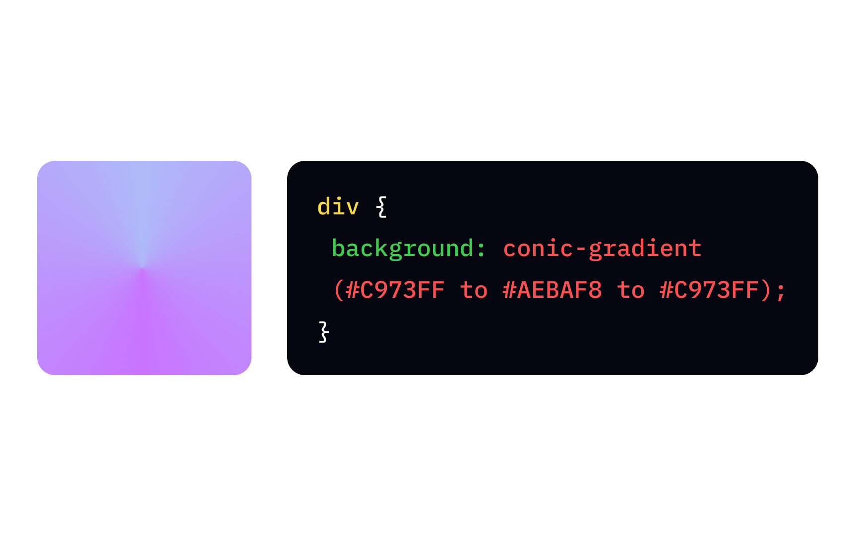
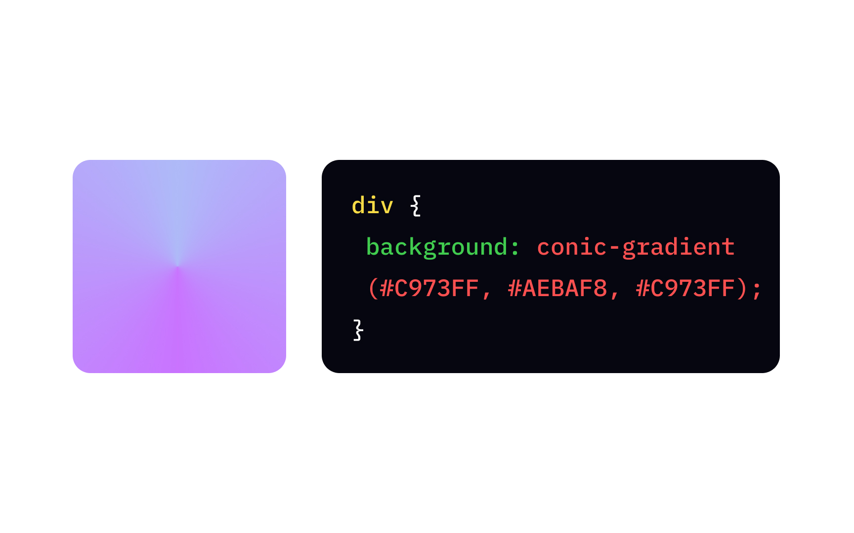
To create the simplest conic-gradient function, you need to specify the starting and ending colors. Adding the first color again as the last color will result in a smoother, more realistic gradient, like in the example.
It is possible to offset the gradient's start point using the "from" keyword and degrees (deg), e.g.:
{
background: conic-gradient(from -45deg, white, black, white);
}
Working on multicolored gradients, like a pie chart, you might certainly need a percentage value to specify how much space the color should take. For example:
{
background: conic-gradient(#444 0 25%, gold 0 70%, #0af 0 100%);
}
Here 0 equals "0 degrees," meaning all gradient colors start at the same point in the center.
