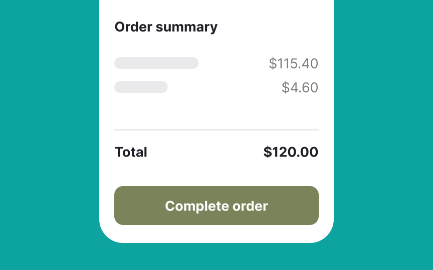
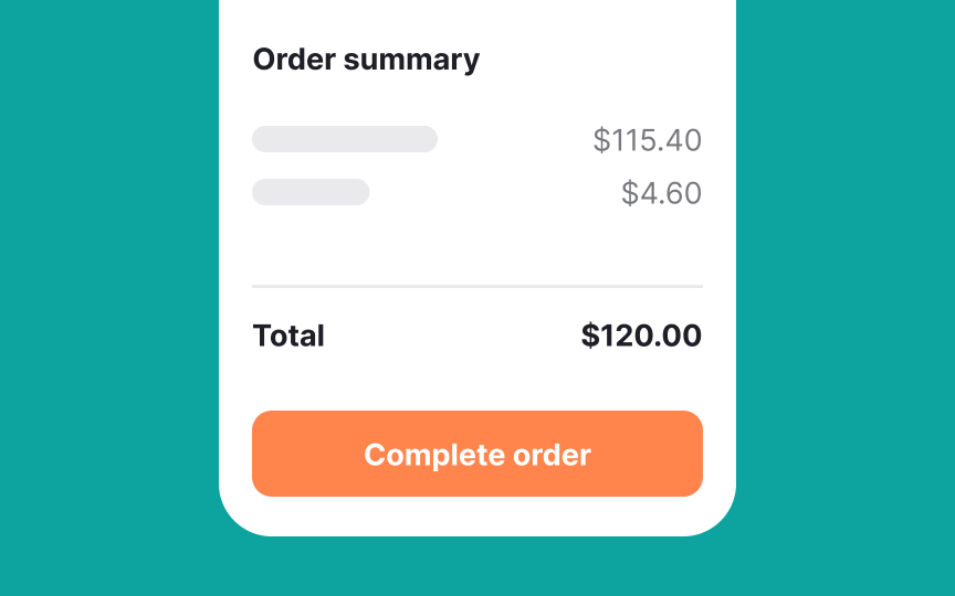
Stimulation
Research shows that colors can significantly affect how we feel and behave. Warm colors like red and orange are known to boost our energy levels. They increase our heart rate and make us feel more alert, which is why these colors are often used in places where quick decisions are needed, like at checkout points. For instance, many stores use red to encourage faster purchases because it creates a sense of urgency.[1]
On the other hand, cool colors like blue and green have a calming effect. These colors can slow down our heart rate and make us feel more relaxed. This is why blue is often used for loading screens—it helps make the wait feel shorter and less stressful.[2]


