The Context of Color
Understand how color can produce different meanings based on the context of its usage
While some research about color psychology exists, it's a challenging topic to study. We can gather quantitative data to base our theories on, but it's often impossible to recreate the conditions to prove them. The two leading theories are the evolutionary theory and the ecological valence theory.[1]
The ecological valence theory states that our color preferences depend on our experiences. For example, people who like the sea will more likely like colors of the blue hue because of their positive experience with it. This theory explains the existence of various color meanings in different cultures and individuals with different backgrounds.[2]
The evolutionary theory claims that our color preferences are determined by evolution.
Keep in mind that both theories are based on inductive reasoning, which is uncertain by its nature.[3] But the correlations are significant enough that we as designers can use them to our advantage.
The idea is that lighter
People often link light with "good" behavior. For example, in one study, people who thought about doing something good felt the room was brighter. Another study found that people donated more money when they felt watched, like by an image of eyes. This suggests that people want others to notice their good actions.[4]
On the other hand, darker colors, which feel less visible, might sometimes encourage "bad" behavior. For instance,
Designers can use this knowledge to guide user behavior:
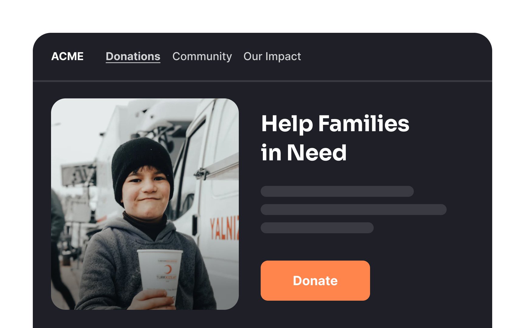
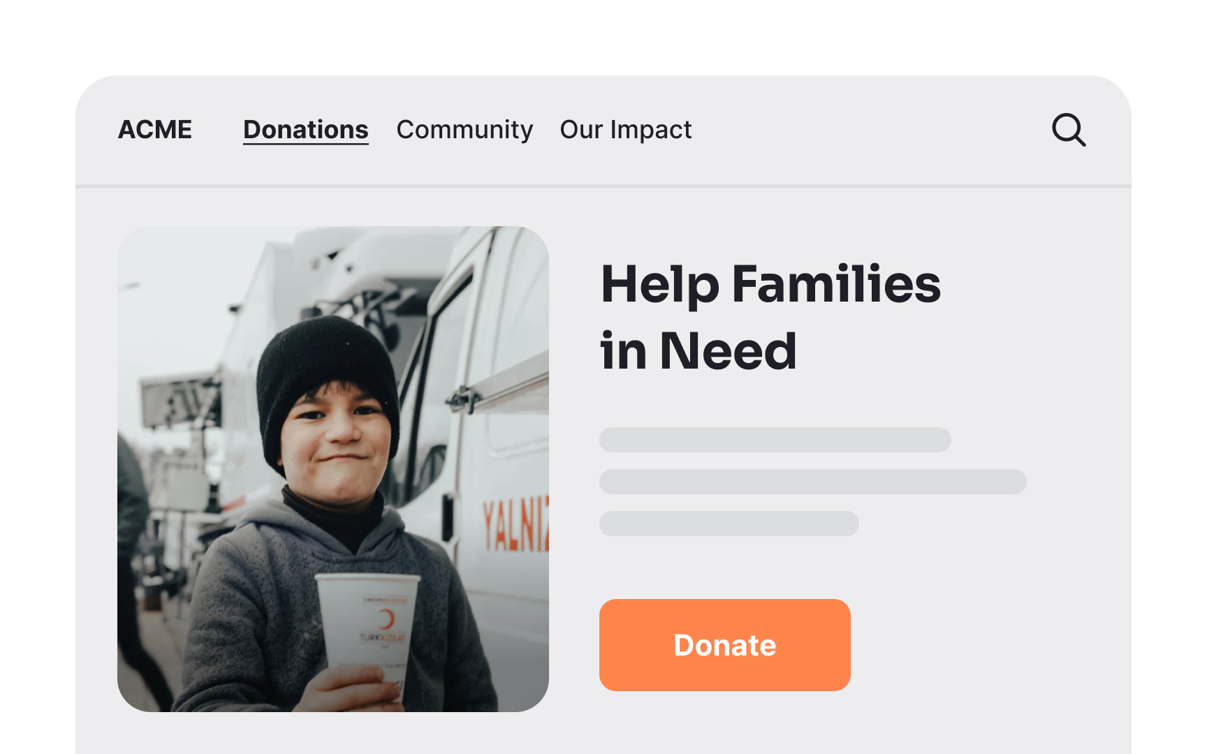
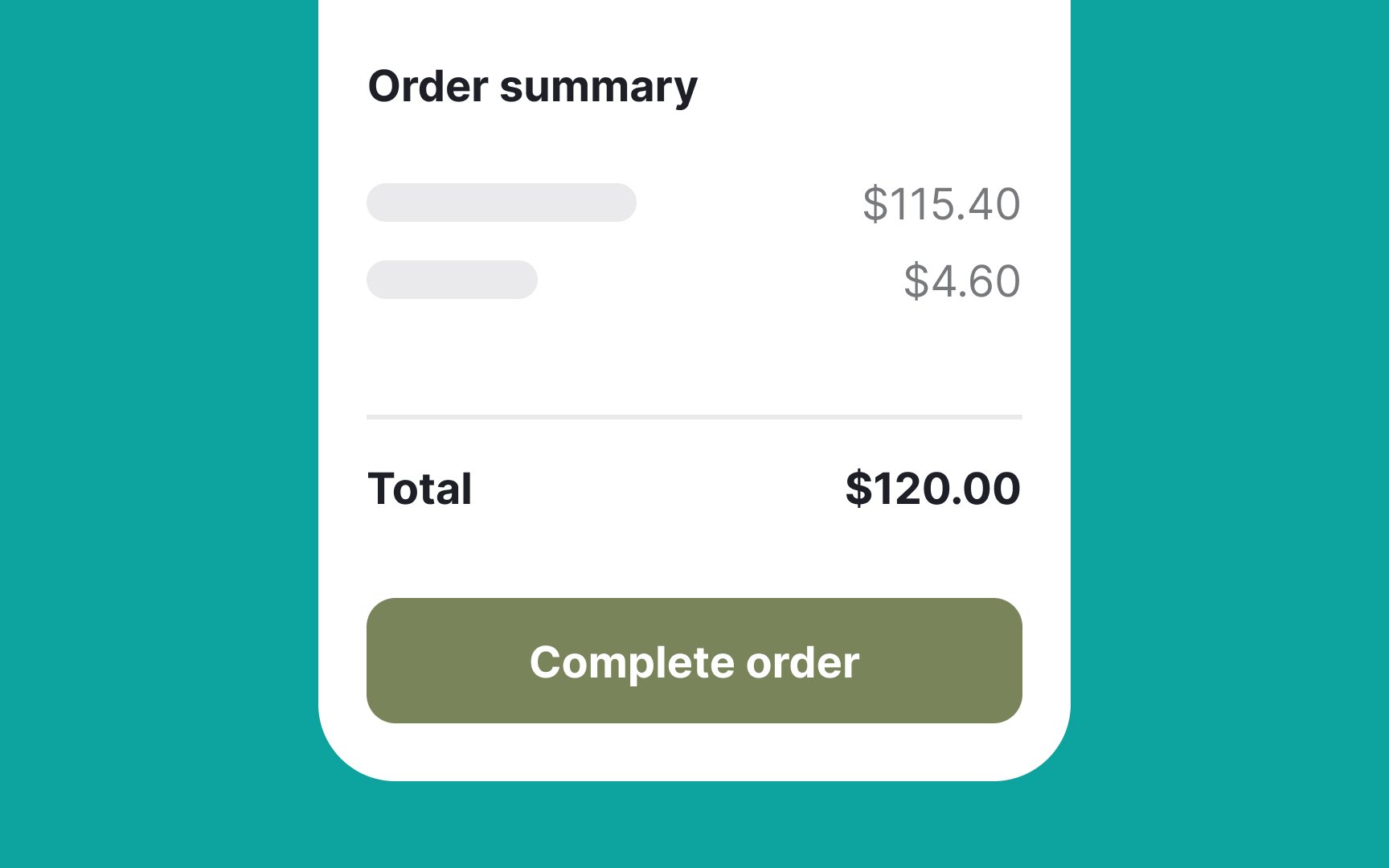
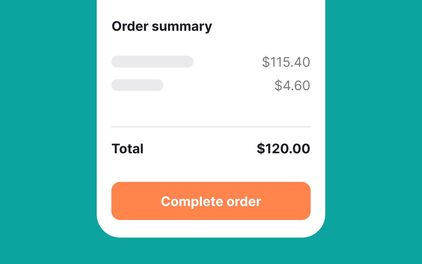
- Use white backgrounds for charity websites. White makes donations feel more visible, leading to more contributions.
- Use darker backgrounds for beginner software. New users might prefer a dark interface where they feel less exposed and can make mistakes without feeling judged.
- Use dark themes for adult content. A dark interface can make users feel more private and less noticed.
While these associations between light and dark colors are rooted in human


Similarly,
Another idea is that we
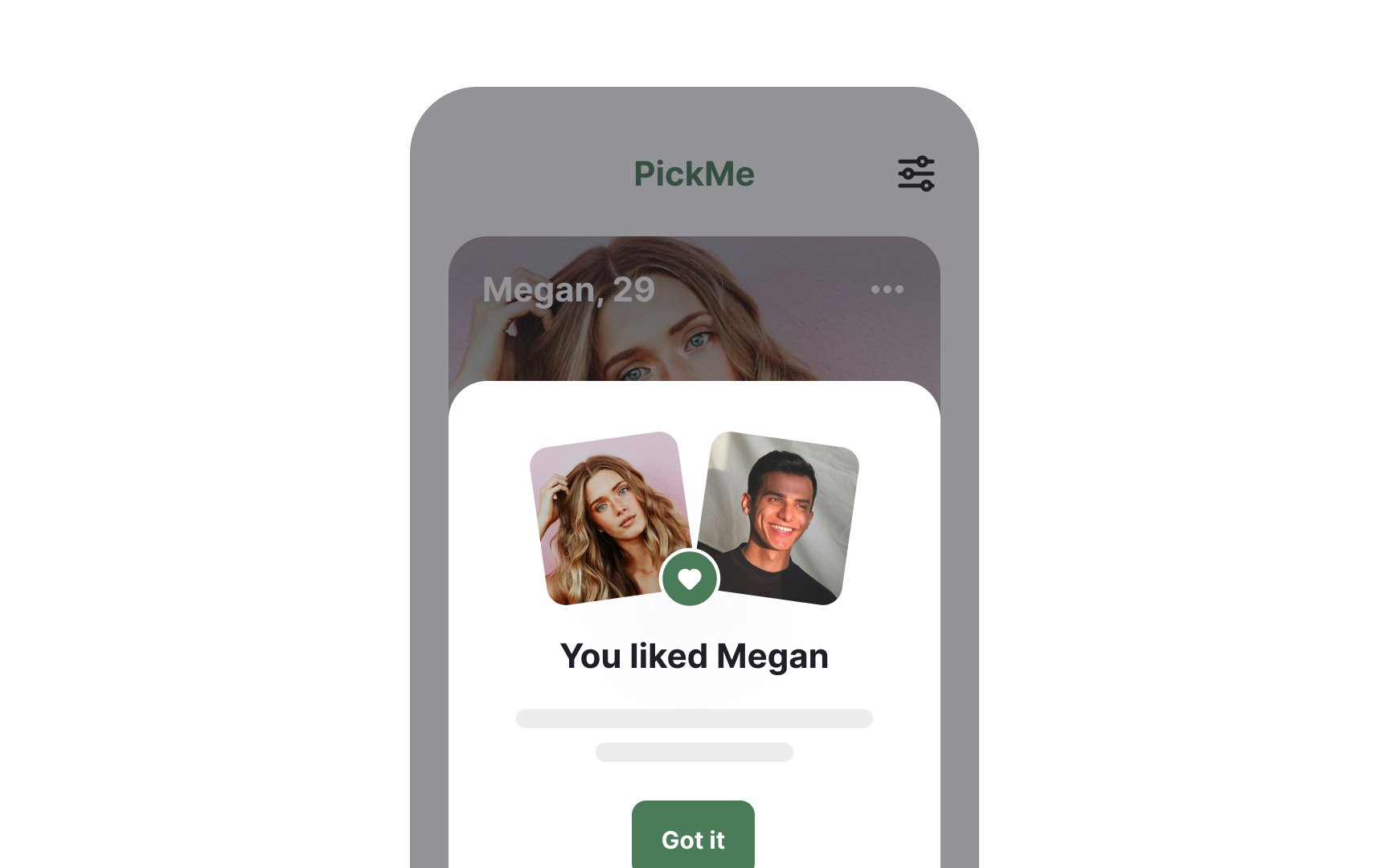
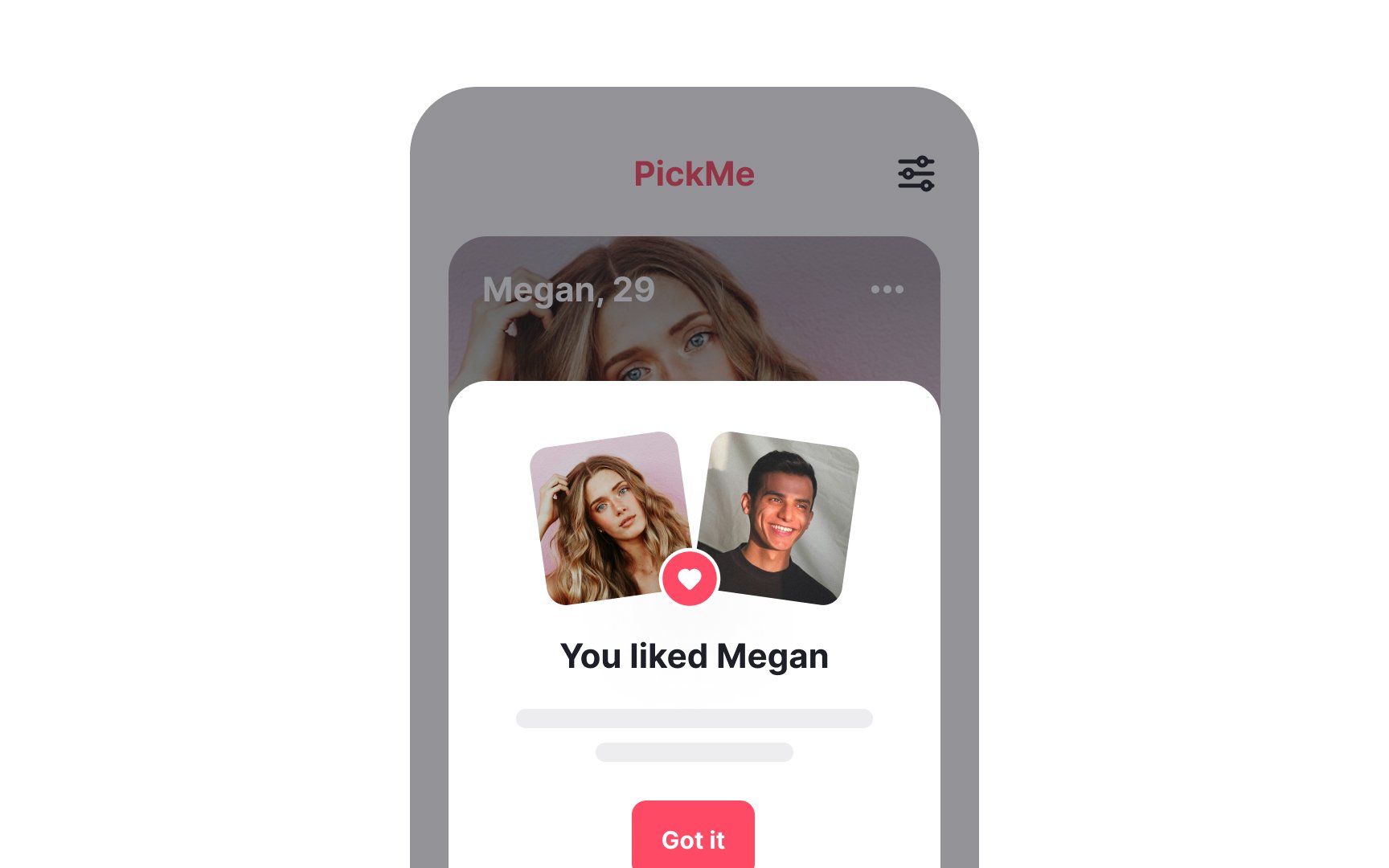
For designers, this means using warm colors can make apps and websites feel more inviting and help users feel connected, especially in social or dating apps.
Warm colors like red, orange, and yellow often appear to move closer to the viewer, creating a sense of depth. Artists have used this effect for centuries to bring certain elements in a painting to the foreground, making them appear more detailed. In contrast, cooler colors like blue and green tend to recede, making background elements seem farther away and less distinct.[9]
In design, these
When designing ads, consider reducing color intensity for events that are far in the future to align with this perception. This approach can create a sense of congruence—harmony between two related elements—when the visual characteristics of an
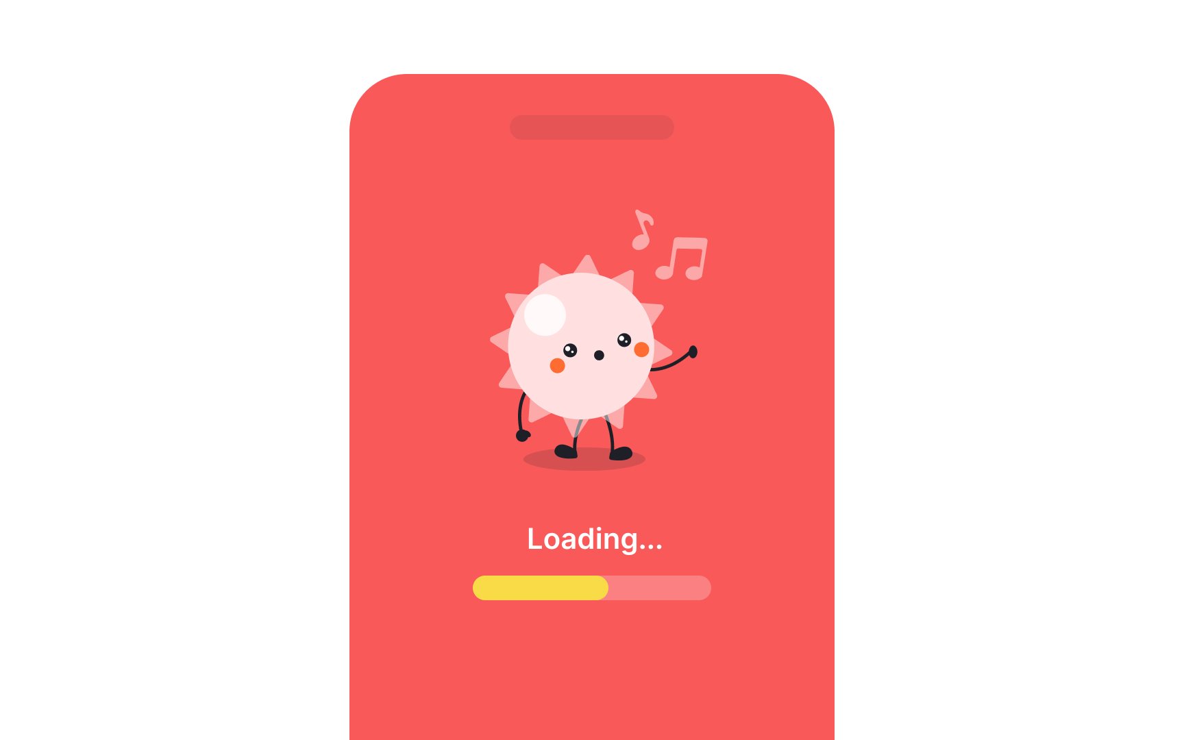
On the other hand, cool colors like blue and green have a calming effect. These colors can slow down our heart rate and make us feel more relaxed. This is why blue is often used for loading screens—it helps make the wait feel shorter and less stressful.[13]

Using blue in
In general, cool colors like blue, green, and purple are known for their ability to create calm and soothing environments. These colors are often used in settings where relaxation and concentration are key, such as in healthcare environments, bedrooms, and workspaces.[14]
However, color preferences are more complex and influenced by factors such as cultural background, personal experiences, and societal norms. For instance, Chinese men in the same study showed a preference for red due to its cultural significance, not gender. This highlights that color choices are shaped by a mix of cultural influences and individual experiences, not just gender. As awareness grows, some companies are moving away from traditional color associations, recognizing the diversity of consumer preferences.
References
- Color Psychology: A Full Guide | Nick Kolenda
- Experiencing Physical Warmth Promotes Interpersonal Warmth | PubMed Central (PMC)
- Experiencing Physical Warmth Promotes Interpersonal Warmth | PubMed Central (PMC)
- What Is Perspective In Drawing? - The Key to Realism in Art | Drawing Fundamentals
- The effects of colors on behavior | Neurofied
Topics
From Course

Share


Similar lessons

Intro to Color Theory

Color Properties
