Toning down bright colors
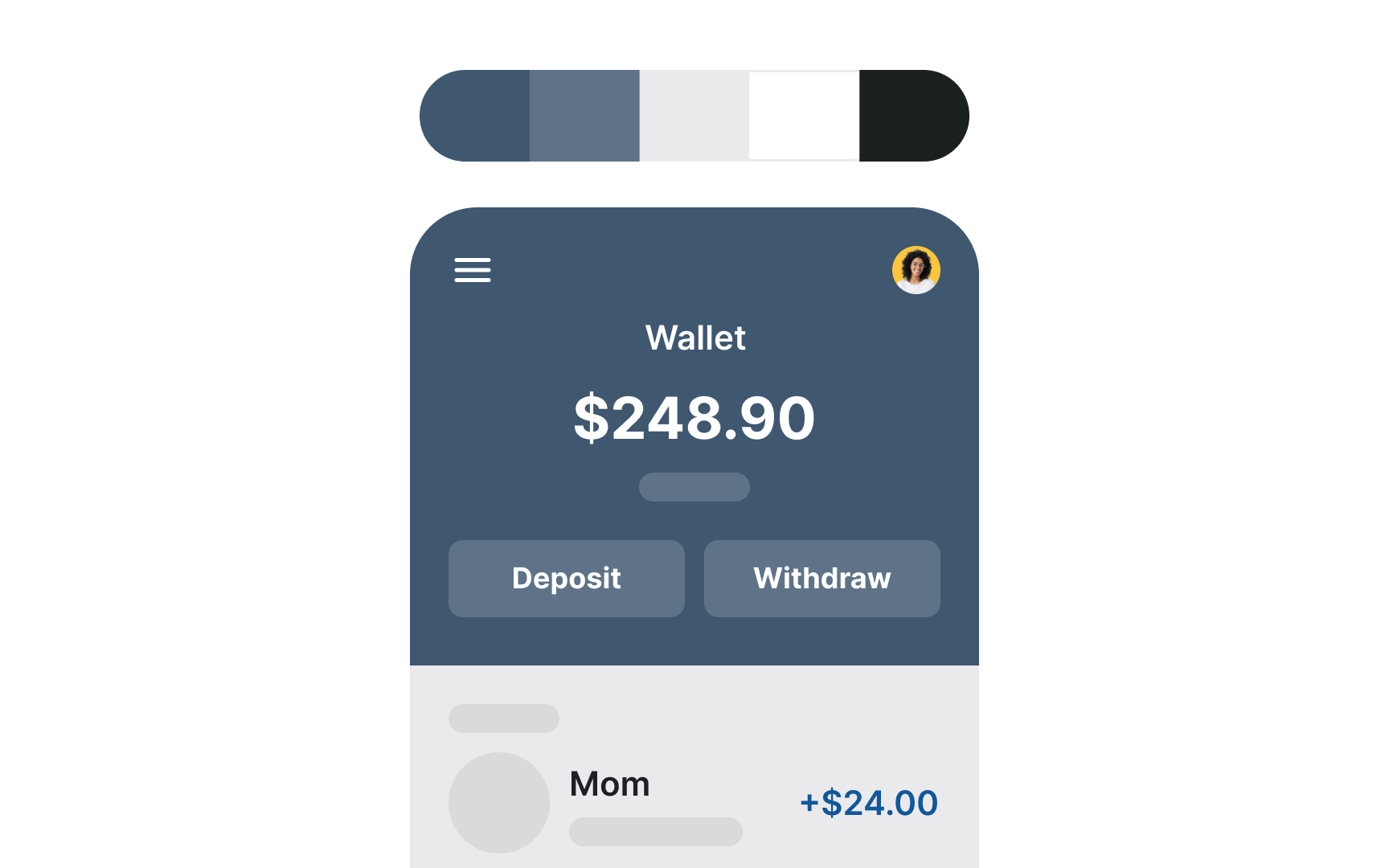
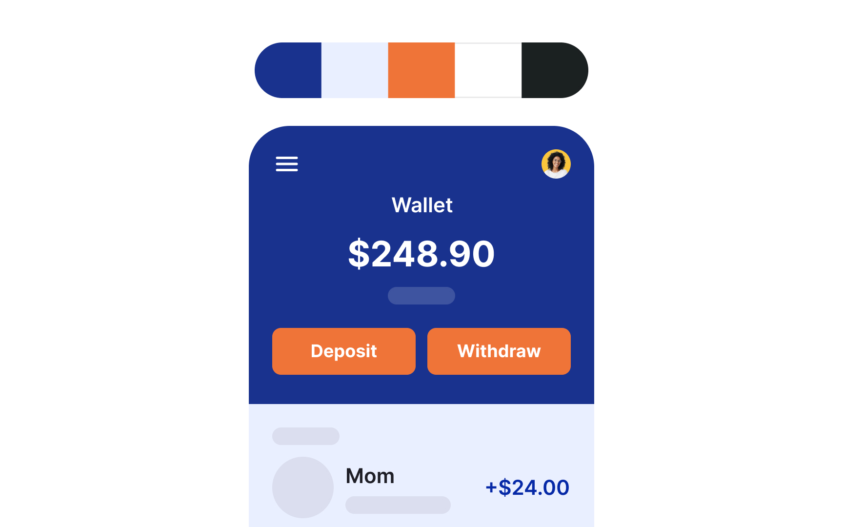
Sometimes, the main brand color is too bright, and designers look for a way to tone it down. Just like with bright red, using monochromatic pastels will have a softening effect. However, blue isn't as energetic as red, so the resulting palette might be too boring. A trick to make it more exciting is adding a tint of its complementary color — in this case, orange. It will add the necessary contrast and make the combination more visually interesting.[1]
This approach can be particularly effective for corporate and professional websites, technology and SaaS, as well as educational platforms.
References
- Color wheel - color theory and calculator | Canva Colors | Canva's Design Wiki
Top contributors