Creating a more youthful palette
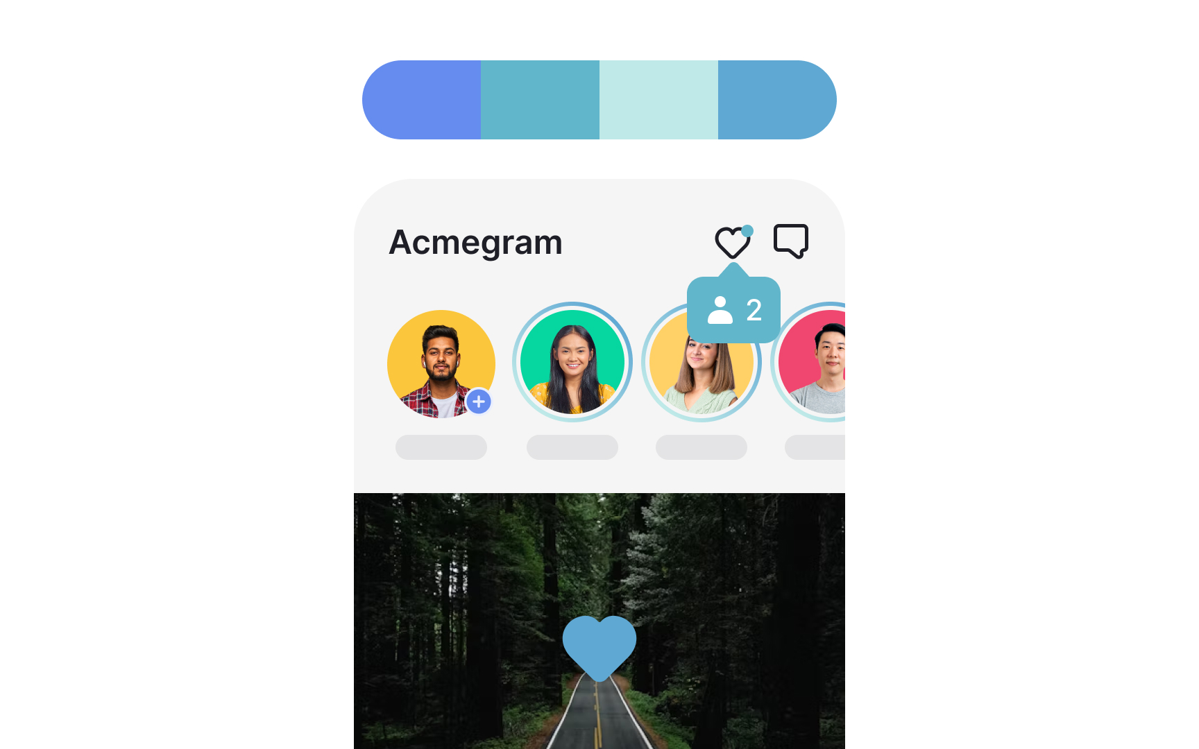
Have you ever wondered, "How do colors affect our moods?" Blue, the world's favorite color, is a go-to choice for many products. However, many people associate blue UIs with boring things for serious people.
So what colors can you add to blue to make it more exciting and appealing to younger people? Go for triadic or tetradic color combinations — 3 or 4 hues equally distant from one another on the color wheel.[1]
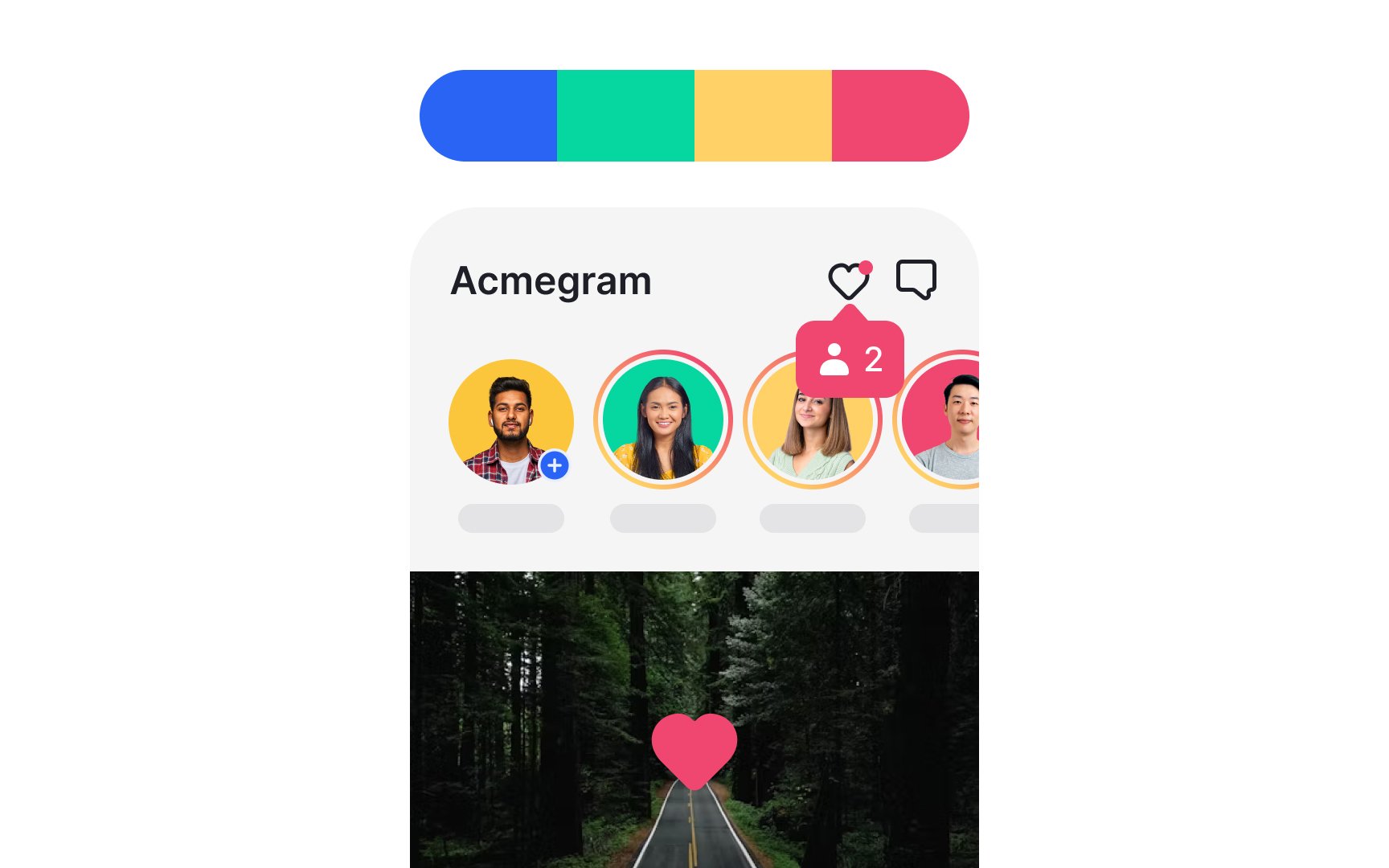
Blue's tetradic colors are pink, yellow, and green. These color combinations tend to be quite vibrant, even when toned down, tinted, or shaded. They can come across as playful and youthful. Make sure to balance these combinations because they can be easily overwhelming, for example, by lowering the color saturation and value.
