Grounded colors

Grounded colors evoke a sense of stability, reliability, and connection to the earth. These hues are often used in design to create a warm, secure, and natural atmosphere.
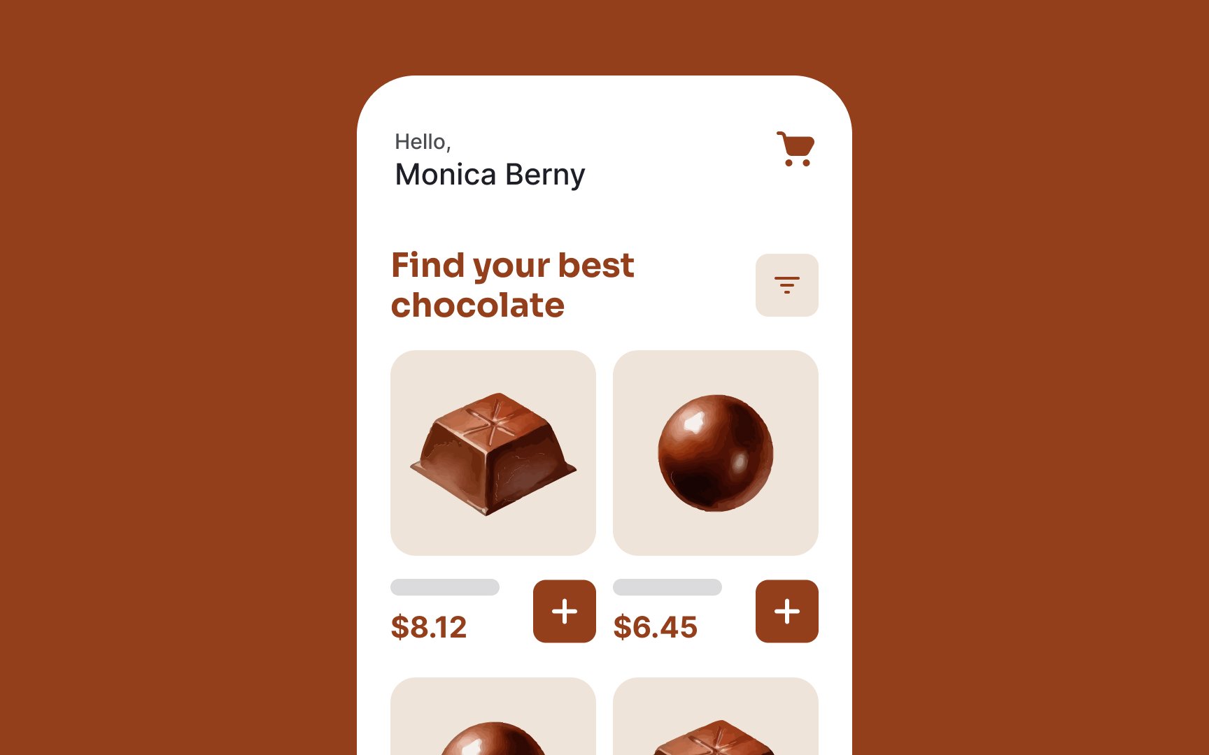
Brown represents the earth and nature, conveying reliability, stability, and comfort. Companies like UPS, Hershey's, Cotton, Edy's, J.P. Morgan, and M&M use brown in their branding and marketing strategies to signify strong relations, reliability, and dependability.[1]
Shades of green like olive, moss, and forest green are linked to nature and growth. Neutral tones like beige, taupe, and cream are versatile and calming. They create a sense of warmth and simplicity in a design. Gray adds understated elegance, making designs feel grounded and composed.
