A debug mode for Figma without plugins
Build a Figma debug mode with variable modes to instantly see which elements use design tokens and system components. Plugin-free, one-hour

I wanted to see which parts of my designs were using tokens and components from my design system, just by looking at the canvas.
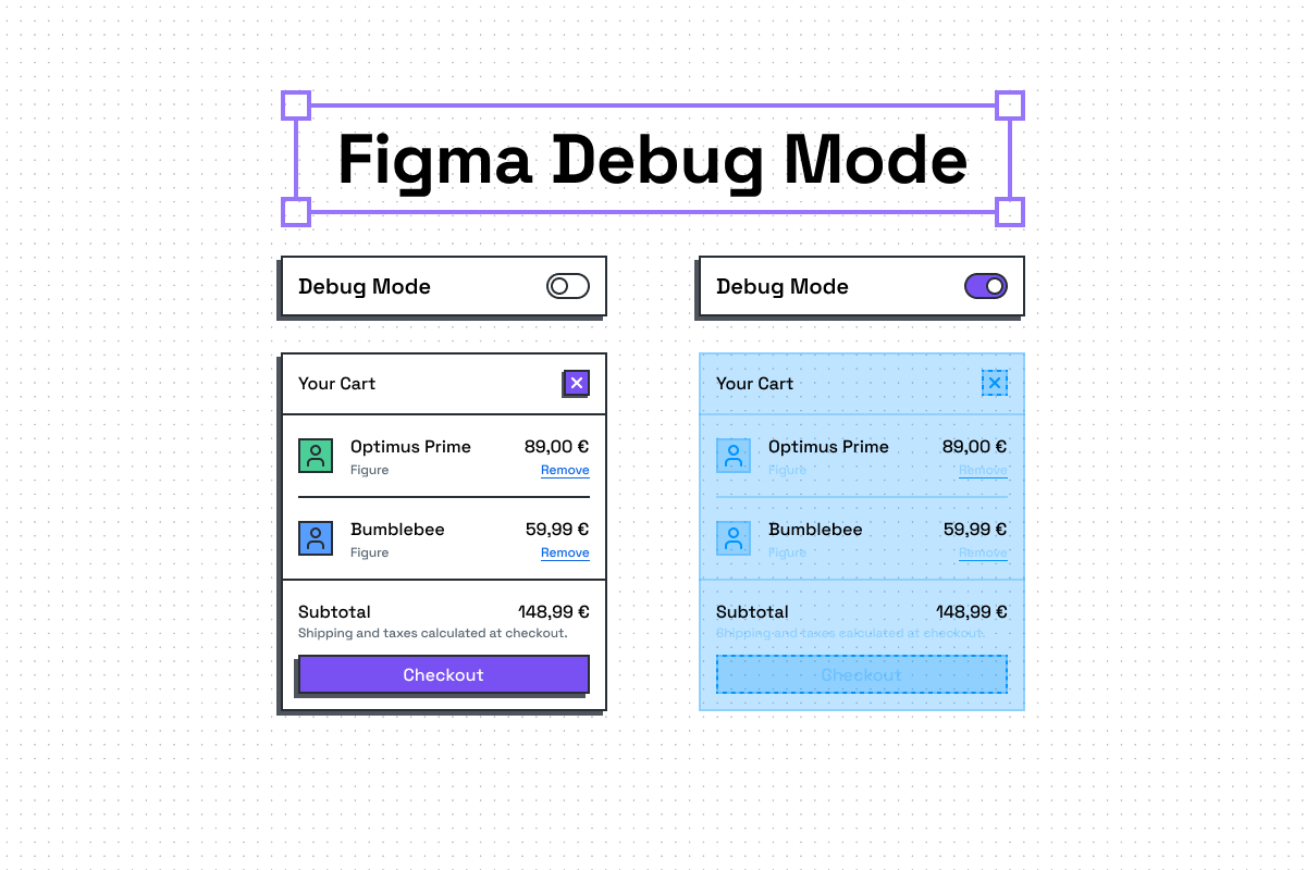
The solution: an additional variable mode paired with an outline component. Toggle it on, and everything using the system lights up: tokens in bright cyan, components with dashed outlines. Everything else stays unchanged.
Why Modes Over Everything Else
Plugins fragment the view: You and I might see different things due to differently configured plugins. With debug mode, I just comment “switch to debug mode” and we see the same thing.
Figma’s outline view strips all color: While outline view has its use cases, debug mode keeps everything readable while adding information.
Component debug variants don’t work at scale: You can’t toggle a debug property across different components simultaneously, and maintaining these would be a constant overhead.
How to Implement the Debug Mode
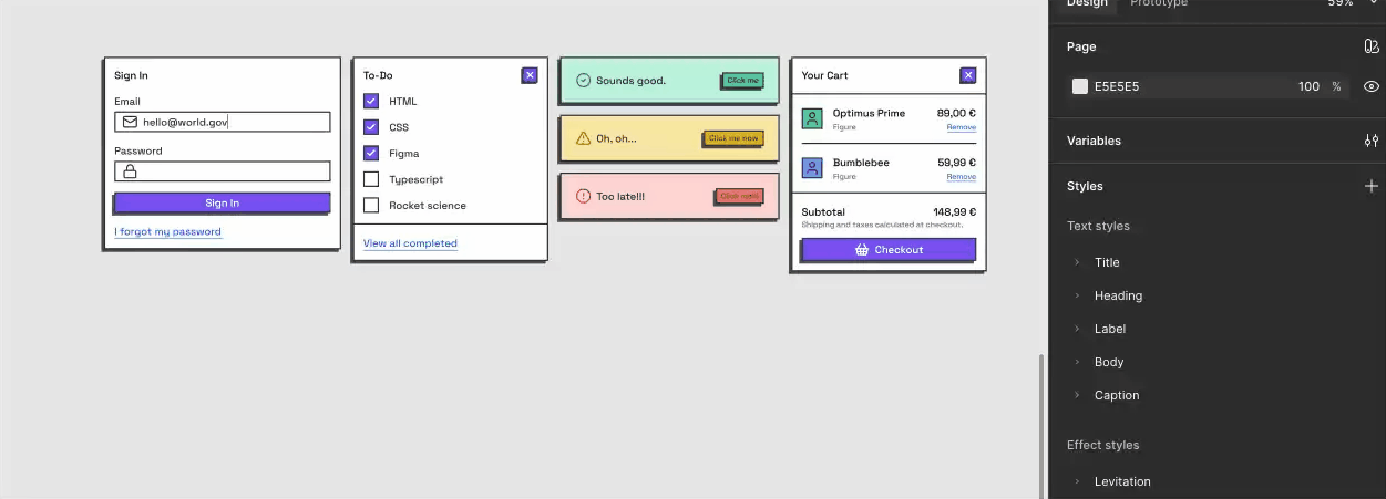
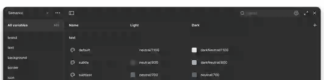
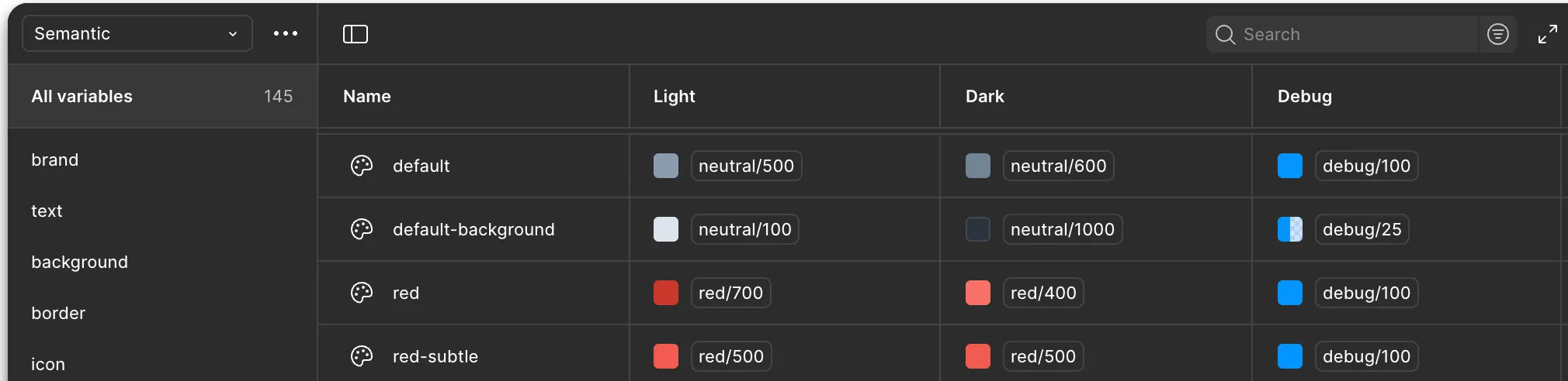
For this implementation guide, I use two collections: Base and Semantic. The base collection contains values like neutral/1100 and the semantic applies this to purposeful names like color/text/default.
If you prefer to work in just one collection, apply all steps to that single collection.
Step 1: Add a new mode
Open the Figma variables and choose a collection. I picked the semantic collection, which already contains Light and Dark mode. Click “+” in the name row to add a new mode and rename it to Debug.
Step 2: Create the debug color tokens
Add two variables: your highlight color at 25% opacity and the same color at 100% opacity. Choose a color you don’t use in your system. If you don’t have a token with 0% opacity in your system, add it to the debug group as well.
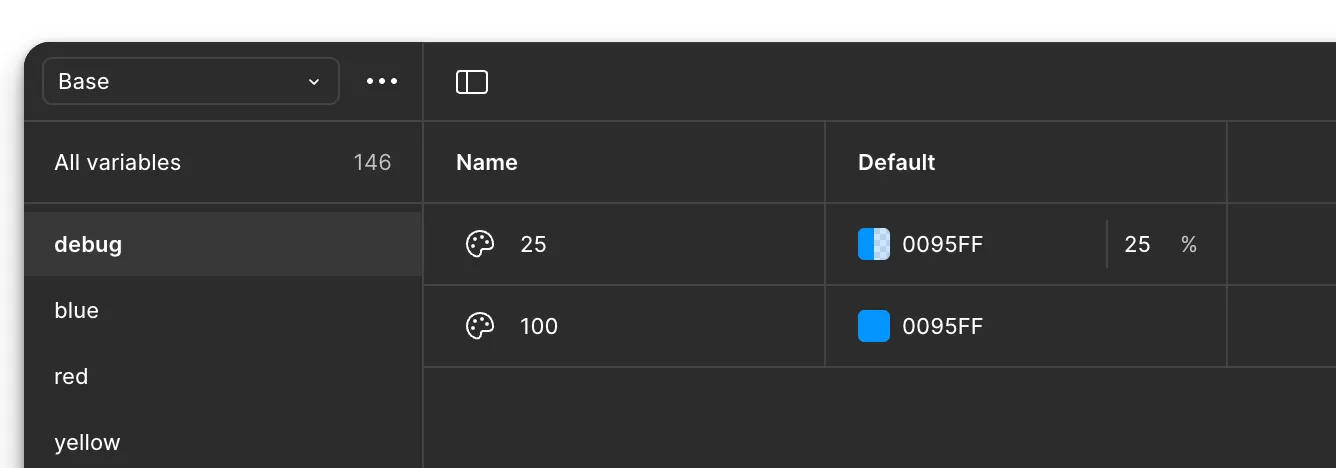
Step 3: Create the debug border token
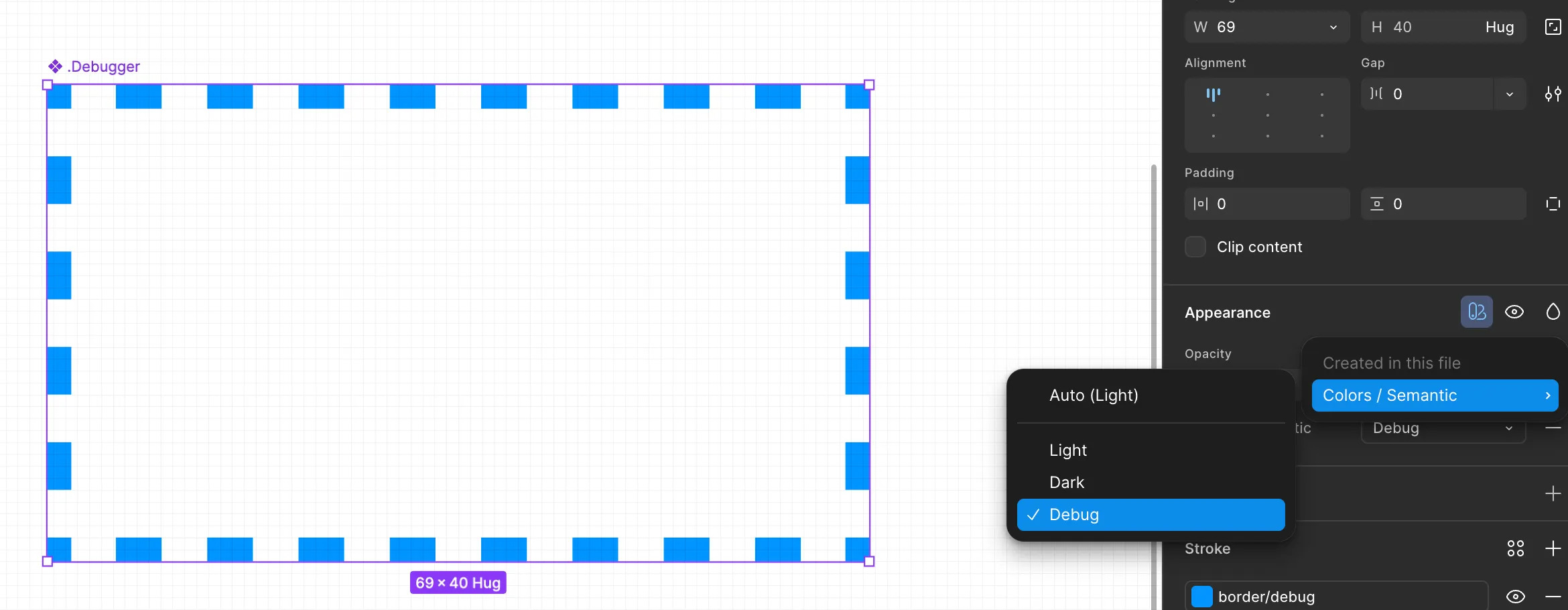
Add a new variable to your semantic collection for the debug border. I used color/border/debug that references the 0% opacity token (in my case color/base/transparent) in Light and Dark modes, and color/debug/100 in Debug mode.

Step 4: Map your tokens
Map all tokens used for backgrounds to color/debug/25 in Debug mode and all other color tokens to color/debug/100. I recommend regularly switching between your default and Debug modes to see if the colors work for you. At the end of this step, you'll have made design token coverage visible.
If your border-radius tokens are in the same collection that has the Debug mode, you can set their values to 0 or 999 to make everything using these tokens have sharp or very rounded edges.
Step 5: Create the debugger component
Build a component with a 2px dashed inside stroke using color/border/debug. If you followed all previous steps, you shouldn't be able to see the border until you turn on debug mode.
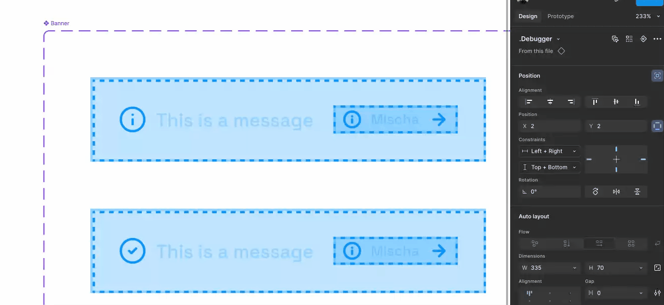
Step 6: Add the debugger to your design system components
Now add instances of the Debugger to every single variant of your components with the following configuration:
- Set the position of the Debugger to absolute
- Set the constraints to Left + Right and Top + Bottom
- Align the size of the Debugger to the parent’s size
- Lock the Debugger layer
I recommend to use the Multi-edit variants feature by pressing Q inside a component set and the Select Layers plugin.
Limitations
Mode conflicts can appear when mixing libraries with variables. In my design system, I had zero conflicts. With multiple libraries, warnings appeared but debug mode still worked.
Semantic misuse isn’t detected: Using the wrong token correctly won’t show up.
Detached system components aren’t detected: This is because the Debugger is still part of the detached component and both use our system tokens. But since we can still use plugins, maybe you have the right plugin to identify detached components easily. If so, share it in the comments.
Dense layouts get noisy: This is intentional. Use it for reviews, not daily work.
Conclusion
Design systems only work when people actually use them. This debug mode turns invisible structure into something you can see and verify without leaving the canvas.
For small teams especially, this approach scales consistency without scaling effort. The setup took me an hour, the learning curve is minimal, and the feedback is immediate.
No scripts to maintain, no dependencies to manage, no additional tools to learn. Just two tokens, one component, and a mode switch that makes the invisible visible.
Topics
Share
You might also like

Applying Color Adjustment Figma Plugin to Optimize the Design Performance


Understanding a Developer's Point of View


Create a Bottom Navigation Bar in Figma
Popular Courses

Introduction to Figma


Introduction to Design Systems


Introduction to Design Audits