Wireframes

StreamOS – Mood-First Streaming Interface
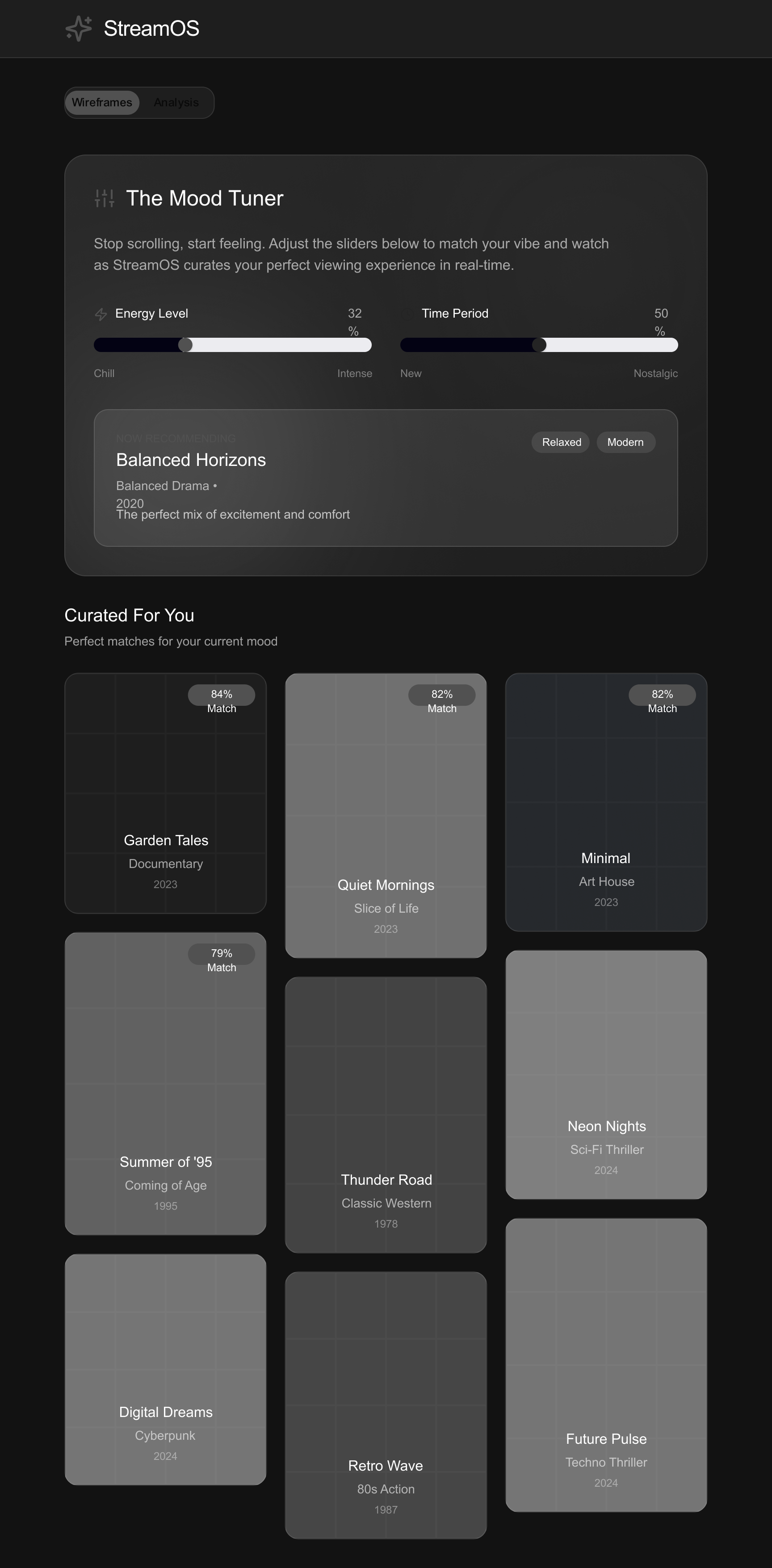
Project Overview: StreamOS is a concept for a next-generation tablet and desktop video streaming application designed to solve "decision fatigue." Unlike competitors that rely on endless static grids, StreamOS utilizes an AI-driven Mood Tuner, allowing users to discover content based on emotional intent (e.g., "Chill vs. Intense") rather than just genres.
Key Features:
- The Mood Tuner: An interactive hero section with sliders that dynamically filters content based on the user's current vibe.
- Smart Context Sidebar: A collapsible panel providing non-intrusive "X-Ray" style cast details and trivia.
- Watch Pods: Integrated social viewing features to connect friends in real-time without leaving the app.
Design Aesthetic: The interface employs a Glassmorphism visual style over a deep charcoal background (#121212). This dark mode approach reduces eye strain during binge-watching sessions while using neon violet accents to guide user attention to interactive elements.
Tools used
From brief

Topics
Share
Reviews
3 reviews

Beautiful wireframe Nazila. Love the Glassmorphism style but there are some contrast issues here and there, the toggle at the top being an example and the "now recommending" above Balanced Horizons being another.
In contrast to Yash, I do understand what you're trying to make and the wireframe does a good job at explaining the product, specially with your project overview.
I don't think you need some form of special mentorship, specially with someone with that many spelling mistakes on their feedback. Keep doing what you're doing and mastering the fundamentals, you're on the right path.
Back to the wireframe, again, small contrast issues as mentioned above. Now:
- Another point is on the color of the slides, a bit confusing.
- The bubble with the match %, I feel like "match" should fit within the bubble.
- The year in the "now recommending" card needs better spacing around it.
- I also don't understand why the cards in the middle are longer, I think they should all be the same size.
Overall, great work here Nazila, some small improvements will make it even better.

Great work the wireframes are clear, logical, and easy to understand. The flow feels smooth and well-structured.

You need a Kot of work to do in designNazila -
it's a good initiative to share in the community – keep working and sharing. I will definitely review few things that I notice can be improved starting with text at the top. It's not readable – give some spacing in the card as well while the colours of the skeleton cards are very different.
I would suggest use to colours like YouTube loading. Even the wire frame should do the job of explaining the product. I am still not able to figure out what you are trying to make so. X needs to be bored and explainable that what is the goal of this via frame rest if you need any help –
⭐️ check my profile and contact me so that we can do a one-on-one mentorship and give you the right direction and training😇
You might also like

edX Sign-Up Page Redesign


Beautify Login page WCAG principles


Design Prioritization Workshop


Sanyahawa - Landing page Design

Uxcel Halloween Icon Pack


eWallet App Development Project

Interaction Design Courses

UX Design Foundations


Introduction to Figma

Design Terminology
