Team8s Landing page

Team8s is a networking and collaborating platform for IT specialists. The task was to design a landing page that effectively communicate the platform's features, benefits, and unique value proposition to attract users to join beta test.
Reviews
3 reviews

Great work! The dark theme with green highlights gives the platform a modern, polished feel. The landing page is consistent and clear, and the user profiles are a great feature, effectively showcasing key skills for collaboration. Overall, a well-executed design with thoughtful details—keep up the excellent work!

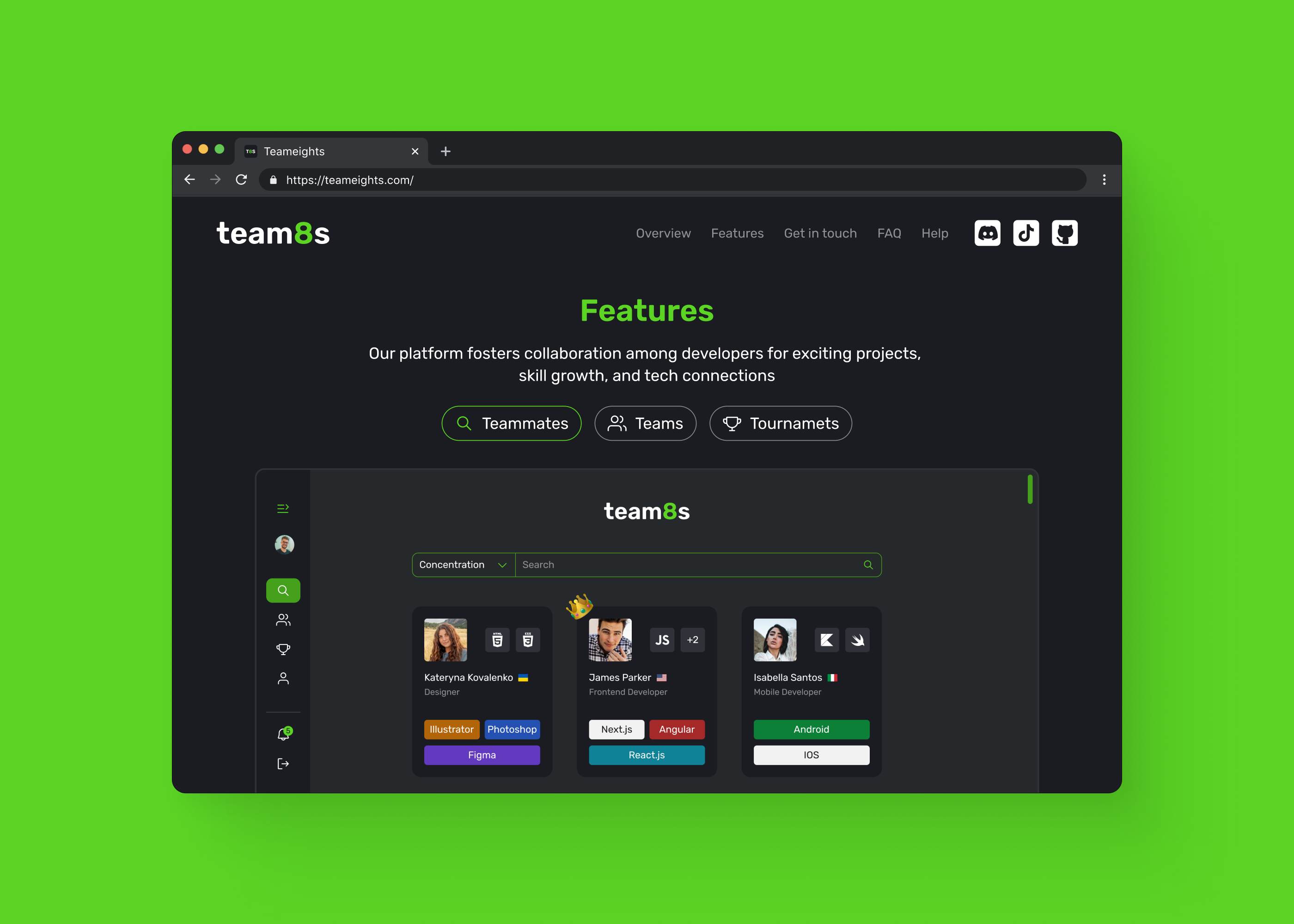
Overall, great work and it's nice to know that its live as well! The dark theme with green accents gives the interface a sleek look, which I imagine appeals to the developer-focused user that you're targeting. There are 2 interfaces at play here - first the landing page for the platform and then second the platform itself, so I will split it like that.
Landing page:
The design of the landing page is clear and consistent which also matches the platform interface. This gives a cohesive and unified user experience. Its a good idea to give the page a quick look-over, the word "Tournaments" needs a spell-check. Although the design is nice and clean it could use more visual elements, like background images, decorative vectors, or subtle design patterns, to make it more engaging. The “Join Beta” section with the "Collaboration Platform For Developers" header stands out and lets the user know exactly what the site is about. This is followed by a simple email input field and a stand-out call-to-action green button, which makes it quick and easy for a user to sign-up and engage immediately. You've highlighted the features of the platform really well and just reading over the snippets of information gives the user enough of a sense of what they're signing up for.
Platform:
Since the platform emphasises collaboration with others, I really like the user profiles with the faces of prospective teammates. Each user card displays relevant skills (e.g., design software like "Illustrator," "Figma," or coding frameworks like "React.js"), which is useful for finding the right teammates based on skills and interests. I am assuming that the crown emoji shows top users? It would be nice to add a label or a badge inside the profile, as the emoji doesn't really fit the rest of the platform look and feel. I like the use of the search bar for finding teammates, it provides a quick way to filter based on specific needs from the user.
I enjoyed exploring your project and the well documented breakdown of what you did also provided insights into your thinking and rationale. Great work, expertly done.

Clean and clear, nice job
You might also like

Improving Dating App Onboarding: A/B Test Design

FORM Checkout Flow - Mobile


A/B Test for Hinge's Onboarding Flow


Accessibility Asse


The Fitness Growth Engine

Uxcel Halloween Icon Pack

Popular Courses

Information Architecture


Design Composition


HTML Foundations