TaskFlow

Design Rationale
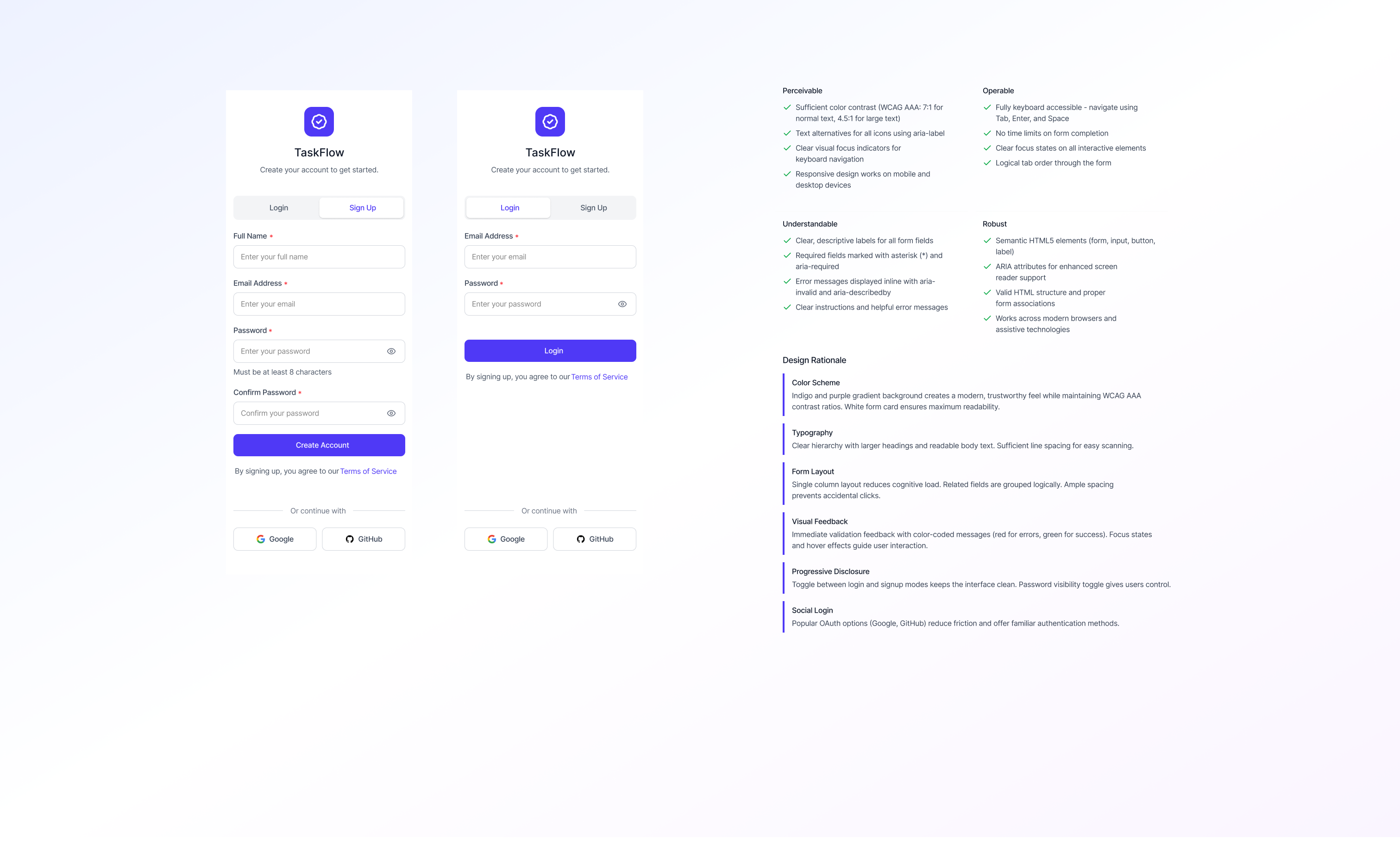
Color Scheme
Indigo and purple gradient background creates a modern, trustworthy feel while maintaining WCAG AAA contrast ratios. White form card ensures maximum readability.
Typography
Clear hierarchy with larger headings and readable body text. Sufficient line spacing for easy scanning.
Form Layout
Single column layout reduces cognitive load. Related fields are grouped logically. Ample spacing prevents accidental clicks.
Visual Feedback
Immediate validation feedback with color-coded messages (red for errors, green for success). Focus states and hover effects guide user interaction.
Progressive Disclosure
Toggle between login and signup modes keeps the interface clean. Password visibility toggle gives users control.
Social Login
Popular OAuth options (Google, GitHub) reduce friction and offer familiar authentication methods.

Reviews
2 reviews

Hi Hiba!
From a product standpoint, TaskFlow feels grounded in clarity which is exactly what a task management concept should aim for. Productivity tools often fail when they try to do too much visually. If this design keeps structure tight and hierarchy clean, that’s already a strong foundation.
What stands out in projects like this is how well priorities are communicated. Task management isn’t just about listing items it’s about helping users decide what matters now. If the flow makes that distinction obvious, then the experience is serving its real purpose.
To elevate it further, I’d examine how it handles complexity over time. What happens when tasks scale, projects multiply, or deadlines overlap? Designing for growth not just the ideal state — is what turns a clean concept into a resilient product. Overall, this feels structured and purposeful, with good product instincts behind it.

Great documentation and presentation! The login/sign up flow is well thought out with clear design rationale. I especially appreciate the detailed permissions and upgrade path explanations. The purple color scheme works nicely. Keep it up!
You might also like

Smartwatch Design for Messenger App


Bridge: UI/UX Rebrand of a Blockchain SCM Product


Pulse Music App - Light/Dark Mode


Monetization Strategy


Designing A Better Co-Working Experience Through CJM


Design a Settings Page for Mobile
Visual Design Courses

UX Design Foundations


Introduction to Figma

Design Terminology
