StreamVibe

Platform: StreamVibe - A Modern Streaming Entertainment Platform
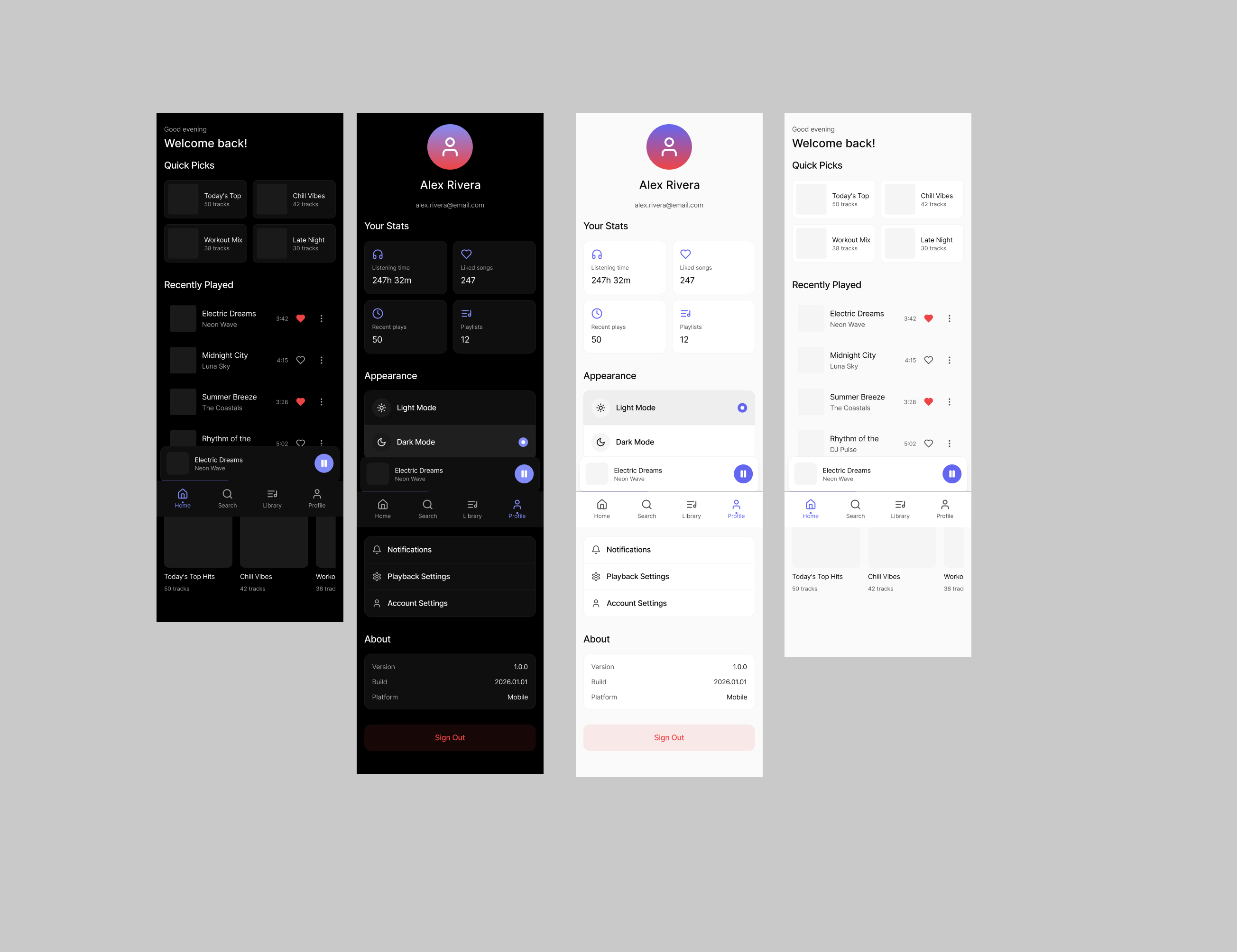
Major Screens Implemented:
- Home Screen - Features a hero section with featured content, trending shows, and new releases in scrollable rows with smooth animations
- Detail Screen - Shows complete information about selected content with cast, director, similar content, and action buttons
- Search Screen - Real-time search functionality with visual grid layout of all available content
- Profile Screen - User settings, watch history with progress bars, appearance controls including the theme toggle, and WCAG compliance information
Design Choices & Thought Process:
Color Palette (WCAG AA Compliant):
- Dark Mode: Deep black (#0a0a0a) background with light gray (#fafafa) text for a 14.5:1 contrast ratio (exceeds WCAG AAA)
- Light Mode: Pure white (#ffffff) background with dark gray (#0a0a0a) text for maximum readability
- Brand Color: Netflix-inspired red (#e50914) for primary actions and branding
- Muted tones: Carefully selected grays that maintain minimum 4.5:1 contrast for all text elements
Mode Switch Placement:
- Positioned in the top-right corner of the navigation bar for easy access
- Uses a sun/moon icon for clear visual indication
- Smooth transitions between themes enhance the user experience

Reviews
2 reviews

Excellent dark mode implementation! The contrast ratios are WCAG AA compliant and the transition between themes is smooth. The streaming interface is well-organized with clear navigation. The red brand color works great with both themes. Nice work on the accessibility features!

Hi Hiba!
At a glance, StreamVibe feels focused on atmosphere which is important for anything media-related. Streaming products live or die by how intuitive and immersive they feel, and this concept seems to aim for clarity over clutter.
What I appreciate is the apparent balance between content density and hierarchy. Streaming interfaces can easily become overwhelming with thumbnails, categories, and recommendations. If your layout keeps discovery intuitive without visual noise, that’s a strong design instinct.
If I were refining it further, I’d explore how the experience differentiates itself what makes StreamVibe distinct from existing streaming platforms? Whether through personalization logic, discovery mechanics, or subtle interaction patterns, sharpening that edge would elevate it from clean execution to strategic differentiation.
You might also like

Smartwatch Design for Messenger App


Bridge: UI/UX Rebrand of a Blockchain SCM Product


Pulse Music App - Light/Dark Mode


Monetization Strategy


Designing A Better Co-Working Experience Through CJM


Design a Settings Page for Mobile
Visual Design Courses

UX Design Foundations


Introduction to Figma

Design Terminology
