Sojo News
Role: Lead UI/UX Designer
- Spearheaded the end-to-end design process for SojoNews, a news aggregation platform, focusing on enhancing user engagement and readability.
- Conducted user research and usability testing to inform design decisions, resulting in a 25% increase in user retention.
- Developed a cohesive design system to ensure consistency across the platform.
Reviews
4 reviews
Great work Dikshaya,
Just a few recommendations
- You have the language options in the top navigation in both, but their is difference in the mobile version — design decisions should be consistent but adapted across devices
- White on green text, I'm not too sure but a darker hue would be best... for accessibility purposes
- Would have loved to see some real content, that way you could consider max/min character lengths
....
How would your blog card design evolve over time as you begin to iterate/
A solid user-centric design case study. Awesome!
Good layout craft. About the color scheme, I agree with Berivan's considerations.
Overall, the design looks modern, clean and user-friendly. I appreciate the structured layout and focus on personalization. There are some suggestions that will help improve the general usability and visual harmony of the interface interface:
Primary color consumption
Primary green color makes it look somewhat excessive and attracts too much attention. Applying the 60-30-10 rule to color balance will help you maintain better visual hierarchy and harmony. Limiting the main colors to important elements will make use of them less intentionally overwhelming.
Bookmark Icon Arrangement
Bookmark symbols are currently located on the left side of the photo. Interactive symbols such as bookmarks, edits, and deletes are most commonly located in the top right corner. This placement improves accessibility by matching the user's expectations and continuing to match actions through different UI components.
CTA Button Contrast
Some call-of-action buttons have a low contrast between the background and text, making it difficult to read button names. Using white or black text instead of green (depending on background color) improves readability and accessibility.
Mobile
Duplicate audio selections on
, mobile version, Hamburg menu and header audio selections will be displayed again. Displaying the same options twice on the same screen frame can confuse the user. Keeping one of them in a menu or header is clearer and cleaner, but not both.
Overall, the design looks modern, clean, and user-friendly. I appreciate the structured layout and the focus on personalization.🚀 I have a few suggestions that could help improve the overall usability and visual harmony of the interface:
Primary Color Usage
The primary green color appears a bit overused and draws too much attention. Applying the 60-30-10 rule for color balance would help maintain better visual hierarchy and harmony. Limiting the primary color to key elements will make its usage feel more intentional and less overwhelming.
Bookmark Icon Placement
Currently, the bookmark icon is placed on the left side of the image, but most commonly, interactive icons such as bookmark, edit, or delete are positioned on the top-right corner. This placement aligns with user expectations and improves accessibility by keeping actions consistent across various UI components.
CTA Button Contrast
Some call-to-action buttons have low contrast between the background and the text, making the button labels hard to read. Using white or black text (depending on the background color) instead of green would provide better readability and accessibility.
Language Selector Duplication in Mobile
In the mobile version, the language selection appears both inside the hamburger menu and again in the header. Showing the same option twice within the same screen frame might confuse users. It would be clearer and cleaner to keep just one of these, either within the menu or in the header, but not both.
You might also like
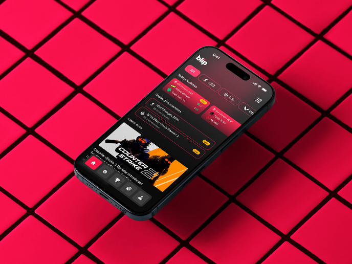
Blip - Esport app design (Light & Dark UI)

Customer Journey Map for a Co-Working Space
Reimagining Asana's Color System
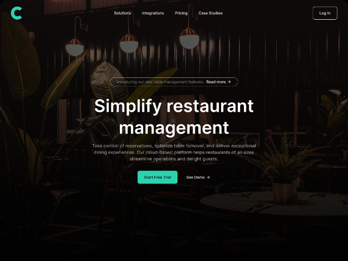
Responsive Main Screen
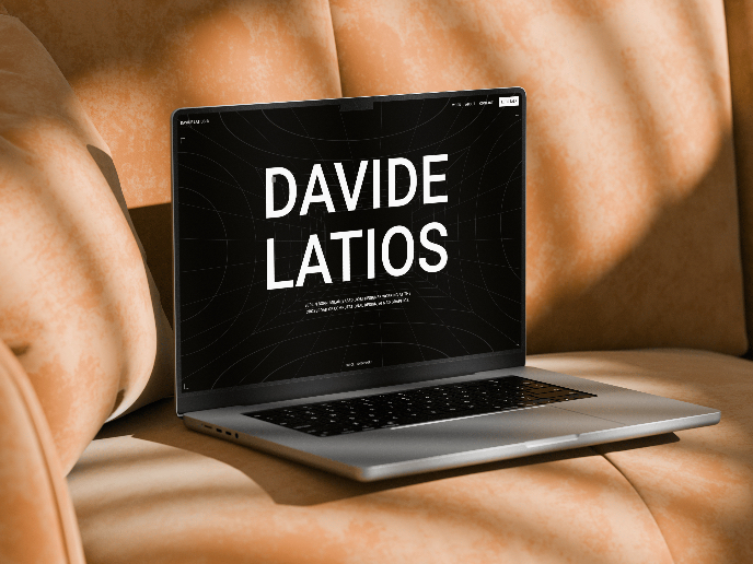
Latios - Free Portfolio Template for UX/UI Designers
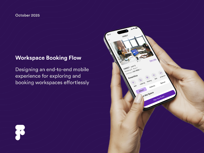
Workspace Booking Flow - UI/UX Design
Popular Courses

UX Design Foundations

Introduction to Figma


