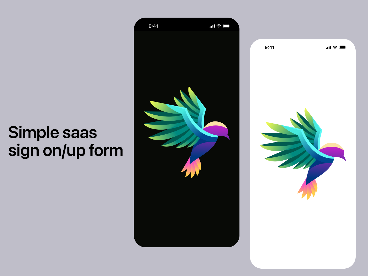
Simple saas sign on/up form

TL;DR
- This project is just a simple saas sign on/up form with focus on accessibility that listed in the plugin
- The colour palette had three iteration, first is from AI, real time colour, and my own palette which from the logo I randomly pick
- I use AI mostly for assisting me on gaining definition and/or know what the minimum and maximum of certain scoring sytem.
- The spacing I use is using 8 as base and then multiply it
- What I use to space between element/object is the rectangle that could help to gain a precise number of width and heigh (WxH) also the white space
- The only reason I use wireframe and animation is because projects that was submitted in this platfrom are very good
- Although it is buggy, I tried to make it not that buggy
- The flow of this prototype is designed so the users who sign in with email will definitely make mistake on email and password
- For the sign up flow, the user will always finish it without obstacle or no error at all
- This prototype are made for light and dark mode and is based on iOS
- The apple and google logo that is on the prototype is just a decoration in the flow
- Component page is very messy because that is the workshop of the component used in the prototype
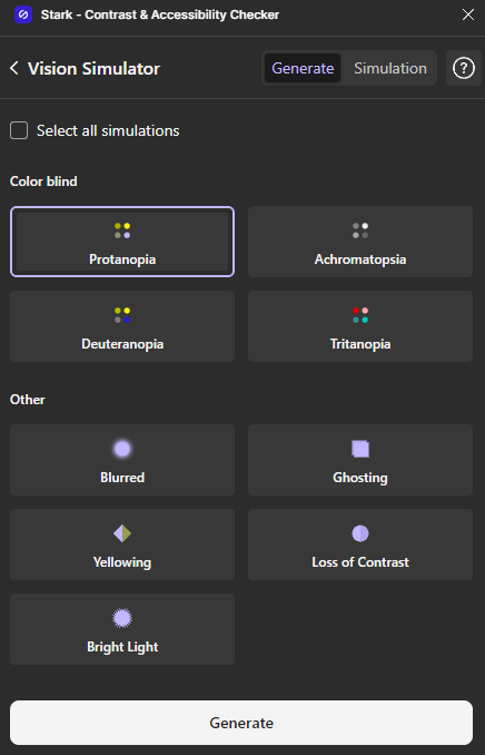
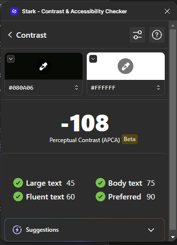
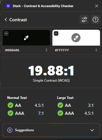
- The plugin I use to check for the contrast and visual simulation will be at the bottom of this page
- This is the last line on this TL;DR, continue to read the whole thing if you want to know more (^人^).
This project is based on iOS system and will be available in two modes for accessibility, light and dark mode.
This project was first using AI to choose the colour, but soon I realize that the colour the AI give was not good enough when I try to implemented it. Then I tried other colour template like realt time color and so on which resulted in me disappointed in the colour selection I got from there. Thus, I had to picked my own colour from the logo I randomly pick which I had to consulted with ai for things like "APCA vs WCAG" or "How do I pick primary and secondary colour" and then implement it in the component with wrong colour palette. As why I picked the logo randomly is because I don't want to suffer from logo making as I don't know how (I have zero knowledge on logo designing or design graphic, except for designing for UI and UX). From there I found a little bit of styles that maybe quite different from others. Then, I fully focused the palette for accessibility for those who suffer colour blindness and other eyes disease, except for those who suffer from diabetic retinopathy. As for the colour palette I reduce it little by little from the highest level to the lower one from accent colour where it shows the most highlighted colour to the less visible secondary colour (AAA -> AA). Well, surprisingly, I personally quite like the colour style.
After using the colour the AI suggested, I continued to make the component so I don't have to redesign everything or copy-paste it on every frame. Yes, I use a block of rectangle to calculate the margin, padding, and other spacing which help me to give the accurate number for "width" (W) and "height" (H) and also the space or some say the white space. And then after I carefully make the component to have the precise H and W, then I place the component, or assets in figma, onto the frame that I have imagine. Because the requirement of the project is to make a Saas sign up form, I also make a login but with special case which is an error case where the user put in the wrong email and address. As for the flow, I personally make it so that the users make mistake and had to re-entered the email and password on the login page, but on the sign up page I make it so the users enter it correctly. And not include the google/apple sign in function, it there just as decoration in this flow.
After the component already placed, I am looking for the official guidelines for the apple and google for sign in because, even if I am doing this just for some training/ project, I prefer to keep it professional. So, I lookup for both logo, and follow some instruction, although it might not same or so different from the guidelines because I had to tweak it and keep the design consistent (if you are wondering why, because the these two different companies had their own guidelines which I had tweak it a little bit so the design can be consistent). And from there I continue to convert frame from light to dark mode.
Now for the last part, wireframing. Well, althought the prototype is not that good, I just quite frustrated with the animation that figma had and almost flipped the table because I just realize that figma can't animate different arch so I had to use static icon. Fortunately I successfully make the typing animation so it's not so boring as just watching a static animation. Why I am doing this? Because the project that was submitted by other learner are better so I had to make it at least "good enough" which is very subjective to me XD (if you, reader, are wondering what is XD, it is a laughing emoticon, almost same as 😂 or LOL or ROFL). It might be buggy, because I don't want to check it after the time I had with the animation (what I mean is the back button, it might not working or moving to different page when pressed).
For those who open my project you might see the component page which very messy, because that's where the workshop of the component is
So, I will post the view of the plugin I have to do those things like checking the contrast and doing simulation below.
Tools used
From brief

Topics
Share
Reviews
2 reviews

Great work, love the right up.
I would add to your error states a red outline to the input field to reinforce attention. Overall, fantastic effort 👌

Looking great Bird illustration is main role playing for the UI screen
You might also like

Designing A Better Co-Working Experience Through CJM


Mobile Onboarding


Monetization Strategy


Zoom Sign in Screen


Button System for Mobile Web Platforms Brief


Jakarta Running Fest 2024 Website

Visual Design Courses

UX Design Foundations


Introduction to Figma

Design Terminology
