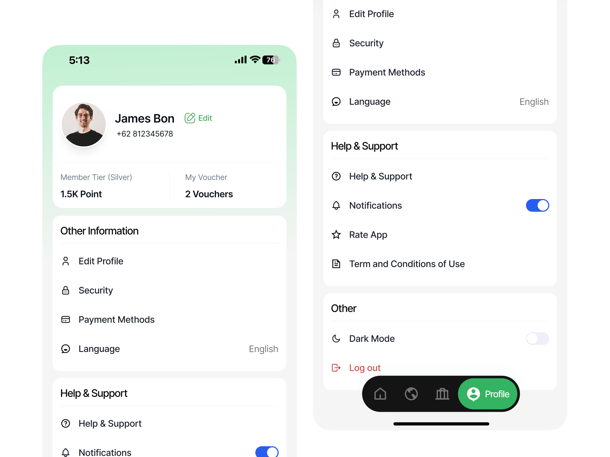
Settings Mobile Page

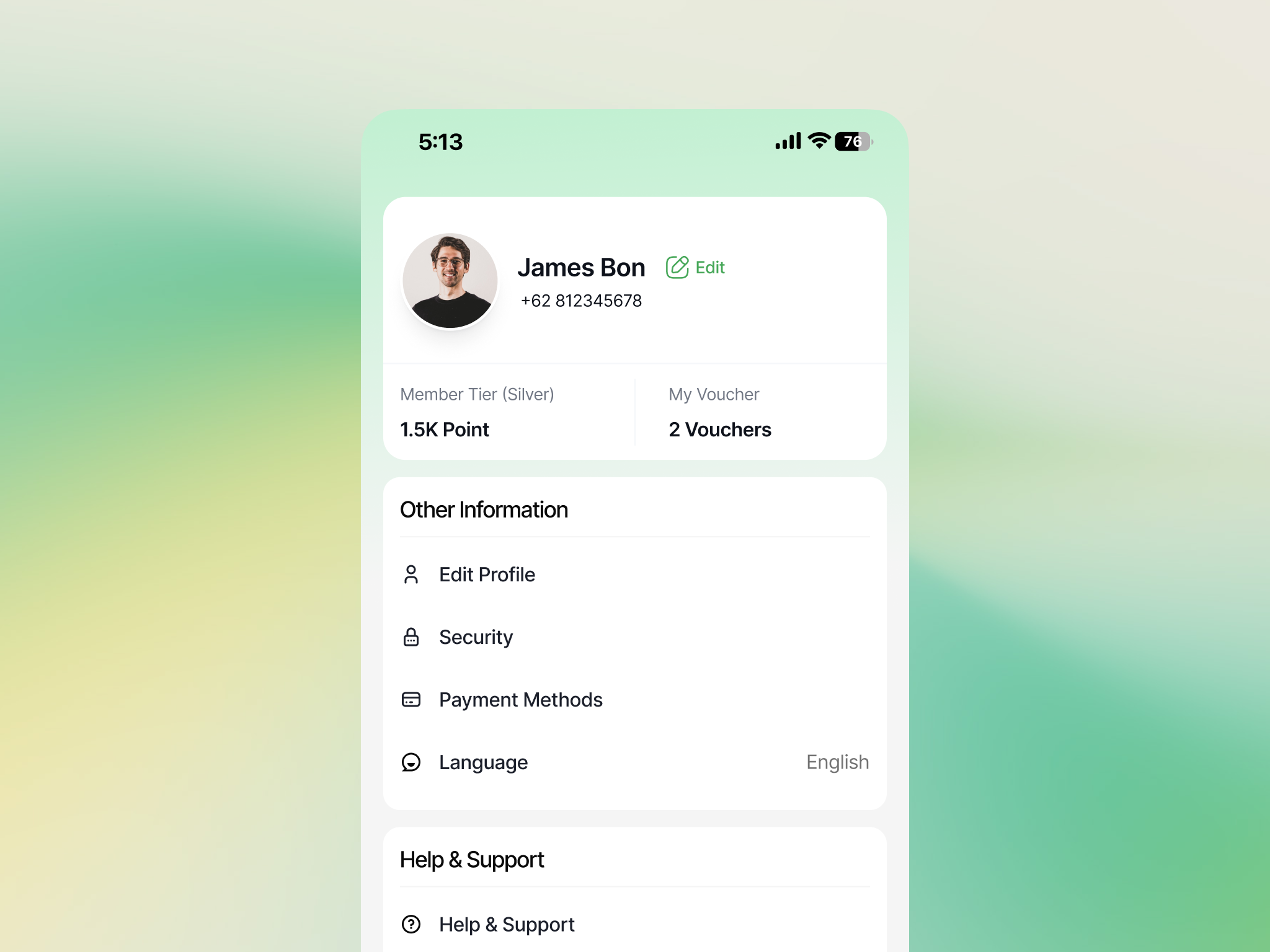
Design this setting with bring some decision like
- Grouping same information with rectangle
- Provide information about support app in setting
- Also themes and log out
This decision based on psychology also which we easy to scan information based category.
Tools used
From brief

Topics
Share
Reviews
6 reviews

My overall impression Solid work with visual grouping, but there are a few pitfalls that hurt the user experience.
You have a clear division into sections (Other Information, Help & Support, Other), readable typographic hierarchy, and a pleasant green palette that ties everything together.
Moreover "Help & Support" appears twice - once as a section header and once as a menu item, which is confusing. "Log out" is partially covered by the bottom action bar - a key option shouldn't be hidden. Nice that you added Dark Mode.
Summary: The direction is good and you can see that you thought about grouping information, but the structure needs refinement. Clean up the duplicates, ensure visibility of key actions, and improve visual contrast between sections, and it will be really strong. 💪

great job! I like it

Clean and simple, I like it.

The layout is clean and well-structured, and grouping related settings improves clarity. However, the type size hierarchy is not used effectively. The text elements feel too similar in size, which makes it difficult to distinguish primary labels from secondary ones. Increasing variation in font size would strengthen visual hierarchy and help users scan the content more efficiently.

nice work

Great work Adi!
You might also like

Smartwatch Design for Messenger App


Bridge: UI/UX Rebrand of a Blockchain SCM Product


Pulse Music App - Light/Dark Mode


Monetization Strategy


Designing A Better Co-Working Experience Through CJM


Design a Settings Page for Mobile
Content Strategy Courses

UX Writing


Common UX/UI Design Patterns & Flows


Building Content Design Systems
