SaaS login/signup

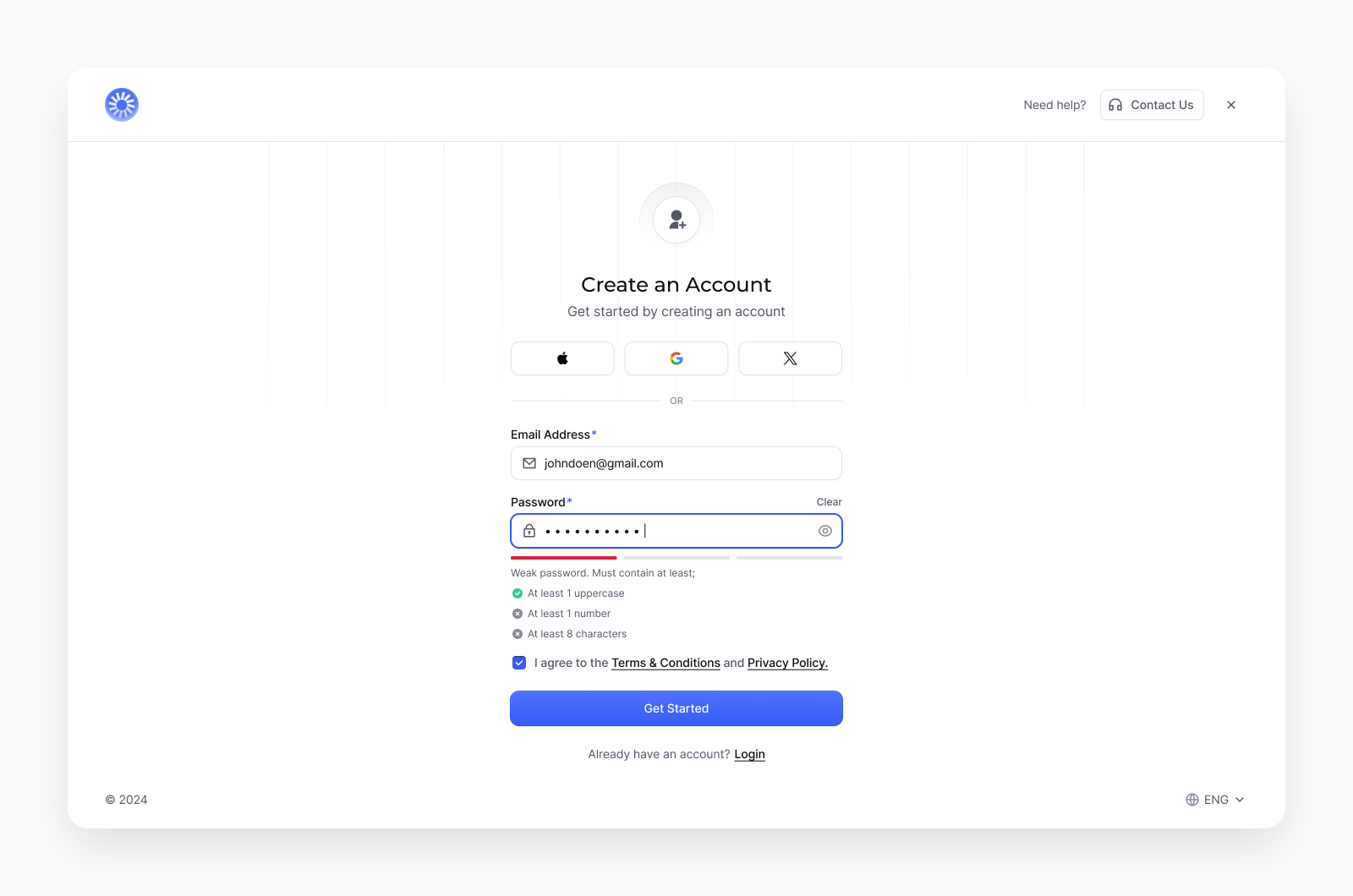
Filled state of a registration page for a SaaS product.
Here I'm showing the password requirements updating while the user is typing...

Reviews
2 reviews

Hi there, this looks clean and covers all the crucial bases, nicely done!
If I have to nitpick and poke some holes, these are my thoughts and considerations when looking at your work.
- Swapping the "Need help" / "Contact us" to the bottom and the local change button to the top. - This feels more intuitive as a mental model across the board.
- Legibility—The components feel cramped. Perhaps adding a bit more white space would allow them to breathe better.
- Microcopy - Possible tweaks to the initial subheader to further guide users in logging in with alternate platforms.
I LOVE how the progress bar is chunked according to the password requirements. It would be really intuitive for users to see that as they "complete" one of the requirements, the progress bar will match that! Well done again!

This is a really clean design! Love the simplicity and elements that you added to give it an extra touch.
A few things I noticed that could help it take a step further:
- Bringing more space overall to let the form breathe.
- Including labels with the social icons. They look sleek by themselves, but can limit certain accessibility standards.
- I can't really tell from the screenshot you shared, but be aware of font sizes when it gets down to the password requirements.
Great work! 🎉
8 Claps
Average 4.0 by 2 people
You might also like

Project
Smartwatch Design for Messenger App

Practice your interaction design skills and design experience optimized for smartwatches.

Project
Bridge: UI/UX Rebrand of a Blockchain SCM Product

A UI/UX overhaul project of Bridge, a blockchain-based enterprise supply chain management web app originally called BSCM. This short case st

Project
Pulse Music App - Light/Dark Mode

This project presents a mobile music streaming interface designed in both light and dark modes. The visual direction combines Japandi minima

Project
Monetization Strategy

This project evaluates two monetization models (freemium and paid) for a new mobile point-and-click adventure game. It compares their streng

Project
Designing A Better Co-Working Experience Through CJM

Project ContextThis project focuses on improving the experience of individuals using co-working spaces. The objective is to identify key pai

Project
Design a Settings Page for Mobile
Showcase your information architecture and content strategy skills by crafting a settings page for mobile.
Visual Design Courses

Course
UX Design Foundations

Learn UX design fundamentals and principles that create better products. Build foundational knowledge in design concepts, visual fundamentals, and workflows.

Course
Introduction to Figma
Learn essential Figma tools like layers, styling, typography, and images. Master the basics to create clean, user-friendly designs

Course
Design Terminology

Learn UX terminology and key UX/UI terms that boost collaboration between designers, developers, and stakeholders for smoother, clearer communication.