
Reviews
3 reviews

Perfect

My very first impression is that I can clearly see the difference in the before and after designs and I appreciate that you were able to give new life to a form that we see many times.
Accessibility & Usability:
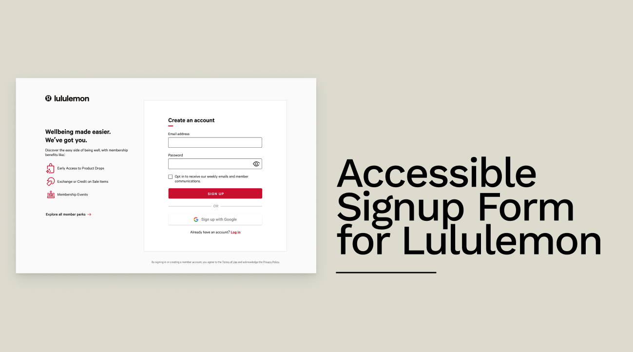
The error messages are indeed clearer now and the colours meet the contrast ratio requirements. The focus and error states are also well designed and visually unambiguous which is great for keyboard users. I do think the SIGN UP button should say SIGN IN since signing up and creating an account in most cases is the same thing. They both assume you don't have an account yet. I do appreciate the inclusion of alternative sign in methods since I myself use that often. The form flows well and with the real time password validation it makes it clear to the user what needs to be done.
Visual design:
You stayed true to the brand style and tone. You've given room for white space while using icons to space out the content and make it more scannable and easier to read. I think you have enough space to add 2 more benefits to really get the user to complete the membership without overwhelming them. I do like that you essentially summarised the benefits though! The new look is cleaner and modern.
Presentation:
You very clearly highlighted the problems and your rationale in your changes. Small thing! There is a typo in your last slide, it says "the the requirements" consider updating this to create a well finished off presentation. Overall a concise and detailed report of your redesign! Clap clap clap!

Simple and super effective.
You might also like

Smartwatch Design for Messenger App


Bridge: UI/UX Rebrand of a Blockchain SCM Product


Pulse Music App - Light/Dark Mode


Monetization Strategy


Designing A Better Co-Working Experience Through CJM


Design a Settings Page for Mobile
Visual Design Courses

UX Design Foundations


Introduction to Figma

Design Terminology
