

Reviews
1 review

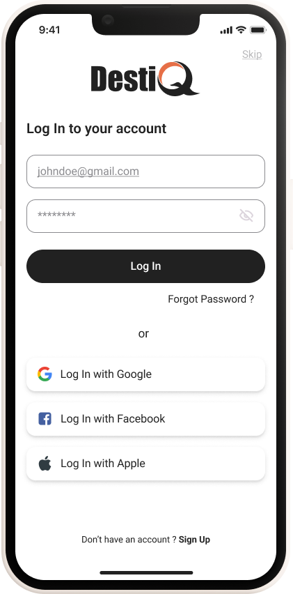
Great start Surbhi! I will break down what I like and what I think you need to take into consideration.
- Clean design aids user focus.
- Known social logins facilitate quick access.
- Prominent “Log In” button guides the user.
What Needs Attention:
- Increase contrast for the “Log In” button for better visibility.
- Add more spacing to improve touch targets in inputs. Radiuses aren't consistent
- Clarify the show password icon’s function.
- Infuse travel-related elements into the “DestiQ” logo.
- Skip Button: Clarify the purpose or consider removing it.
- CTA Design: Make “Sign Up” visually distinct as an actionable button.
- Readability: Increase font size for “Forgot Password?” for better clickability.
- Social Icons: Use branded colors for social media login options.
- Legal Links: Include privacy policy and terms of service links for transparency.
4 Claps
Average 4.0 by 1 person
You might also like

Project
Smartwatch Design for Messenger App

Practice your interaction design skills and design experience optimized for smartwatches.

Project
Bridge: UI/UX Rebrand of a Blockchain SCM Product

A UI/UX overhaul project of Bridge, a blockchain-based enterprise supply chain management web app originally called BSCM. This short case st

Project
Pulse Music App - Light/Dark Mode

This project presents a mobile music streaming interface designed in both light and dark modes. The visual direction combines Japandi minima

Project
Monetization Strategy

This project evaluates two monetization models (freemium and paid) for a new mobile point-and-click adventure game. It compares their streng

Project
Designing A Better Co-Working Experience Through CJM

Project ContextThis project focuses on improving the experience of individuals using co-working spaces. The objective is to identify key pai

Project
Design a Settings Page for Mobile
Showcase your information architecture and content strategy skills by crafting a settings page for mobile.
Visual Design Courses

Course
UX Design Foundations

Learn UX design fundamentals and principles that create better products. Build foundational knowledge in design concepts, visual fundamentals, and workflows.

Course
Introduction to Figma
Learn essential Figma tools like layers, styling, typography, and images. Master the basics to create clean, user-friendly designs

Course
Design Terminology

Learn UX terminology and key UX/UI terms that boost collaboration between designers, developers, and stakeholders for smoother, clearer communication.