Log in / Sign up - Desktop / Mobile (Cora Music)

Reviews
1 review

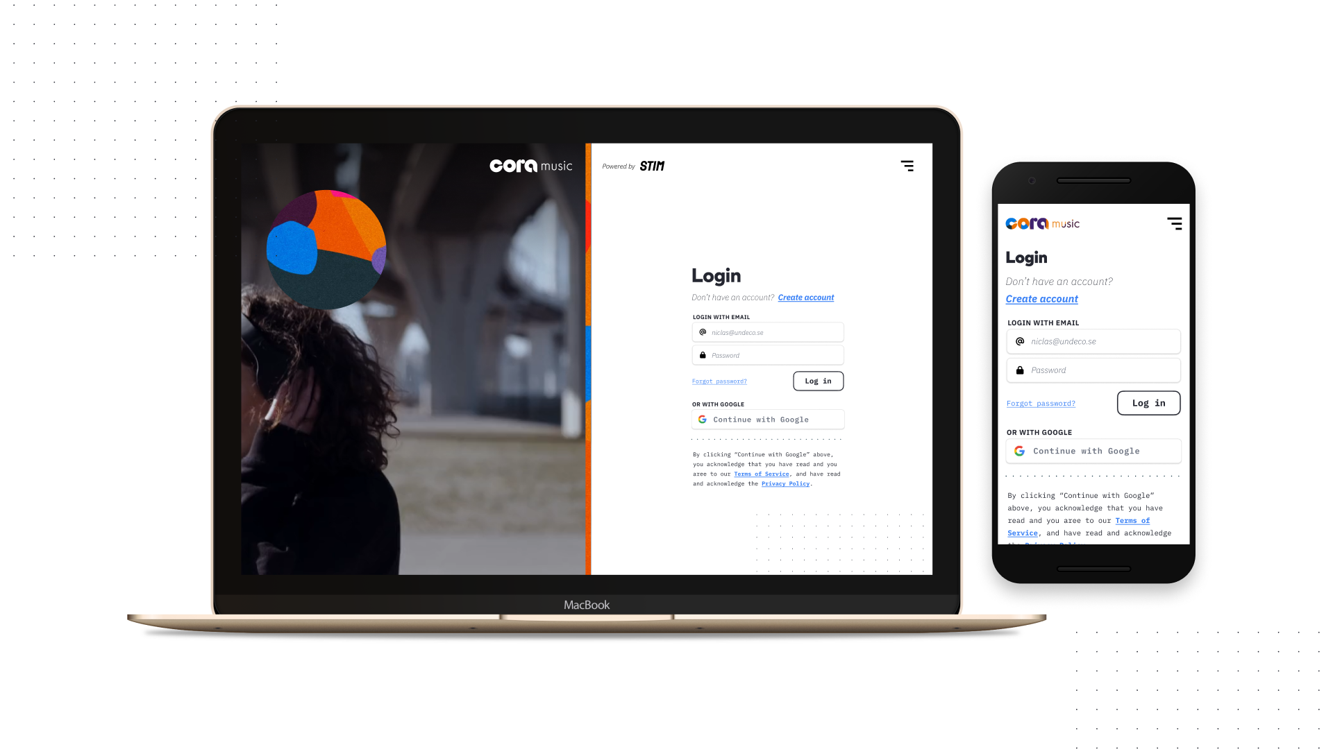
The login screen for Cora Music, displayed on both desktop and mobile, presents a clean, user-friendly interface. Here's a detailed UI review:
Strengths:
- Responsive Design: The layout adapts well to both desktop and mobile platforms, ensuring accessibility across devices.
- Visual Hierarchy: Important actions like "Login" and "Create Account" are prominent, with clear calls to action and easy-to-read labels.
- Branding: The vibrant logo and colorful elements on the desktop add a lively and engaging brand identity.
- Alternative Login Options: Offering Google login provides convenience and aligns with modern user expectations.
- Clarity: The use of white space and simple typography ensures a clear focus on the form fields and buttons.
Areas for Improvement:
- Contrast and Accessibility: The blue "Create account" link might lack sufficient contrast against the white background, potentially affecting users with visual impairments.
- Redundancy: Some areas are tight, increase the space for inner padding.
- Imagery Integration: While the desktop version uses a large, engaging background image, the transition to mobile feels less cohesive, as the image is not present, potentially reducing brand consistency.
4 Claps
Average 4.0 by 1 person
You might also like

Project
edX Sign-Up Page Redesign

OverviewThis project focused on improving the accessibility and user experience of the edX sign-up page. The original design had usability a

Project
Beautify Login page WCAG principles

This accessible signup form design follows WCAG principles by ensuring the interface is perceivable, operable, understandable, and robust fo

Project
Design Prioritization Workshop

A structured session to evaluate product ideas, prioritize high-impact features, and define a clear implementation plan.

Project
Notion Login Page Accessibility Optimization

Overview: This project focused on improving the accessibility and usability of the Notion login page. The original design had several UX and

Project
Sanyahawa - Landing page Design

I designed this with one goal in mind: make creating an account quick and easy Many sign-up pages feel crowded and confusing, so I focused o

Project
Healthy Dashboard

well being dashboard
Popular Courses

Course
Introduction to Figma

Learn essential Figma tools like layers, styling, typography, and images. Master the basics to create clean, user-friendly designs

Course
Design Terminology

Learn UX terminology and key UX/UI terms that boost collaboration between designers, developers, and stakeholders for smoother, clearer communication.

Course
Common UX/UI Design Patterns & Flows
Learn how to use tried and tested UX/UI design patterns and flows to solve recurring design problems faster and build interfaces that feel intuitive