Color System refresh for Planner

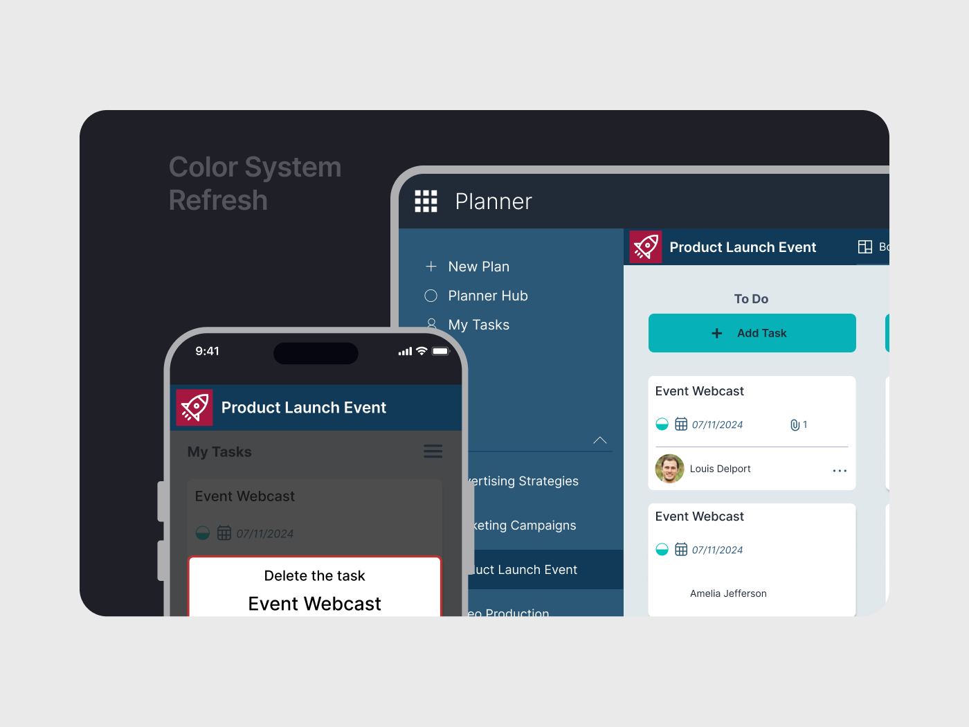
For the new color system, I wanted to create a feeling a calmness and trust, and at the same time convey a professionalism image.
The color blue is traditionally associated with loyalty, honesty and trust. It has a calming effect while also enhancing cognitive skills. Combined with the light neutral colors, it keeps the interface clean simple.
I complemented the hues of blue with two brighter colors to liven up the design and add make the UI elements stand out.
Tools used
From brief

Topics
Share
Reviews
1 review

Hi Francois, it's great to see your project showcase. The color scheme is very easy to eyes to see in long time and I love how well you present it in the application on desktop and mobile. I only wish you could include more demonstrations to show how you categorize the colors as well as their hierarchy applying in the product.
Love to see more from you!
You might also like

edX Sign-Up Page Redesign


Beautify Login page WCAG principles


Design Prioritization Workshop


Notion Login Page Accessibility Optimization


Sanyahawa - Landing page Design


Healthy Dashboard

Visual Design Courses

UX Design Foundations


Introduction to Figma

Design Terminology
