Color System for Productivity Tool
This carefully curated palette is designed to enhance the user experience. The primary blues establish trust and focus, the secondary greens bring balance and clarity, while the tertiary oranges energize and highlight key elements. Together, these colors create a harmonious, user-friendly environment that boosts productivity and inspires creativity.
Reviews
1 review
Hello 👋
Your project has some strong foundational ideas, especially with the choice of blue as the primary color—it’s a great fit for productivity tools, known for being reliable and trustworthy. It would have been even more compelling to include some benchmarking data showing how blue is commonly used in these tools due to its popularity and psychological impact.
I noticed a potential issue with the green you chose as a secondary color, which is identical to the system color for success. This could create confusion, and I don’t recall seeing this green used as a secondary color in the UI example. Consistency in color roles is key to avoid any misunderstandings in user interaction.
Similarly, the orange you presented as a tertiary color appears to function as a system color for warnings or pending states. This overlap might lead to confusion, especially in scenarios where distinctiveness is important for quick recognition.
Regarding the WCAG compliance slide, you showed text over green and orange in dark grey, and over red in light grey, almost white. However, in the UI example, you used these colors in tags with similar tints, which diminished the contrast and readability. Ensuring that your color choices maintain adequate contrast is essential for accessibility and usability.
At the end, while your color scheme ideas are clean and promising, the UI example needs further refinement to fully reflect the values and intentions you’ve outlined earlier in the project. With these adjustments, your work could truly stand out.
You might also like
💊 Healthcare Desktop & Mobile App UX/UI Design
Personal Wellness Dashboard
Fitness Challenges App
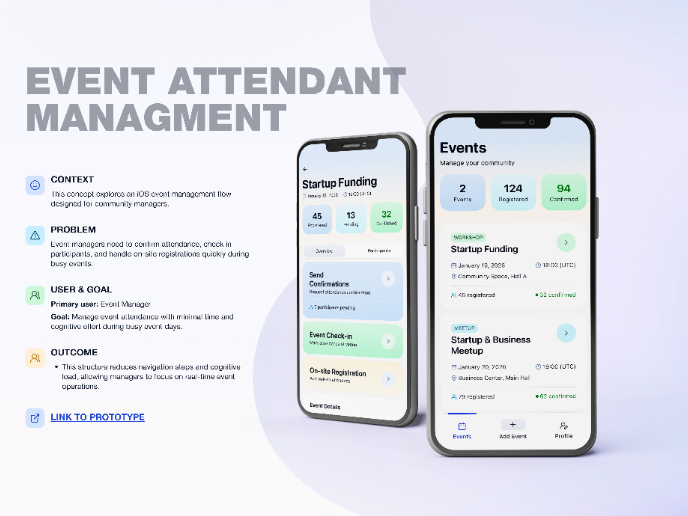
Events Managment App
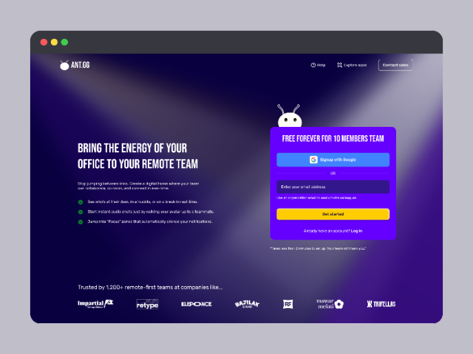
SaaS Signup Design
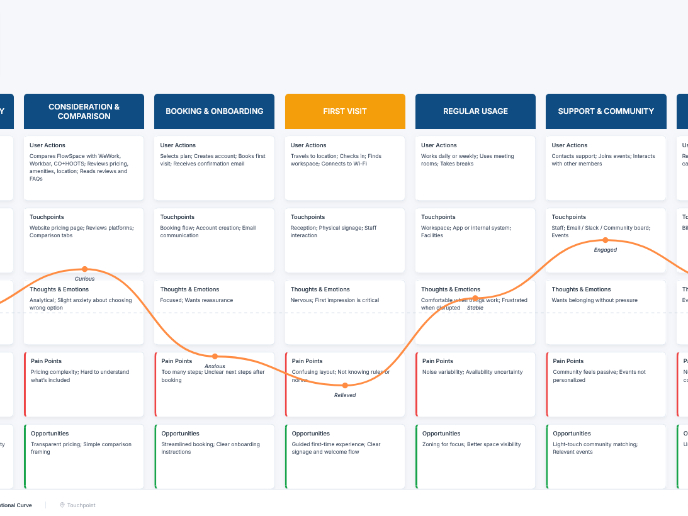
Customer Journey Map — Offsite Co-Working Experience
Visual Design Courses

UX Design Foundations

Introduction to Figma


