

Reviews
2 reviews

Hey Fatima,
I was curious, what is this project about? I can see it was done based on a brief, and that’s actually something worth calling out in your presentation. It helps a lot to explain what the goal of the task was and how you approached solving it.
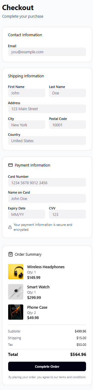
The UI looks quite clean overall, but the input labels feel a bit too close to the fields. Adding a little more padding there would make things easier to scan and more comfortable to read.
One more small thing to check is consistency. In two sections you’re using an icon next to the title, while in the other two you’re not. It might be good to decide on one direction and apply it across all sections so everything feels more cohesive.

Hey Fatma, this might be a project you're still working on but even if that is the case, I would leave it as a draft until more completed. Projects represent what you can do and what you have here actually damages your portfolio.
The project doesn't have a title, the single image is low quality, and there is nothing on your thought process behind the work connecting it to user or business needs.
These things show attention to detail, creativity, and effort, things I don't get from your project yet. It's an ok draft that shows some understanding of UI fundamentals but you really need to put more effort into it to stand out.
You might also like

Smartwatch Design for Messenger App


Bridge: UI/UX Rebrand of a Blockchain SCM Product


Pulse Music App - Light/Dark Mode


Monetization Strategy


Designing A Better Co-Working Experience Through CJM


Design a Settings Page for Mobile
Interaction Design Courses

UX Design Foundations


Introduction to Figma

Design Terminology
