Banking App Pay Flow Redesign

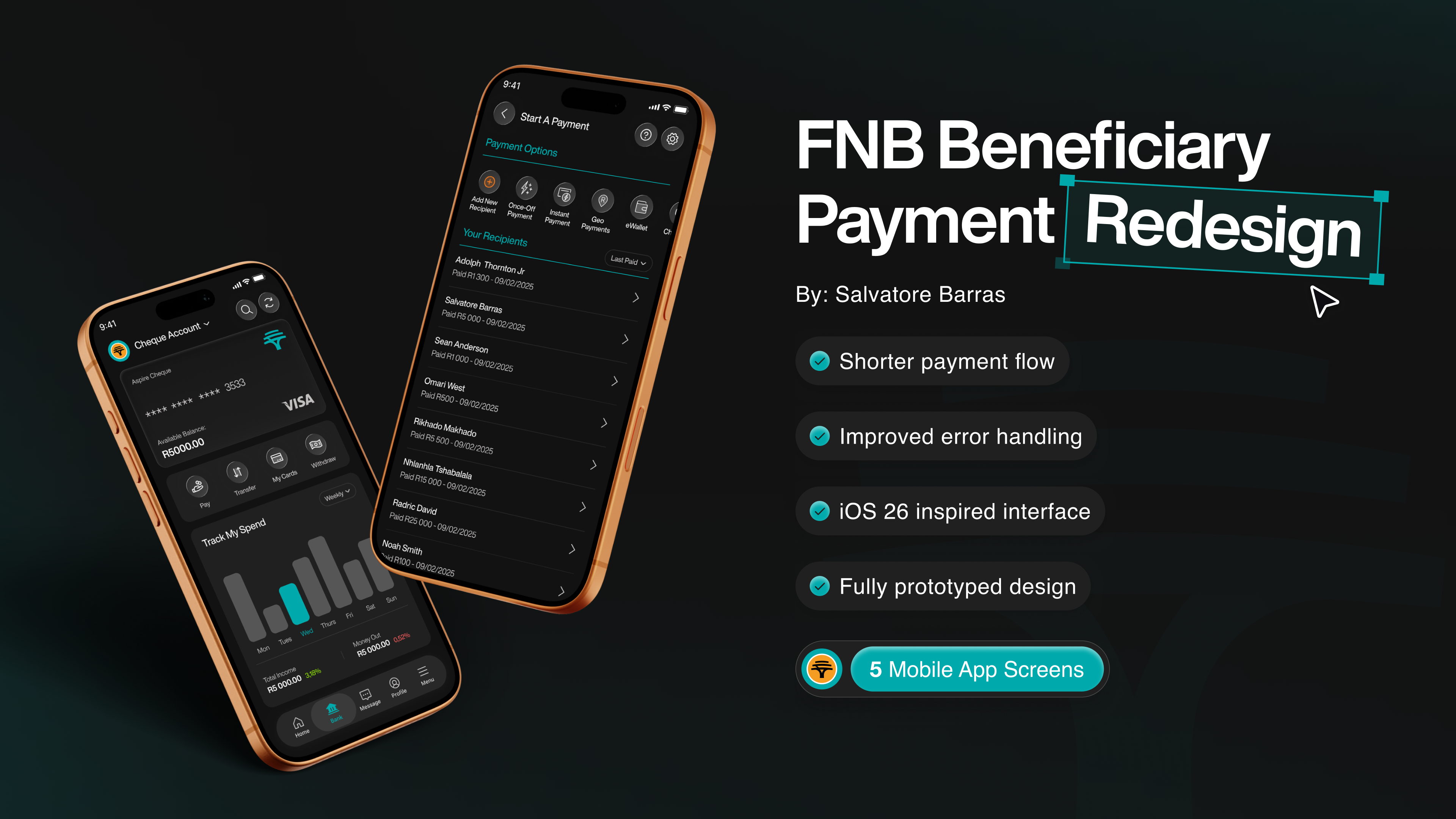
This redesign explores how a familiar but under-optimised feature in a major South African banking app can be made faster, simpler, and more human. I focused on the “Pay Existing Beneficiary” flow in FNB South Africa's mobile banking app — a task many users perform regularly, yet the experience is slowed down by unnecessary steps, poor error handling, and visual noise.
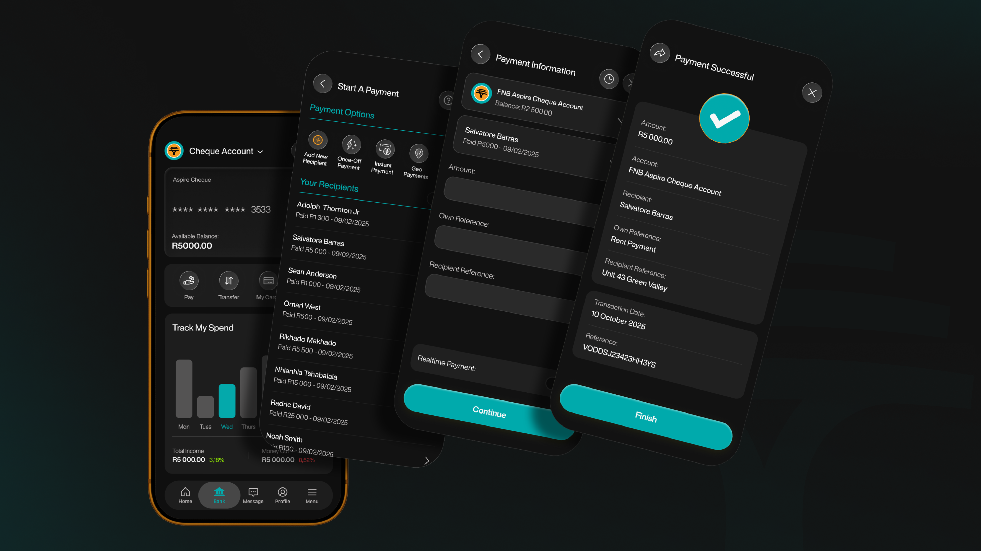
The project breaks down the original end-to-end flow, identifies key friction points, and presents a reimagined experience built with clarity and usability in mind.
Highlights:
- Fully prototyped
- Dark & light modes
- Streamlined navigation (fewer steps, more context)
- Inline error handling and improved feedback loops
- Refined layout with stronger hierarchy and readability
- Accessible, native-feeling design decisions
- Thoughtful use of motion and confirmation to build trust
Figma File: https://www.figma.com/community/file/1572349032622115603/fnb-beneficiary-payment-redesign
NB: This concept was created for creative purposes. I have no affiliation with FNB.
Reviews
2 reviews

It felt like I just had a full-course dinner browsing your project 😋 I'm full. Appreciate the walkthrough and NBs, they really help my second-guessing brain.
My question is rather technical, do you also experience the liquid glass button appearing crooked on the curved glossy side when designing? I thought it was just because my GPU couldn't handle it, but it also appeared in the project images (exported PNGs). If you zoom the button in the Figma file, it's flawless.
Oh, the icons. What was your reason for choosing heavier icons for Bank and Message? The other icons are just simple hairlines, while the new ones have some weight in them, the ellipsis for the message and the whole building for the bank 🏦

Great work!!
You might also like

SONZ - Entertainment platform


Camp & Travel Explorer - App Design


Solar system Dashboard Utility

Uxcel Halloween Icon Pack


Signup page for a SaaS website


Color System

Popular Courses

UX Design Foundations


Introduction to Figma

Design Terminology
