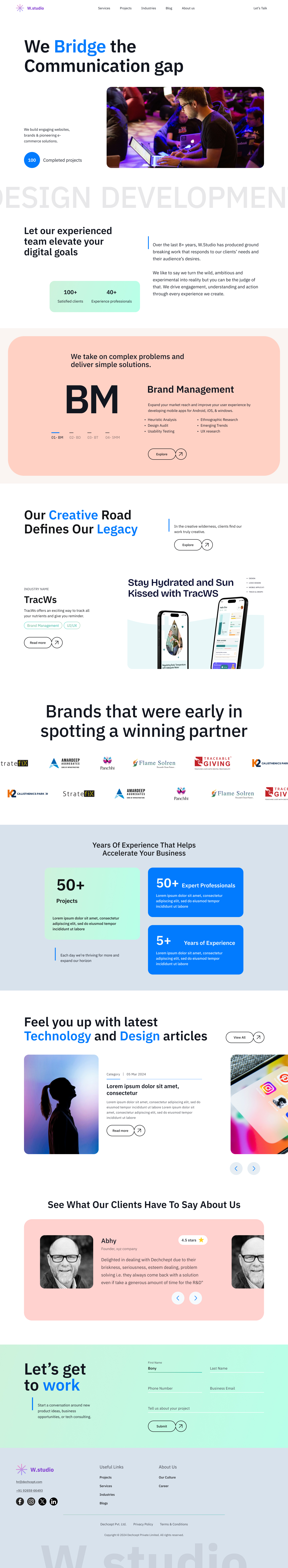
An IT Company Website
This is the landing page of an IT company who wants to Redesign their existing website and showcase their value to the needful clients.
My design choice is totally based on a lot of reference and users' review. Since, the purpose of the website is to showcase the value of the company and encourage them to contact for new project.
Based on the target audience, I developed a persona that covers the people who are 30+ in age, value the trustful agencies, look for authentication and a future proof partner.
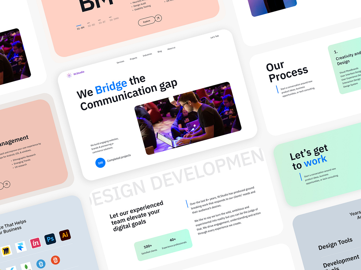
I tried to keep the design Clean and Modern yet aesthetic. In this Project, I chose "Blue" as primary color to associate the Brand with trust and added green blue gradient that give a sense of growth.
Love to hear your thoughts ✨
Reviews
1 review

I like the style of the project and the colour work is very nice. Soft colours, soft angles, air through the page leave a nice impression.
I see your desire to use a non-standard grid, but it's not always justified, sometimes the blocks look chaotic and like the alignment is broken.
I would recommend removing some decorative elements that have no functional load but overload the screen, this way the screens will look cleaner and will be easier for users to scan.
I recommend to be consistent in typography, for example use normal case ot title case, but not two at the same time.
It would be a good idea to reduce the number of font sizes, there are too many different sizes in your work. This will improve the page hierarchy.
Anyway, this is a good direction, good work that can be improved 🙌
You might also like

SONZ - Entertainment platform


Camp & Travel Explorer - App Design


Solar system Dashboard Utility

Uxcel Halloween Icon Pack


Signup page for a SaaS website


Color System

Popular Courses

UX Design Foundations


Introduction to Figma

Design Terminology
