Proximity
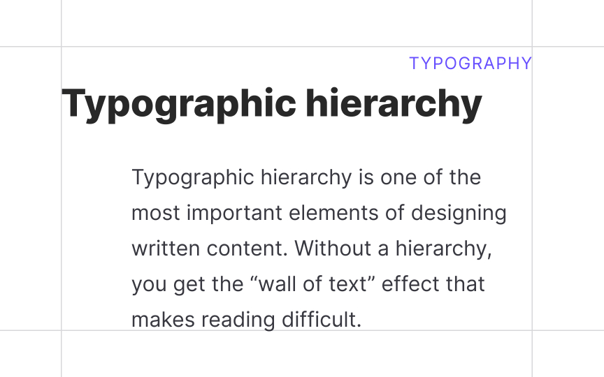
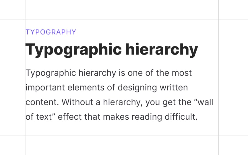
The principle of proximity implies that related elements are placed near each other. In turn, unrelated elements are set at a distance. When arranging text in a composition, designers use white space to group related sentences into paragraphs, making sure users can identify which headlines and subheads relate to which paragraphs.
Additionally, proximity is one of the strongest design principles — it can overpower similarity of color or shape. This means that even if you use the same typeface and color for a headline and body text but place them too far from each other, users might consider them to belong to separate groups and overlook them.[1]
References
- Proximity Principle in Visual Design | Nielsen Norman Group


