Keep the link style familiar
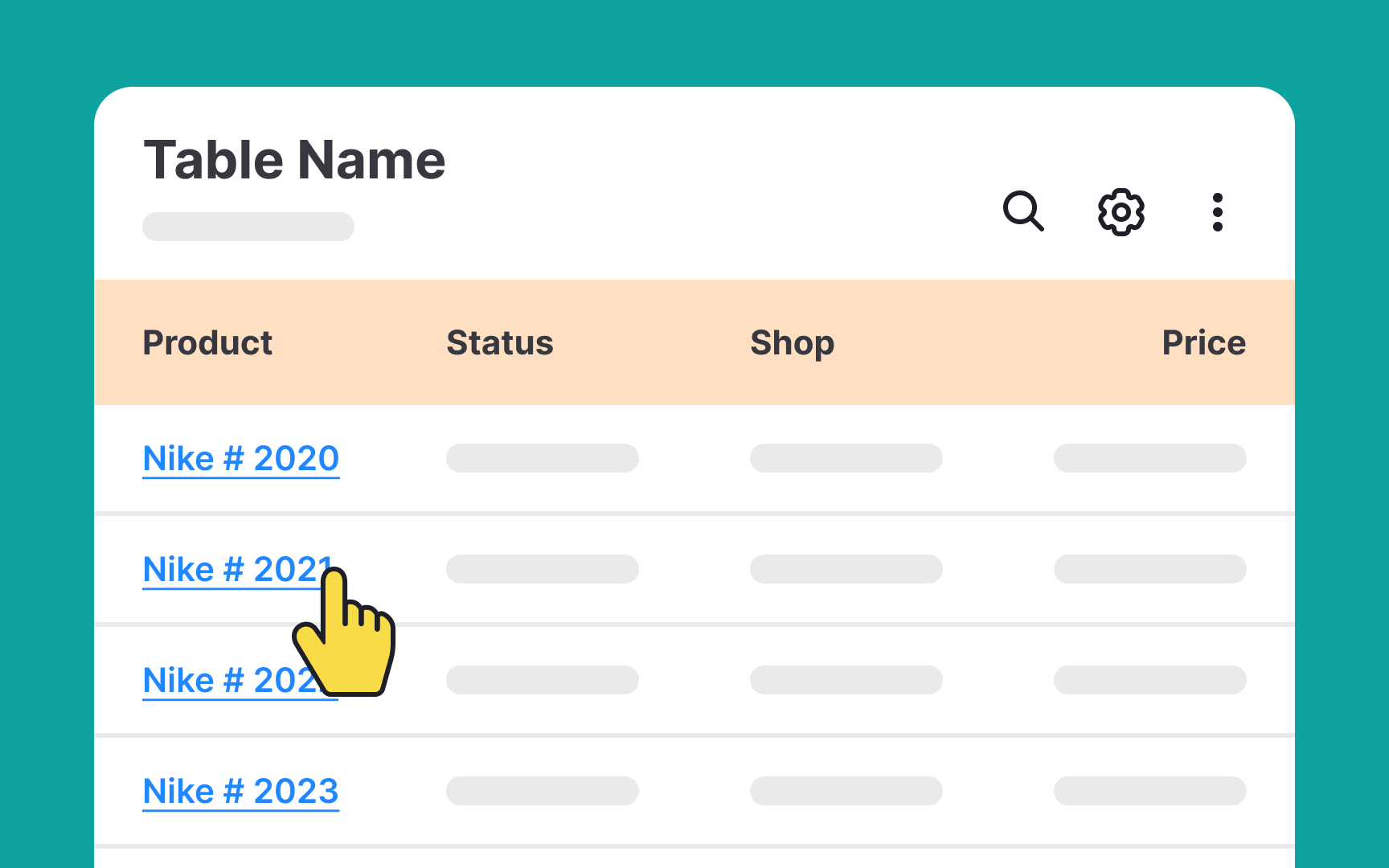
Tables often feature clickable links within their content, and maintaining their easily recognizable appearance is key for user convenience. The most widely recognized format for links is underlined text in blue. Enhancing these links with hover effects, such as a color change or increased underline thickness, reinforces their interactivity. Adhering to these standards helps users quickly identify these elements as clickable links.
Furthermore, it's essential for accessibility that the link color is distinct from the table's background. As per the Web Content Accessibility Guidelines (WCAG), text and interactive elements should have a contrast ratio of at least 4.5:1 for standard text and 3:1 for larger text.[1] This ensures that the links are easily discernible for all users, including those with visual impairments.
Pro Tip: Make sure the link changes its color to purple once it's been opened so that users know what links they've already clicked on.
