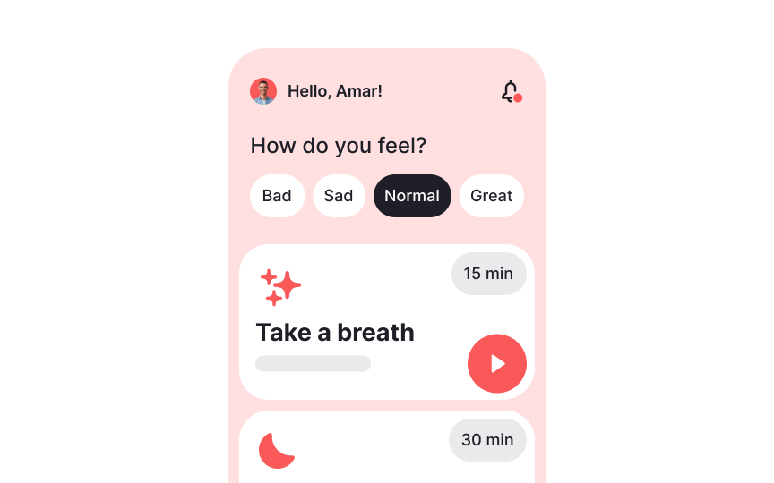
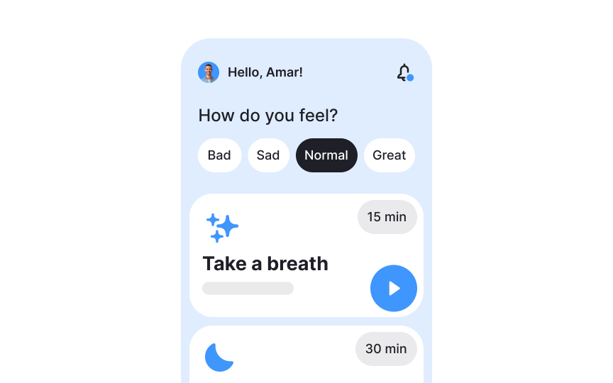
Calming colors
Looking at certain blue shades can help reduce stress and create a sense of tranquility. Light blue, in particular, is very soothing and helps people feel at ease. In fact, staring at the sea, ocean, lake, or just a swimming pool causes an increase in neurochemicals that make us feel calmer, happier, and more relaxed.[1]
Green is another calming color, symbolizing nature and growth. It can make people feel refreshed and relaxed, making it a great choice for spaces where relaxation is important.
White is also known for its calming effects in Western cultures. It creates a sense of cleanliness and simplicity, often making spaces feel more open and peaceful.[2] On the other hand, keep in mind that it also symbolizes death and sadness in many Eastern cultures.[3]
References
- How White Impact Moods, Feelings, and Behaviors | Verywell Mind
- How White Impact Moods, Feelings, and Behaviors | Verywell Mind


