Place related elements in proximity
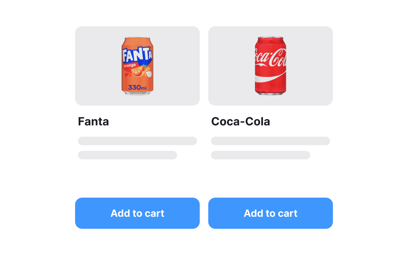
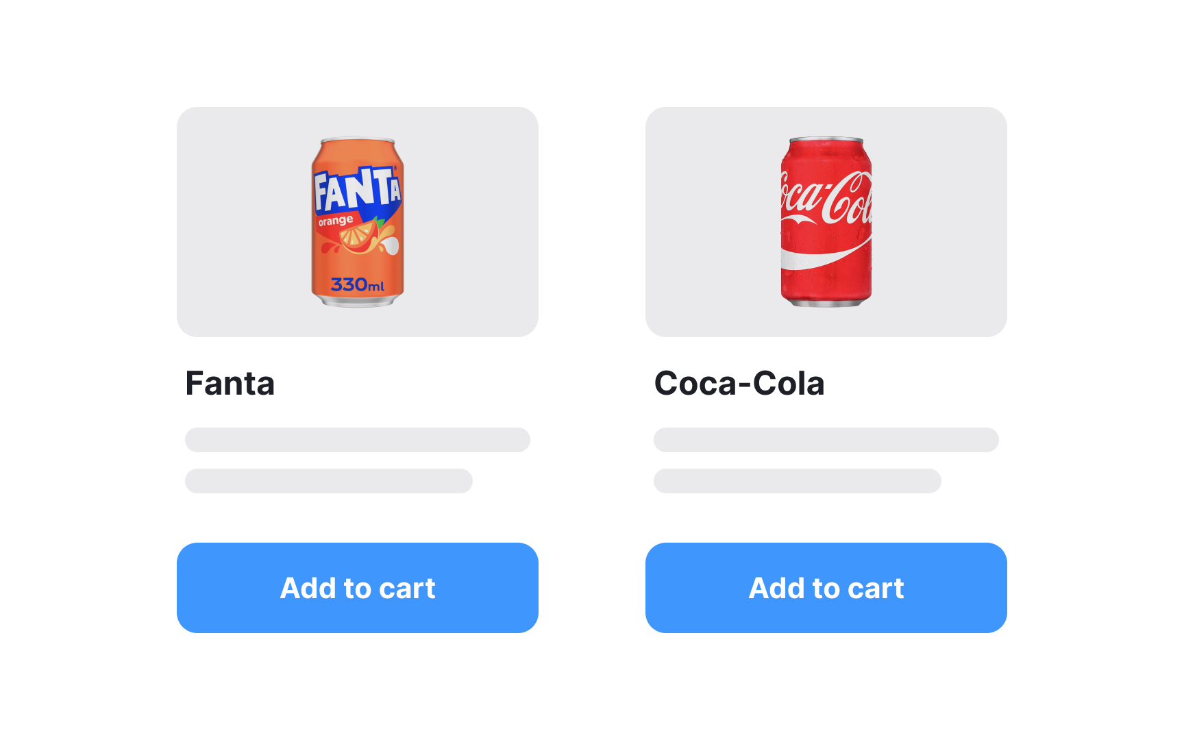
Don't skimp on white space but always keep the proximity principle in mind — related elements should be near each other and aligned respectively.[1] Users perceive nearby elements as parts of one group and far-away elements as strangers to each other.
Consider a webpage with a form that includes input fields, labels, and a submit button. By maintaining sufficient white space around each form field and aligning them closely, you visually group these related elements. Users instinctively perceive these elements as part of the same task or form, facilitating a clear understanding of their relationship.
