CSS display property with the flex value
When arranging elements on a page, we might need to lay them out in rows or columns. For this matter, web developers swear by the flexbox tool.
The tool name explains itself as it allows you to:
- Arrange elements both vertically and horizontally inside the container
- Spread elements over the container
- Shrink elements to fit into small space
- Make all columns in a multi-column layout of the same height even if they contain a different amount of content
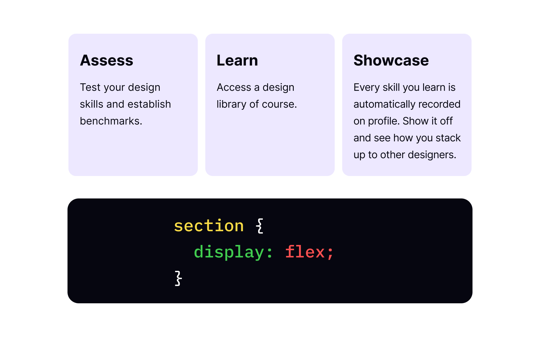
First, you need a parent element, like <section>, and children elements that will be laid out as flexible boxes. Then, we take a familiar display property with a special value of flex and apply it to the parent element. As a result, the <section> element becomes a flex container, and its children behave like flex items.
With one single display:flex; declaration, we have a multiple-column layout with equal-sized columns. Besides, an element with this value behaves like a block-level element, meaning no other content is allowed here.
Pro Tip: We use display:inline-flex when we want the whole flex container to behave like an inline-level element, while its children continue acting like flex items. The inline container takes as little space as possible while its inner items adapt and shrink to fit a smaller box.
