Place error messages below the input
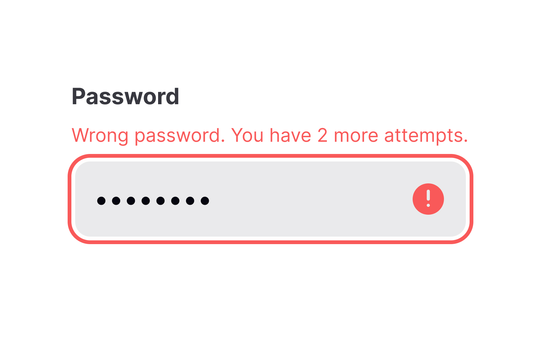
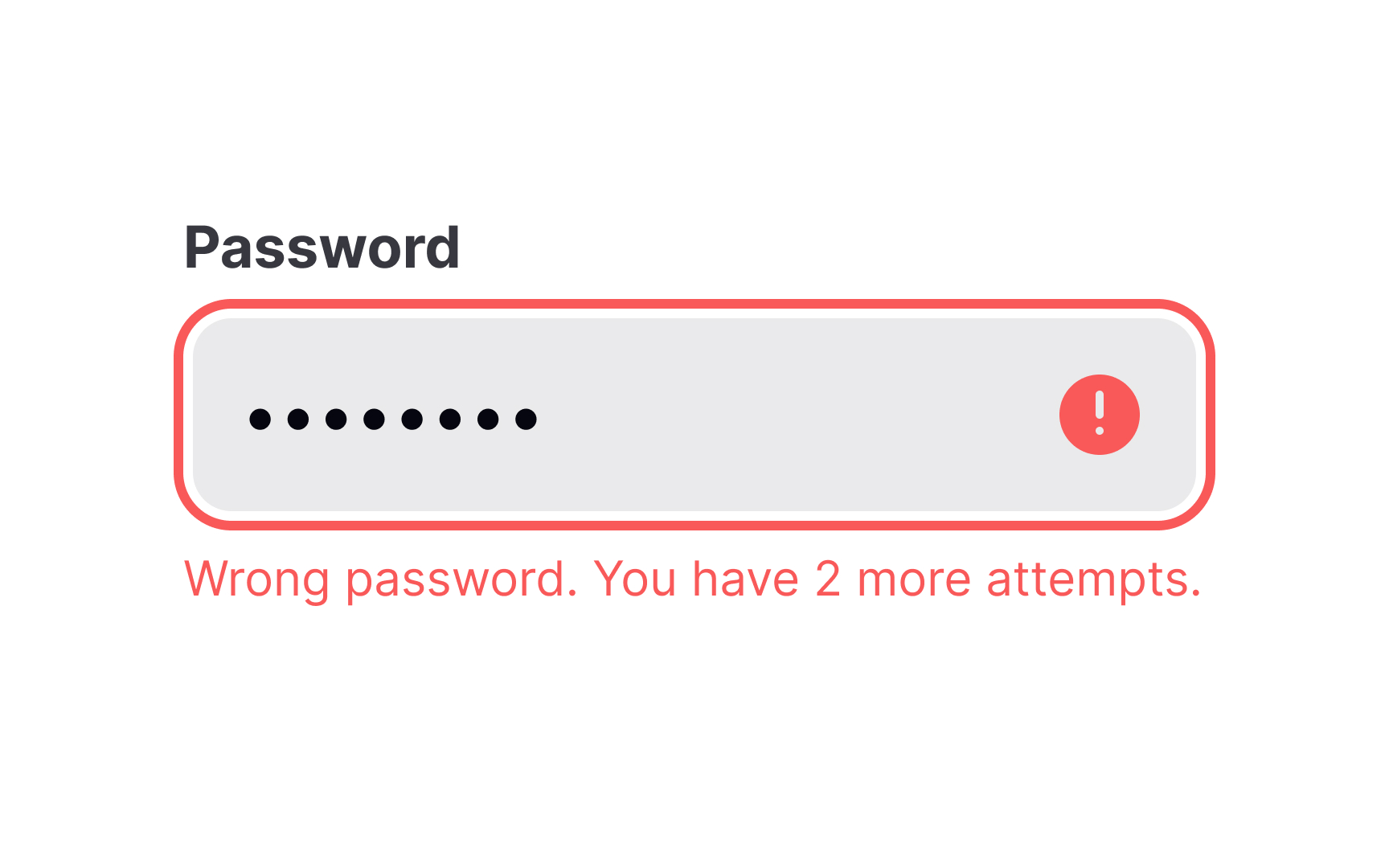
Placing error messages near input fields improves usability. Users quickly associate the error with the specific field, reducing frustration and speeding up correction. The best placement is to the right of the input or directly below it.[1]
Errors placed above the input can be missed, especially in forms with multiple fields. Errors on the left disrupt the reading flow in left-to-right languages. Messages should be visually distinct but not intrusive.
For accessibility, errors should be programmatically linked to inputs using ARIA attributes. This ensures screen readers announce them properly to those using such assistive technology.
References
- The Best Place for Error Messages on Forms | UX Movement