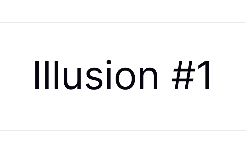
Look at the details
This can be an easy thing to overlook, but the details of a typeface can have a huge impact on the legibility of that typeface. One of the most obvious things to check is whether there's enough distinction between characters. For example, if the uppercase "i" (I), lowercase "L" (l), and number "1" don't use distinct glyph shapes, it can confuse readers under certain circumstances.
Also pay attention to whether characters like capital "C" and "G" have enough distinction between them, or whether there's any distinction between the capital "O" and the number "0." Considering these small details can make your typography look more polished and professional.


