Slab serifs
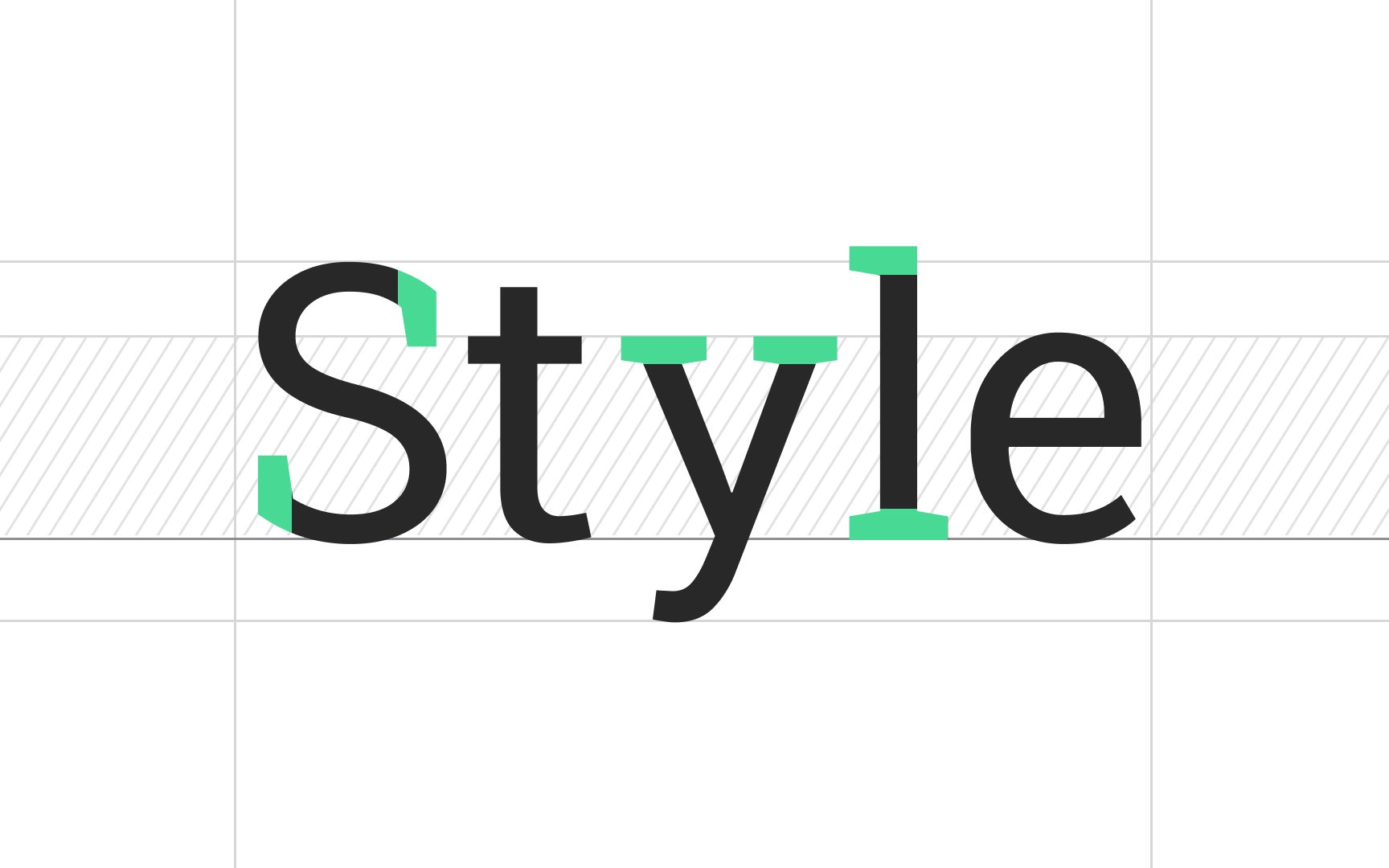
Slab serifs were invented in the 19th century and were characterized as:
- Sturdy and block-like
- Had no evident weight contrast in strokes
- Their terminals could be either blunt and angular or rounded
With the development of printed media, slab serifs became remarkably popular. Publishers used this distinct typeface for advertising materials and book covers but rarely for body text.
Interestingly, the credit for the typeface's second name — "Egyptian" — belongs to Napoleon Bonaparte. After his Egyptian campaign, the Western world was swept by a fascination with Egyptian culture. In many European saloons, you could have encountered furniture and decor resembling the artifacts found in Egyptian tombs. At the same time, due to a marketing gimmick, Slab serifs were often called "Egyptian" even though there was no connection between this typeface and traditional Egyptian writing systems.[1]
Popular slab serif fonts include Rockwell, Clarendon, Serifa, Courier, and Memphis.
