Monospace typefaces
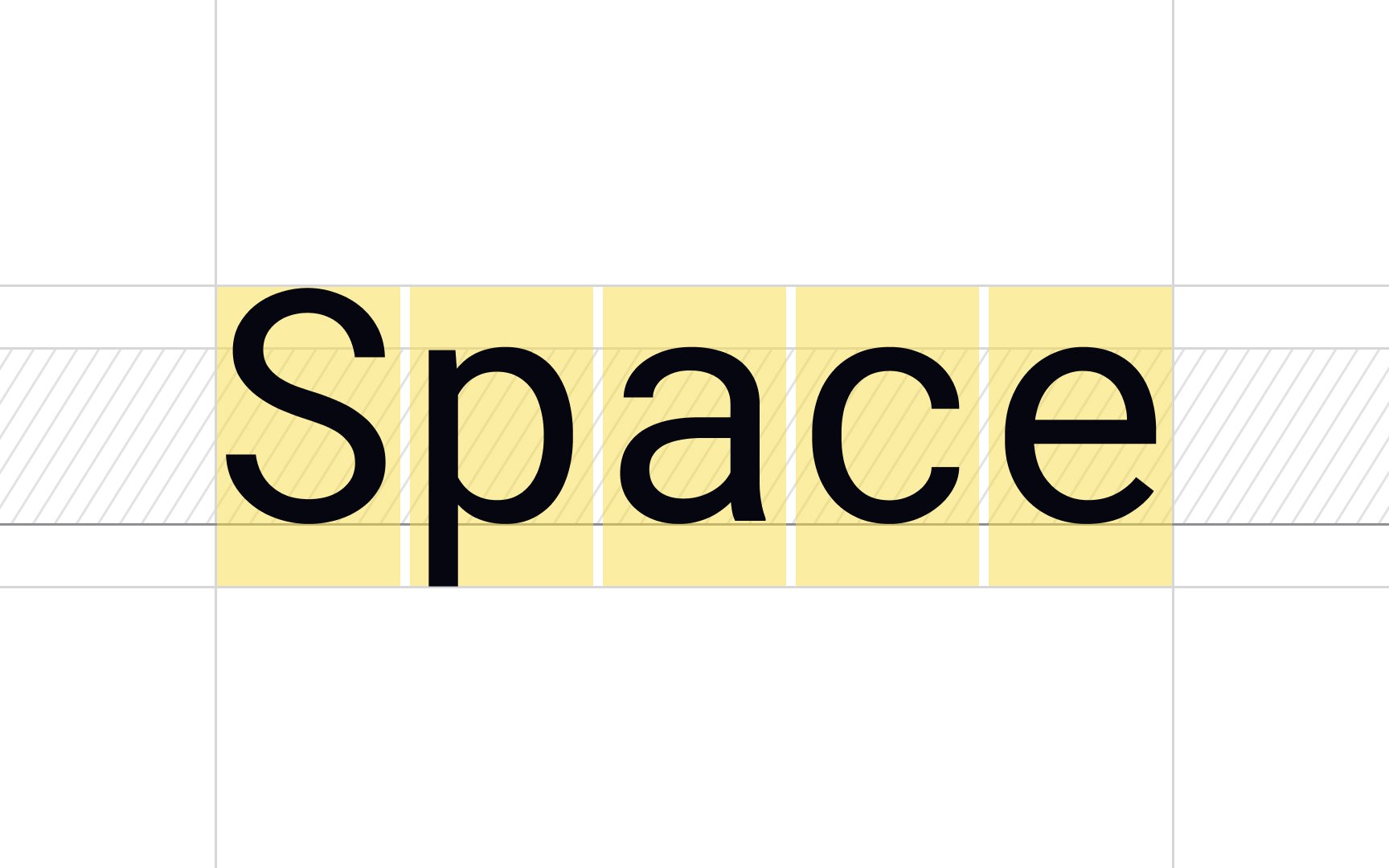
In contrast to proportional typefaces, where different letters have different widths, monospace typefaces have the same width for each letter. For example, the thin letter "l" will take the same amount of space as the wide "W." Text written in monospace typefaces are reminiscent of those typed on manual typewriters, and designers can use them to add a retro feeling to their projects.
One of the advantages of this type is that each letter occupies the same amount of horizontal space. For that reason, these typefaces are widely used in programming so that developers can easily spot mistakes in code. On the other hand, monospace typefaces take up more space than proportional typefaces, and long stretches of monospace text can tangle together visually and appear much harder to read.[1]
